


“If we want users to like our software we should design it to behave like a likable person: respectful, generous, and helpful.”
– Alan Cooper
There probably isn’t a better way to encapsulate what a good user interface should be. In fact, the 4 golden rules of UI design exist to ensure that the UI we create is as close as possible to being like a likable person. Someone who is kind, considerate, and always ready to lend a helping hand.
UI designers are familiar with the 10 Usability Heuristics for UI Design by Jakob Nielsen, the 8 Golden Rules of Interface Design by Ben Shneiderman, and Bruce Tognazzini’s Principles of Interaction Design which form the basic principles applicable to any interactive systems. The 4 golden rules have been derived from these and can be termed the fundamental principles of UI design.
4 Golden Rules of User Interface Design

Ensure users’ control over the interface
How does it feel when you’re driving in a new city with no maps or navigation signs? You might keep taking wrong turns, or seek help from those passing by every now and then. Doesn’t that come in the way of exploring the city in a pleasurable manner?
Software users are no different. Therefore, no matter what your product may be, it is important to ensure that its navigation is clear and self-evident. Users should be able to accomplish their goals with ease. Even when it comes to feature-heavy and mission-critical B2B applications, the UI cannot afford to be intimidating so much so that they are afraid to press a button. A good user interface provides the users with context and offers directions every step of the way.
For example, the ‘Undo’ action after deletion gives the user the option to undo an action in case it was performed by mistake.
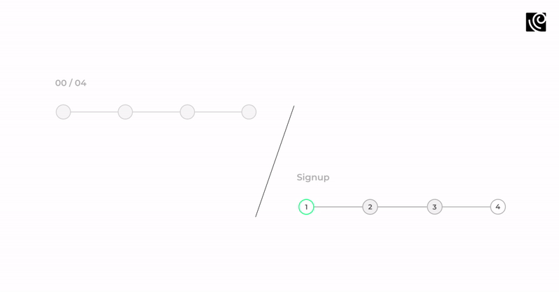
Visible system status indicators such as these ensure that the users know where they stand on the process pathway and how much is still to go.
Feedback, both visual and haptic, such as the ‘Done’ tickmark appearing, or the small vibrate tone in the Pinterest app when you pin something to a board convey the right message to the users assuring them that their action is completed.

Make all the interactions comfortable
When it comes to making the user feel comfortable, the fable of Goldilocks and the Three Bears comes to mind. A great interface is one that has “just the right feel” in terms of the information displayed and the actions users can take. Anything extra here is only equivalent to noise and diminishes the relative visibility.
What does it take to simplify interfaces? Not much really, when you design with the ‘less is more’ philosophy in mind. Remove unnecessary elements or content that does not directly support user tasks. Ensure that the information presented on the screen is relevant and provides value. This value can be evaluated on the basis of user testing your designs.
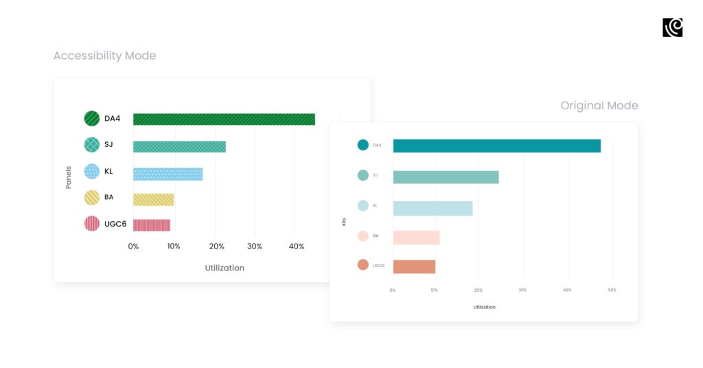
For example, we conducted a UX Audit on a lab analytics tool which revealed that a few users had trouble discerning the color blocks in the bar graphs. From a design standpoint, relying on color alone for readability and affordance (possible actions that the user can take) was making it difficult for users who were color blind.
We iterated and finalized a direction after user testing sessions with users and reviews with Subject Matter Experts and Internal Stakeholders. Based on the learnings, we recommended creating an ‘Accessibility mode` for color-blind users using the following design alternatives.
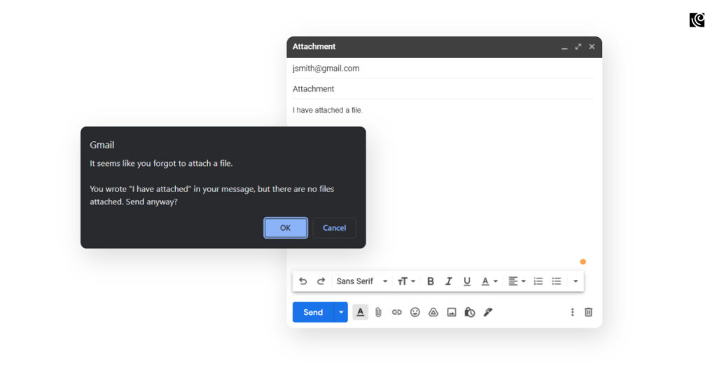
Gmail does a great job of designing for mistakes. It always provides a prompt reminding the user to attach a file if the word in any form appears in the body text.
Keep cognitive load to a minimum
Cognitive load refers to the amount of mental prowess required to use a product. And only for those living under a rock, there’s a whole book dedicated to the concept – Don’t Make Me Think by Steve Krug. The UI of a software product should not relay undue pressures on the user – put simply – it should not make the user think.
When designing a user interface, it is important to keep the steps required to complete an action to a minimum. Another piece of sound advice comes from Jakob Nielsen’s 10 usability heuristics which places recognition ahead of recall in UI design. Recognizing an element or a pathway is comparatively simple to do than recalling it because recognition triggers more cues in our brain and those cues help us remember information.
Promoting recognition in user interfaces can be done by making the content and functionality easily accessible and visible. The organization and positioning of UI visual elements are crucial to ensuring a great user experience.
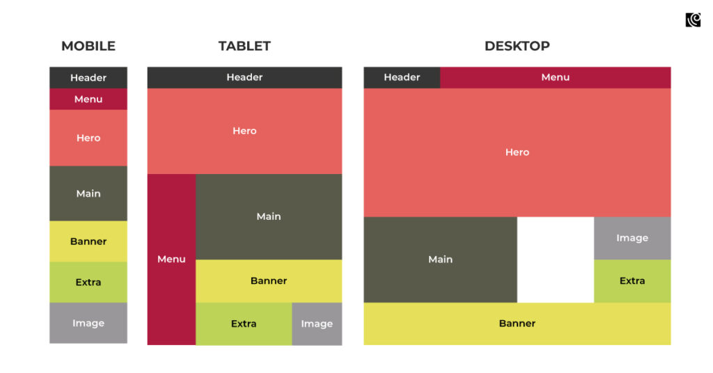
To do this, UI designers make use of layouts to introduce structure to the interface. This helps in bringing about a predictable rhythm and a sense of familiarity. Grids come in handy as a framework to arrange UI elements in a way that ensures a good visual balance on every page. It allows designers and developers to create more consistent and appealing UIs.
Ensure consistency across the product
Consistency is key when it comes to good UI. It is one of the benchmark qualities of usability. Building on the previous point of cognitive load, consistency is a vital element that helps in reducing it. Consistency is what helps instill confidence and brings a sense of comfort to users with its uniformity in visual styles of colors, fonts, and icons along with navigation flows.
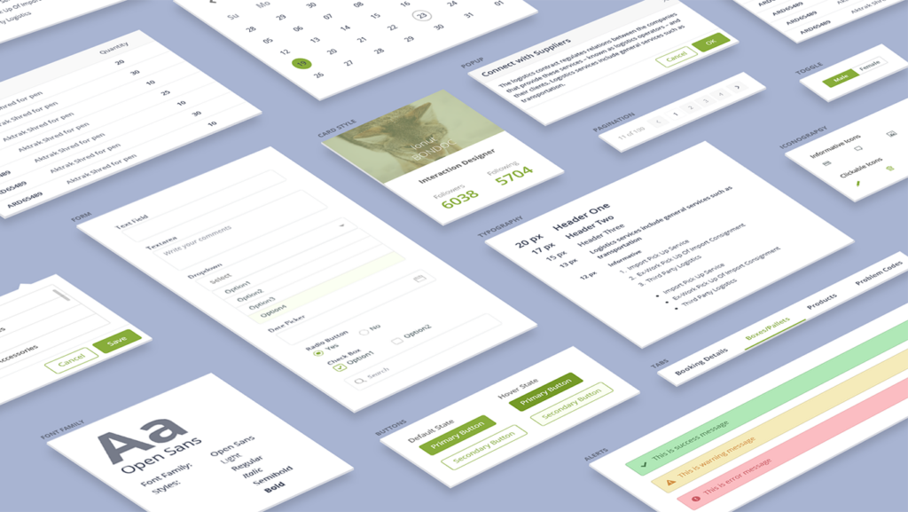
Having a design system in place helps in building consistency. For example, the ‘Back’ button on every page should ideally look the same on all pages and be placed in the same position. The NN group outlines the design system as “a set of standards to manage design at scale by reducing redundancy while creating a shared language and visual consistency across different pages and channels”.
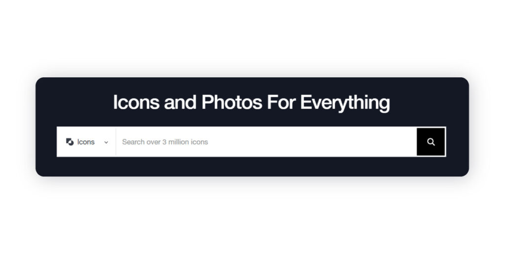
Another great way to reduce cognitive load by being consistent is to follow established conventions of visual cues such as icons. The magnifying glass as a search icon or its very placement at the top of the page makes sure that users identify and find it with utmost ease.
You may have noticed the repeated use of words such as ‘familiarity’, ‘consistency’, and ‘predictability’ in this post. These words are hint enough of the fact that good UI design is all about making the users feel at ease. While there are a lot of conversations around the importance of user experience design, the way it manifests for users is through the actual interface of the product. As a UI designer, you are sure to have applied these golden rules of UI design in your work. Do share your experiences with us in the comments section.


