


My deep-set mistrust of all kinds of status indicators stemmed from the washing machine timer. How does one explain a normal cycle that’s supposed to take 40 minutes and is still spinning, even 60 minutes later? What level of Inception-style sorcery are these machines trying to pull off?
It’s true, status indicators are tricky business. Especially in the digital space, loading UI interactions hold the power to make or break your user experience.
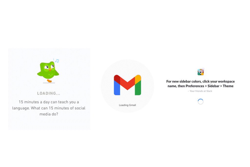
The reason behind the ‘tricky business’ part of designing progress indicators is that there’s so much potential! A loader is where you can bring in a bit of quirk (think Slack), show sass (Duolingo’s the undisputed boss), or just reinforce your brand (we see what you’re doing there, Google). With this level of potential, it’s easy to get carried away and miss out on the original purpose of a loader, which is to control your user’s perception of time and provide the right guidance.
5 UX Best Practices to Design Loaders
Visibility of system status is the first of NN’s 10 usability heuristics for UI design –
“The design should always keep users informed about what is going on, through appropriate feedback within a reasonable amount of time.”
When users are informed about the current system status, it helps them gain a clear idea of the outcome of their previous step and determine what’s to be done next. Predictable interactions are crucial tools that ensure the users’ trust in the product.
Here are 5 UX best practices to follow when designing progress indicators.
The best loader is one that hardly appears

In a perfect world, all internet connections would be high-speed, the code would be optimized, image files would be light as a feather, and the data size would be perfect to load.
Since this is miles away from reality, UI designers have to ensure that their progress indicator does the job. But before we even get to that, even a loader as cute as a hopping bunny is bound to annoy users when it stays on screen for infinity. Plus, it amounts to bad UX. Therefore, before designing progress indicators, it is crucial to first address issues that slow down the process of page loading. Start off by keeping the pages of your product or website simple and bug-free as far as possible and restrict the appearance of loaders to a minimum.
The best loader is also a timer
“Your call is important to us, please stay online.”
This is the one thing everyone dreads when they have to contact a call center or a helpline. Now, compare that with this –
“You are 4th in line, you can hold the line, or expect a call back in approximately 10 minutes.”
A simple message such as this one which provides even an approximation of the waiting time provides a sense of relief to the user.
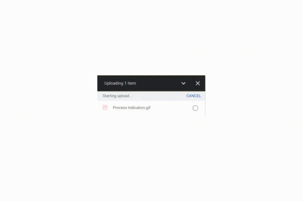
Visual indications of work done such as the number of files uploaded/pending, and the number of minutes that a software update would take are helpful in conveying expectations to users and keeping frustrations at bay.
The best loader always provides explanations
A smart addition to your loader animation involves providing the reason that’s causing the delay and revealing what’s going on while the user waits –
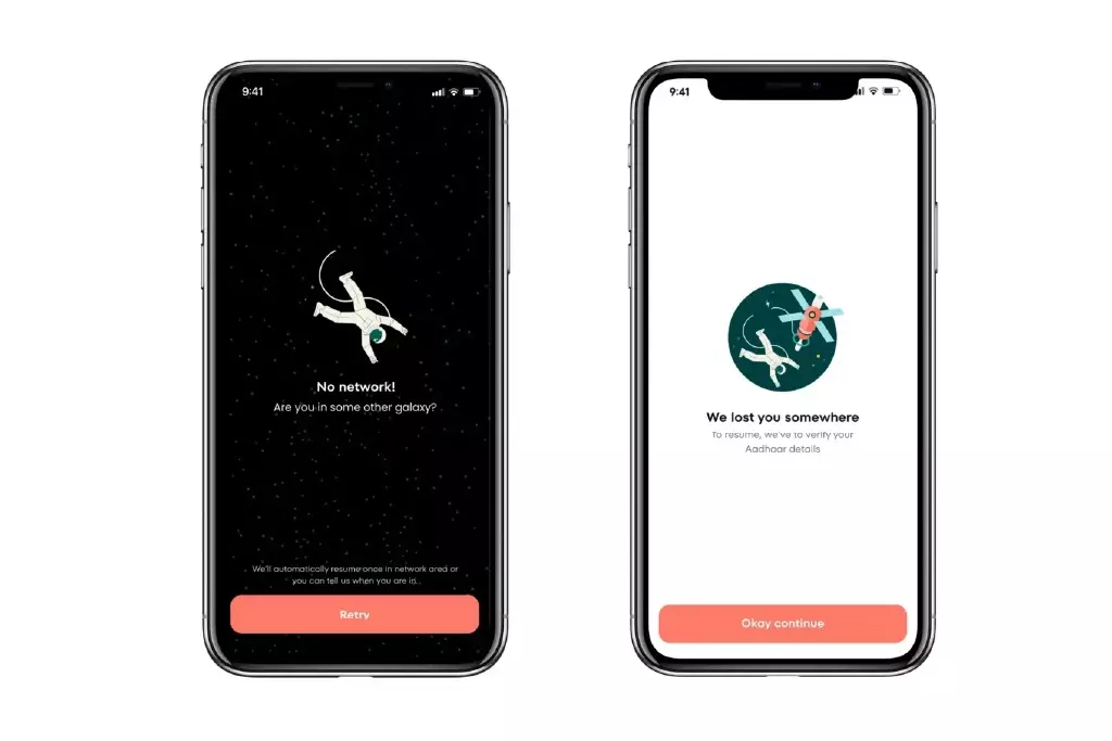
This example of the loader design provides an explanation as to why the user is being made to wait (they may be offline) or if there’s a task to be finished before moving ahead (verifying Aadhar details). Thus, along with the visuals, a crisp microcopy is an essential requirement of a helpful status indicator.
These specific, simple-to-understand explanations let the user know about the problem causing the wait and if they can do something to speed it up, or if it’s a delay generated by the system.
Score: User delight: 1 | User frustration: 0
The best loader can’t speed up time, but it alters the perception of time
Time flies when you’re on vacation, or you’re out having fun with friends, or doing something you love. While Google’s offline dinosaur game may not formally be a loading page, it still provides a fun experience for users while they get back online – a gold standard in altering the user’s perception of time. There’s hardly a soul who hasn’t lost track of time while playing it –
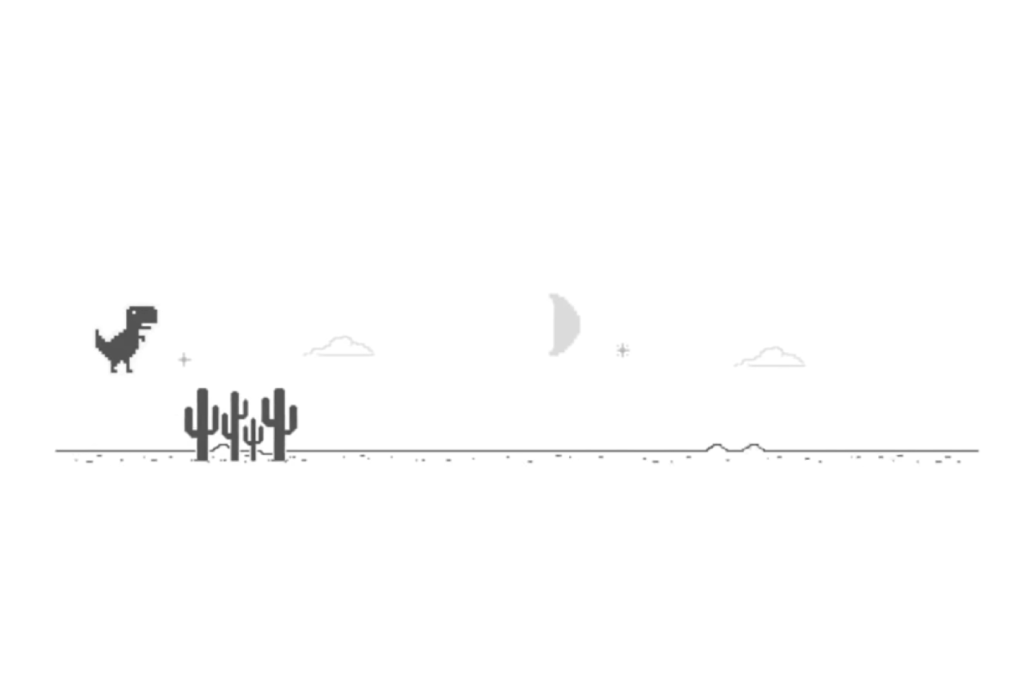
It’s fun, it’s effortless, and it’s meant for everyone. Before you know it, you’ve lost track of time and didn’t even miss the chaos of the internet.
A mini-game such as this one isn’t an ideal solution, since it plays no role in providing assistance to users. However, it does a stellar job of keeping people engaged for a few minutes until they get back online.
The point to be noted here is that no matter how engaging your loader design may be, remember that it’s still a sort of a placeholder activity and not the final destination of your users. Therefore, this is a good time to remind you of keeping your app or website light and speedy to ensure that the page loads are quick and hassle-free.
The best loader is a subtle cheerleader
Any marketing professional worth their salt never misses an opportunity to plug in their brand. UI designers can take a leaf out of the marketing playbook when designing loaders. Take the example of Expedia –
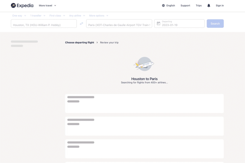
As a travel website, Expedia provides this delightful animation as the users wait for the results of their flight search query. While it does not use the logo or the brand name, this subtle animation is in line with the brand and is a cheerful value addition.
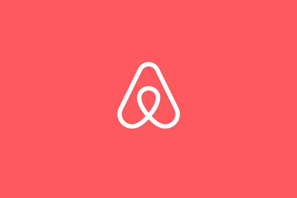
Now, compare that to Airbnb’s loader design which is an animated logo – yes, it’s good branding, but also quite in-your-face, isn’t it?
To conclude, let’s do a short recap of the best practices listed above in the context of time and value.
- Ensure that the user receives feedback immediately after receiving the request
- For waits estimated up to 5 seconds, it is best to display a looped animation
- For waits estimated up to 10 seconds, use a numeric indicator (percentage of doneness or minutes to go)
- Ensure that the accompanying message is contextual and provides the right assistance to users
Designing status indicators and loaders provide a brilliant opportunity to put your best foot forward. Hold-ups are a source of frustration for users, so this is a great way to showcase good UX practices. Make sure you do away with annoying animations and pushy mind games, and instead provide custom feedback, integrate your brand’s personality, and infuse a sense of trust in your system.


