

How to Design AI Experiences Healthcare Users Actually Trust

In this guide, you'll learn how to:
Understand why AI UX is behaviour design, not interface design
Identify the six product problems AI solves in healthcare
Choose the right AI experience pattern for your product
How to tell the difference between AI UX that builds trust and AI UX that erodes it
Apply the Sense-Shape-Steer framework to your AI product
Avoid the four mistakes that kill AI adoption
Evaluate an AI UX design partner (including what to look for and what to run from)
Let's get into it.
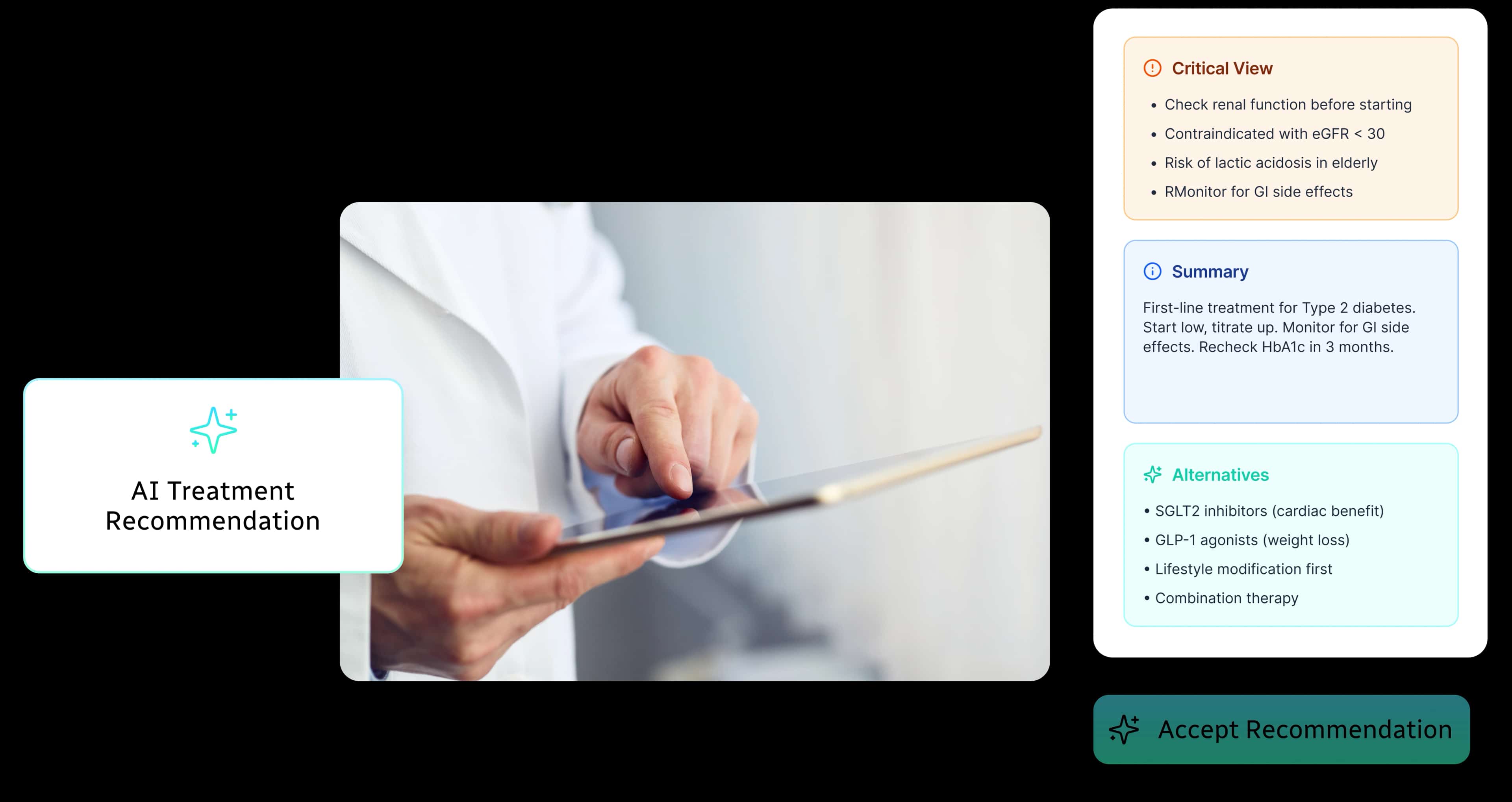
AI UX Design Basics


ABOUT THE AUTHOR

CEO and UX Practitioner
Bansi Mehta is leading voice in healthcare UX who has spent over 15 years making complex products feel clear, capable and human. She is equal parts design romantic and technologist - drawn to the elegance of beautifully simple interfaces whilst remaining endlessly curious about AI and the future of human-computer interaction.
As founder and CEO of Koru UX, an award-winning design agency, Bansi leads 45+ designers who have completed more than 1,500 UX projects to improve the way millions of users interact with technology.

In this chapter, we’ll cover what AI UX design is, why it’s a fundamentally different discipline from traditional UX, and why healthcare makes it even harder to get right.
If you’re a product leader trying to figure out why your AI features aren’t getting adopted (or trying to make sure your next one does), start here.
What is AI UX Design?
AI UX design is the practice of designing how intelligent systems behave, communicate and earn trust.
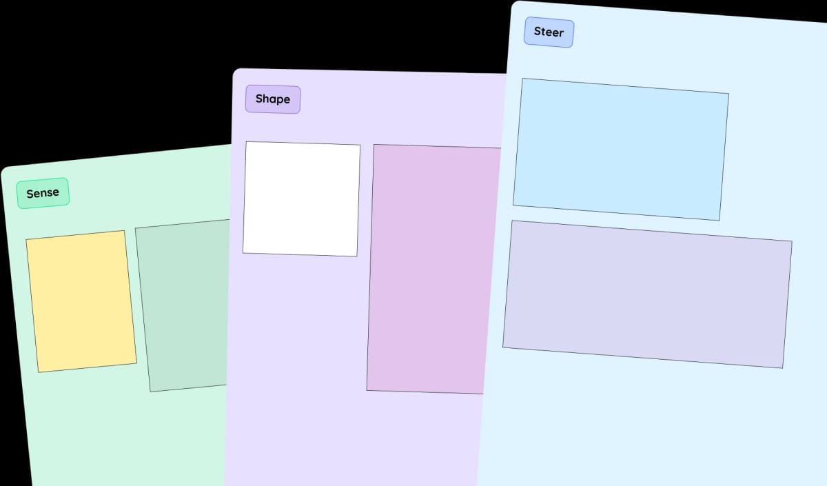
Unlike traditional UX, where the same input reliably produces the same output, AI UX must account for variability, uncertainty and systems that learn and change over time.
That means designing things traditional UX never had to touch:
- When the system should act vs when it should wait for permission.
- How it communicates confidence (or lack of it).
- What happens when it gets something wrong.
- How it earns more autonomy over time.
- How different users (with different risk tolerances) interact with the same AI.
It's not interface design with a chatbot bolted on. It's behaviour design for systems that think.
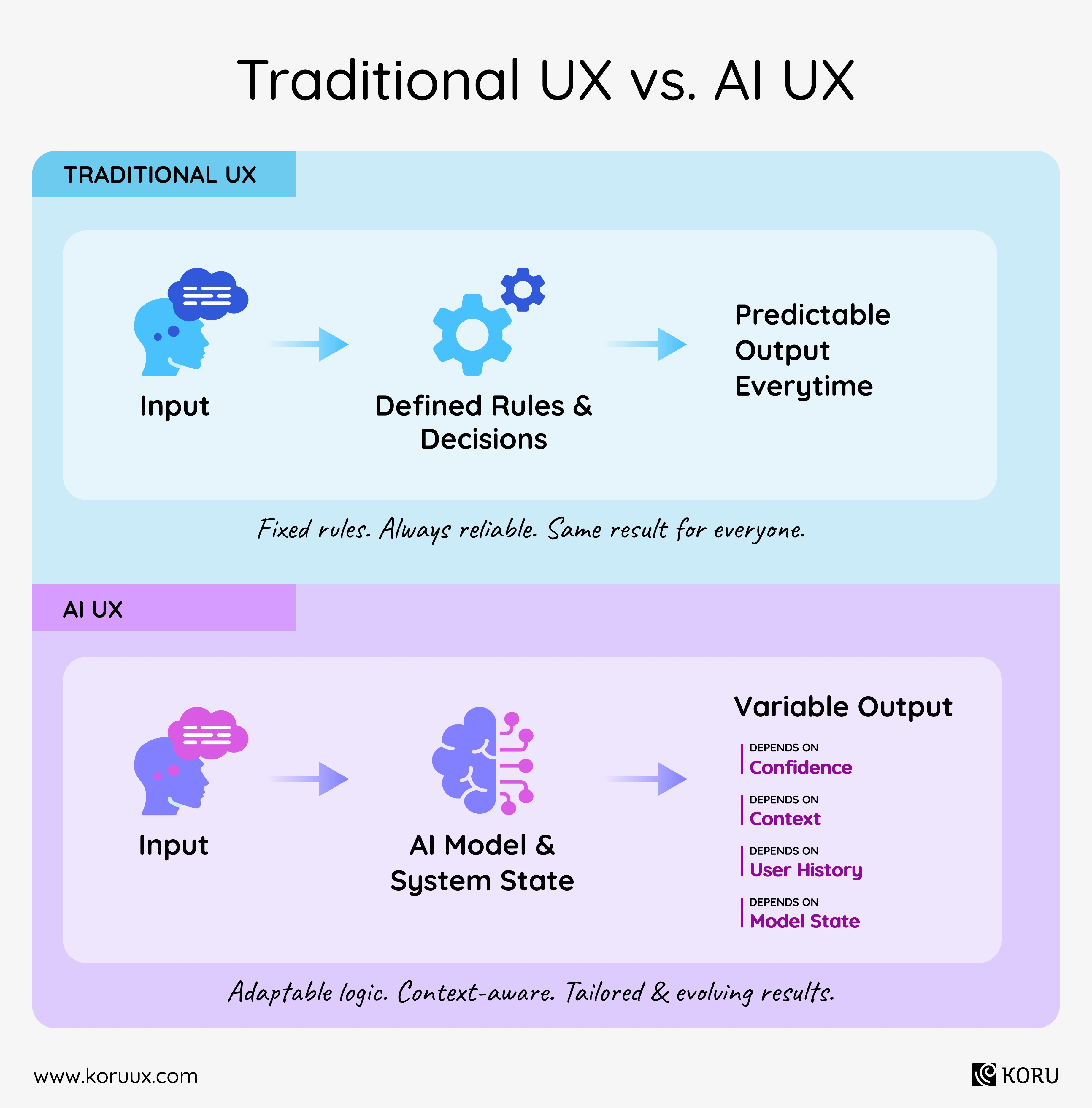
Want a practical framework for designing AI behaviour?
Download our freeSense-Shape-Steer FigJam workbook

How is AI UX Different from Traditional UX?
Traditional UX assumes predictability. Click this button, get that result. Refresh the page, same thing happens. Design the flow once, it works forever.
AI breaks every one of those assumptions.
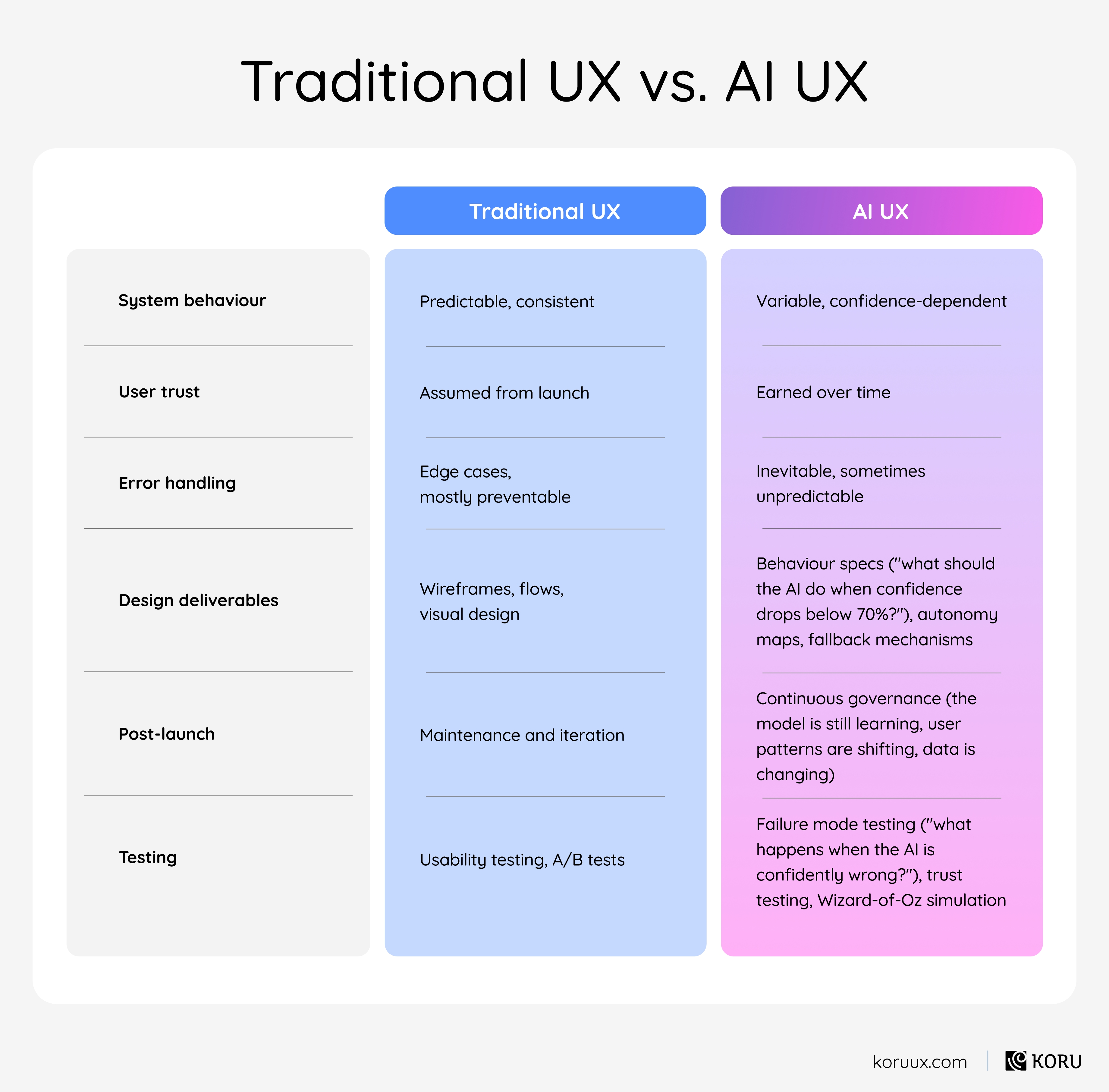
The same query can produce different results depending on context. The system’s confidence varies from interaction to interaction. It learns from user behaviour, which means the product literally changes over time. And it will, at some point, get something wrong in a way nobody anticipated during testing.
This creates design challenges that don’t exist in conventional software:.
This is why conventional UX agencies struggle with AI projects. Not because they lack talent, but because the toolkit and the mindset are genuinely different. We’ll get deeper into this in Chapter 7.
Why Does AI UX Matter?
You can build the most sophisticated AI model in your industry and still watch it fail if the experience around it isn’t designed properly.
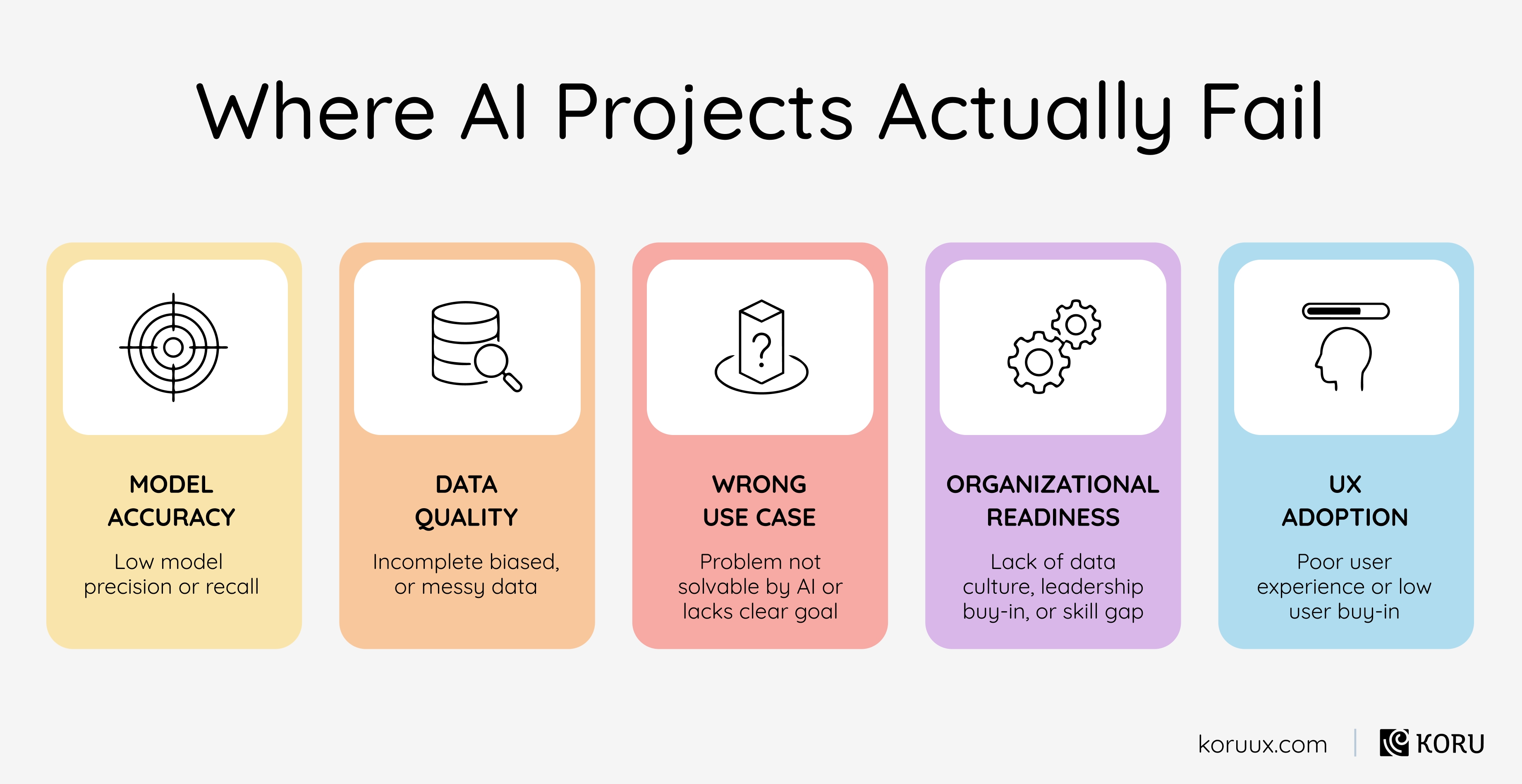
Gartner estimates that 85% of AI and machine learning projects fail to produce a return. And while there are plenty of reasons AI projects fail (bad data, wrong use case, organisational resistance), one of the biggest and most overlooked is the experience layer.
Users don’t adopt AI features they can’t understand. They don’t trust systems that can’t explain themselves. They abandon tools that sound equally confident whether they’re right or guessing.
The pattern plays out publicly. IBM’s Watson for Oncology was trained on world-class clinical data but hospitals abandoned it because clinicians couldn’t understand its reasoning. Epic’s sepsis prediction model achieved strong accuracy in testing but generated so many alerts in practice that care teams learned to ignore them. The models worked. The experiences didn’t.
The fix is designing the AI’s behaviour so that trust builds naturally through use.
We’ve shipped 1,500+ healthcare technology projects, and the pattern is consistent. The teams who treat AI UX as behaviour design build products that get adopted. The ones who treat it as a visual design exercise with some AI features added in watch those features gather dust.
Why Healthcare Makes AI UX Even Harder
Healthcare adds layers of complexity that most product teams underestimate.

User Environment & Mindset
Clinical decisions happen under time pressure, cognitive overload and constant interruption. Your AI feature doesn’t get a calm, focused user. It gets a hospitalist with 11 tabs open, two patients waiting and a phone ringing.

Life or Death Consequences
A bad recommendation in e-commerce means a wasted purchase. A bad recommendation in healthcare can mean patient harm. That changes everything about how you design confidence displays, override mechanisms and escalation paths.

Compliance Burden
HIPAA constrains what data you can surface and how. FDA Human Factors guidance applies to AI-assisted clinical tools. The EU AI Act classifies healthcare AI as high-risk. These aren’t abstract compliance boxes. They shape actual design decisions. (HIPAA doesn’t just affect what data you store. It affects what you can show in a tooltip.)

Stakeholder Demands
A single AI feature in healthcare needs to earn trust from clinicians (who want clinical evidence), nurses (who want workflow integration), patients (who want reassurance) and administrators (who want audit trails). Design for one audience while ignoring the others and adoption dies.
Precisely because healthcare AI UX is harder, teams who get it right build a moat that’s nearly impossible to replicate. Generic AI UX agencies can’t fake healthcare domain expertise. Healthcare UX agencies without AI experience can’t design for systems that learn and change. The intersection (AI interaction design + healthcare domain depth + research methodology) is where the competitive advantage lives.
In the next chapter, we’ll get practical: the six specific product problems that AI actually solves in healthcare, and how to recognise which ones apply to your product.
The Six Problems AI Actually Solves in Healthcare Products
Not every product problem needs AI. But when one of these six friction patterns shows up in your user research, it’s a strong signal that AI can help.
AI applied to the right problem with the wrong experience design makes things worse, not better. So for each pattern, we’ll cover what the AI does and where the design gets tricky.
Problem 1: Information Overload
The information your users need exists somewhere in the system. They just can’t find it when they need it.
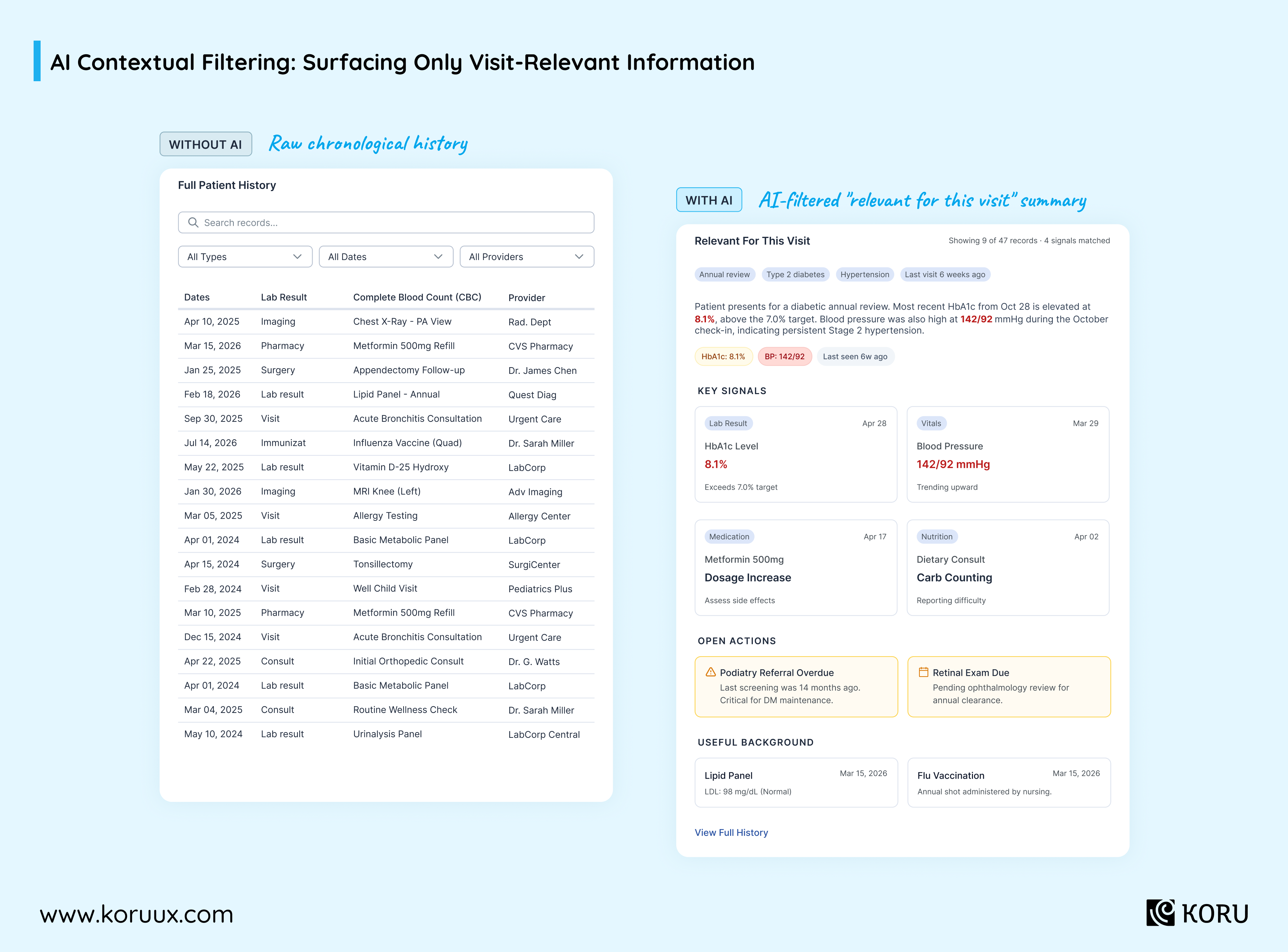
In healthcare, a clinician preparing for a patient visit might be facing 10 years of records. The information relevant to this visit is buried in there somewhere. So they spend valuable minutes hunting, or they miss something.
AI can surface what’s relevant based on context and push everything else into a “full history” view. The design challenge isn’t what the AI retrieves. It’s how it signals why it thinks this is relevant, and how easy it is to see what got filtered out.
Problem 2: Manual Work
Your users type information that already exists somewhere else. They copy data between systems and repeat the same tasks dozens of times daily.
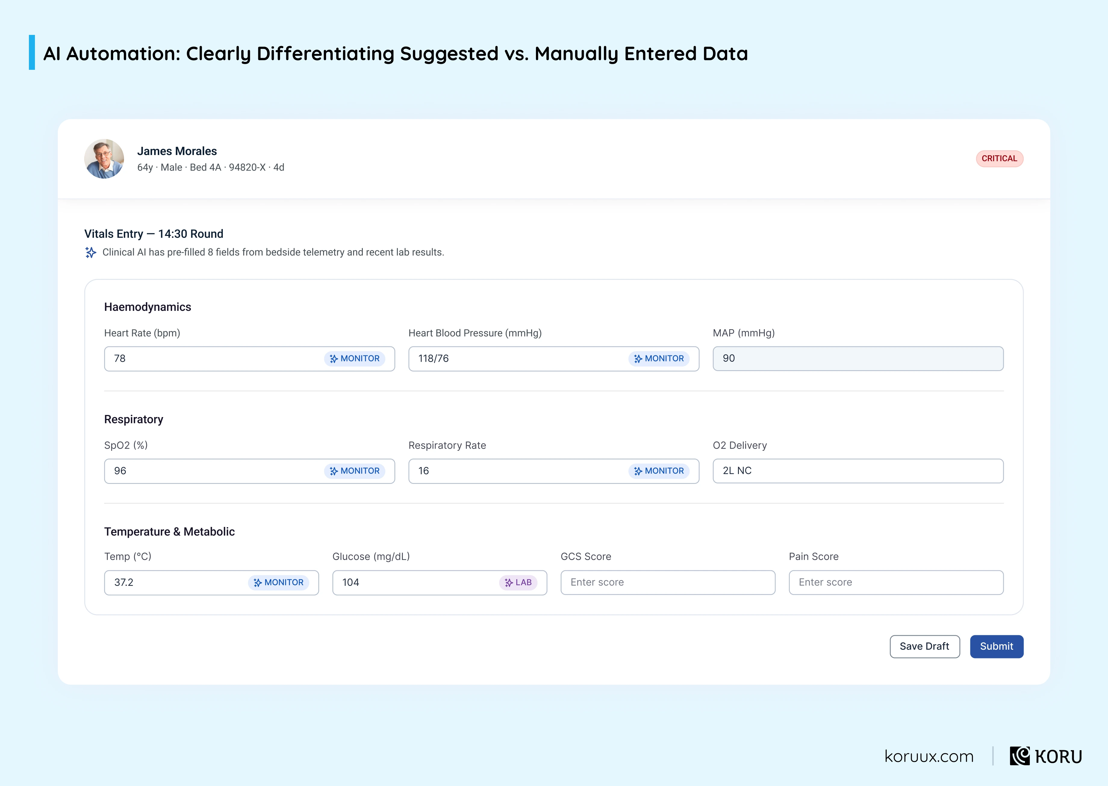
In healthcare, a nurse manually transcribing vitals from a bedside monitor into the EHR isn’t doing clinical work. They’re doing data entry.
AI can automate the repetitive parts. But the difference between an AI that silently fills in fields and one that suggests entries with clear labels and one-click editing is the difference between a feature clinicians rely on and one they learn to ignore.
Problem 3: Personalization Gaps
Most products offer one interface for everyone, maybe with some configuration options buried in settings.
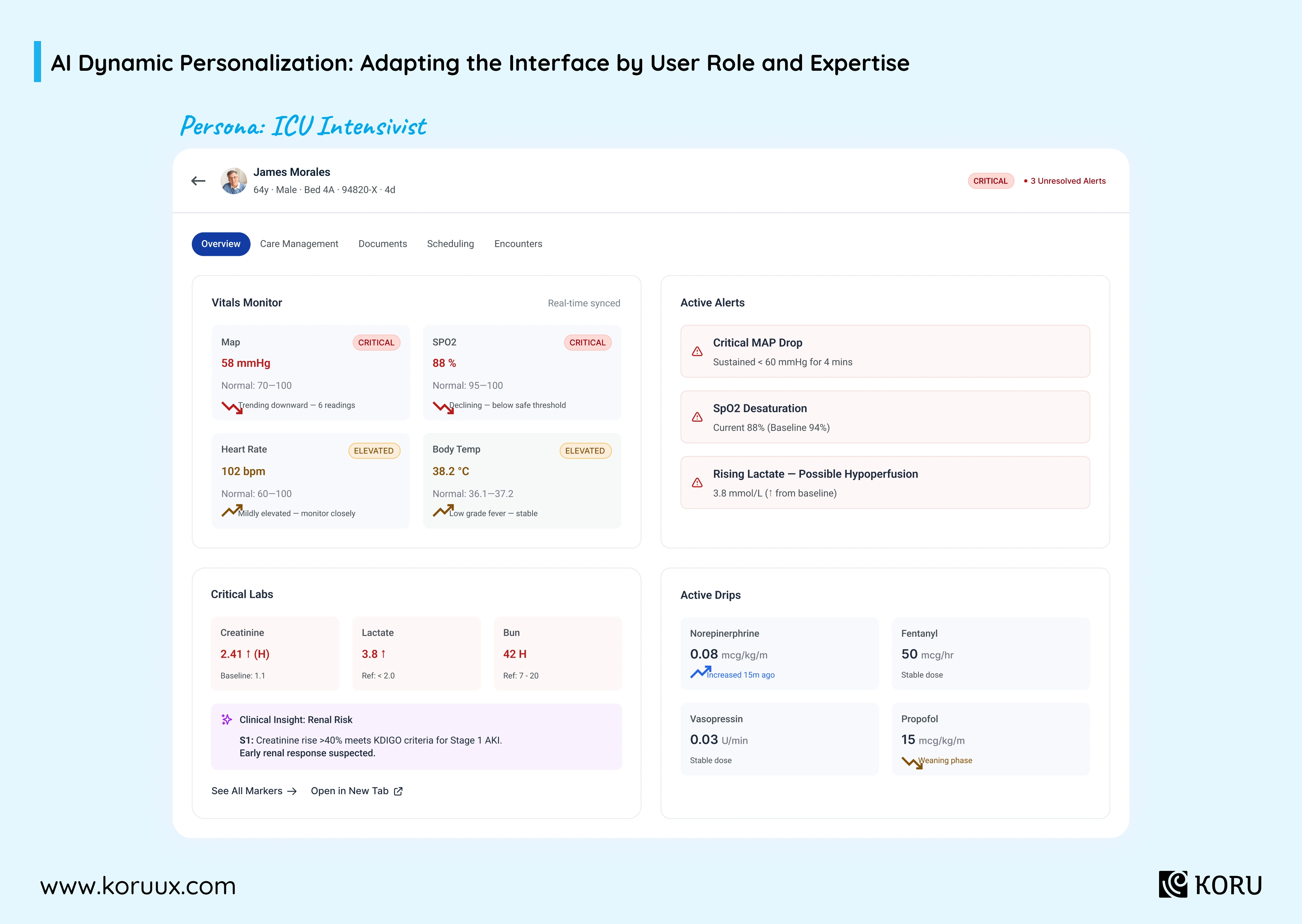
An ICU intensivist and a general practice nurse have completely different needs, risk tolerances and workflow patterns. Serving them the same experience isn’t a neutral choice. It’s actively making one of them less effective.
AI can adapt the experience based on role, behaviour and expertise level. The design challenge is doing this without feeling invasive. There’s a line between “this product understands how I work” and “this product is watching me.”
Problem 4: Adoption Barriers
New users get stuck. They’re not proficient enough to be effective, but they’re discouraged enough to abandon features or invent workarounds. In healthcare, workarounds aren’t just inefficient. They can be dangerous.
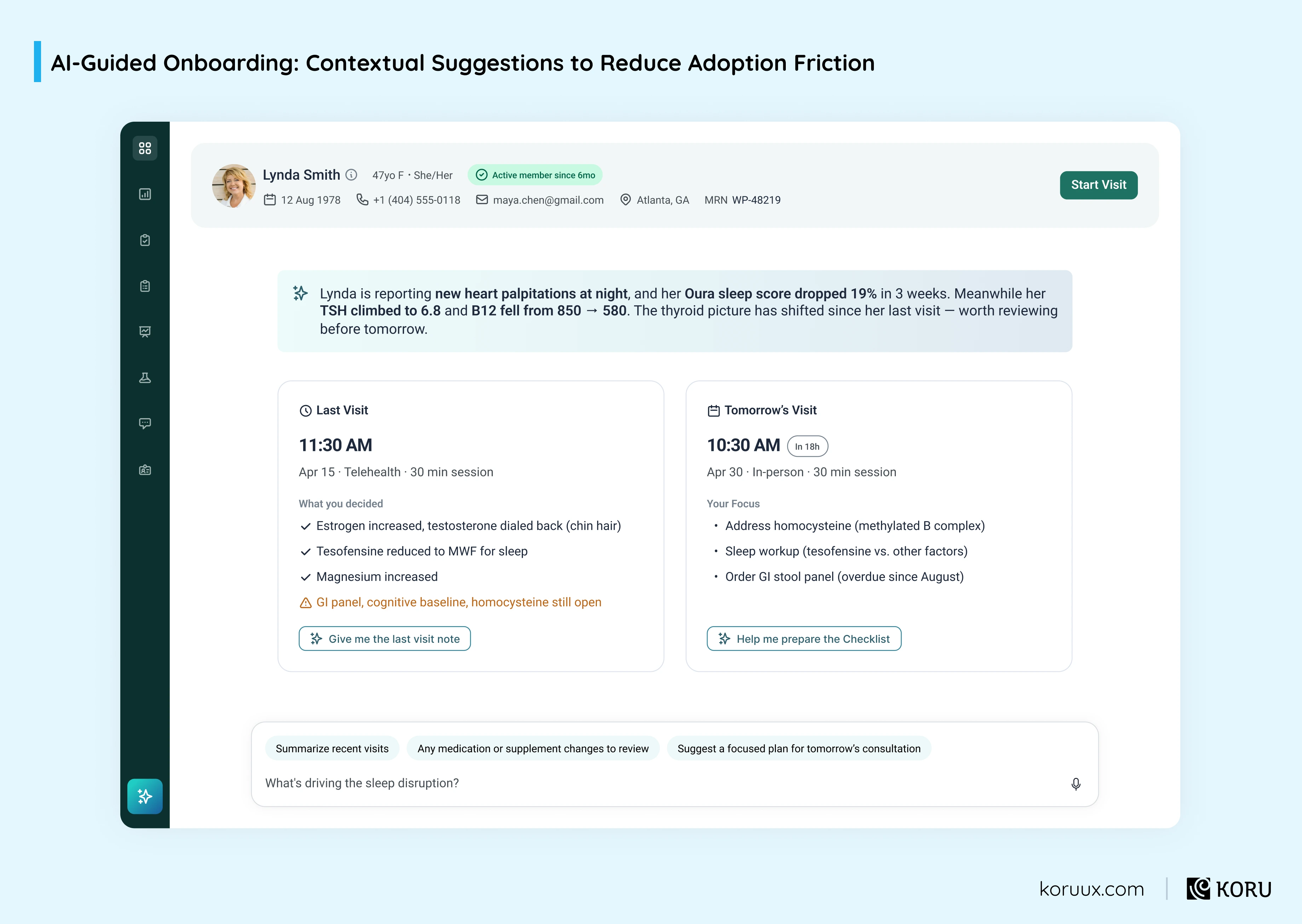
AI-guided onboarding can meet users where they are. It can offer contextual suggestions based on what they’re trying to do, natural-language guidance instead of static help docs, and “most clinicians at your facility do X next” prompts that transfer institutional knowledge without requiring a training session.
The hard part is knowing when to help and when to get out of the way.
Problem 5: Cross-System Fragmentation
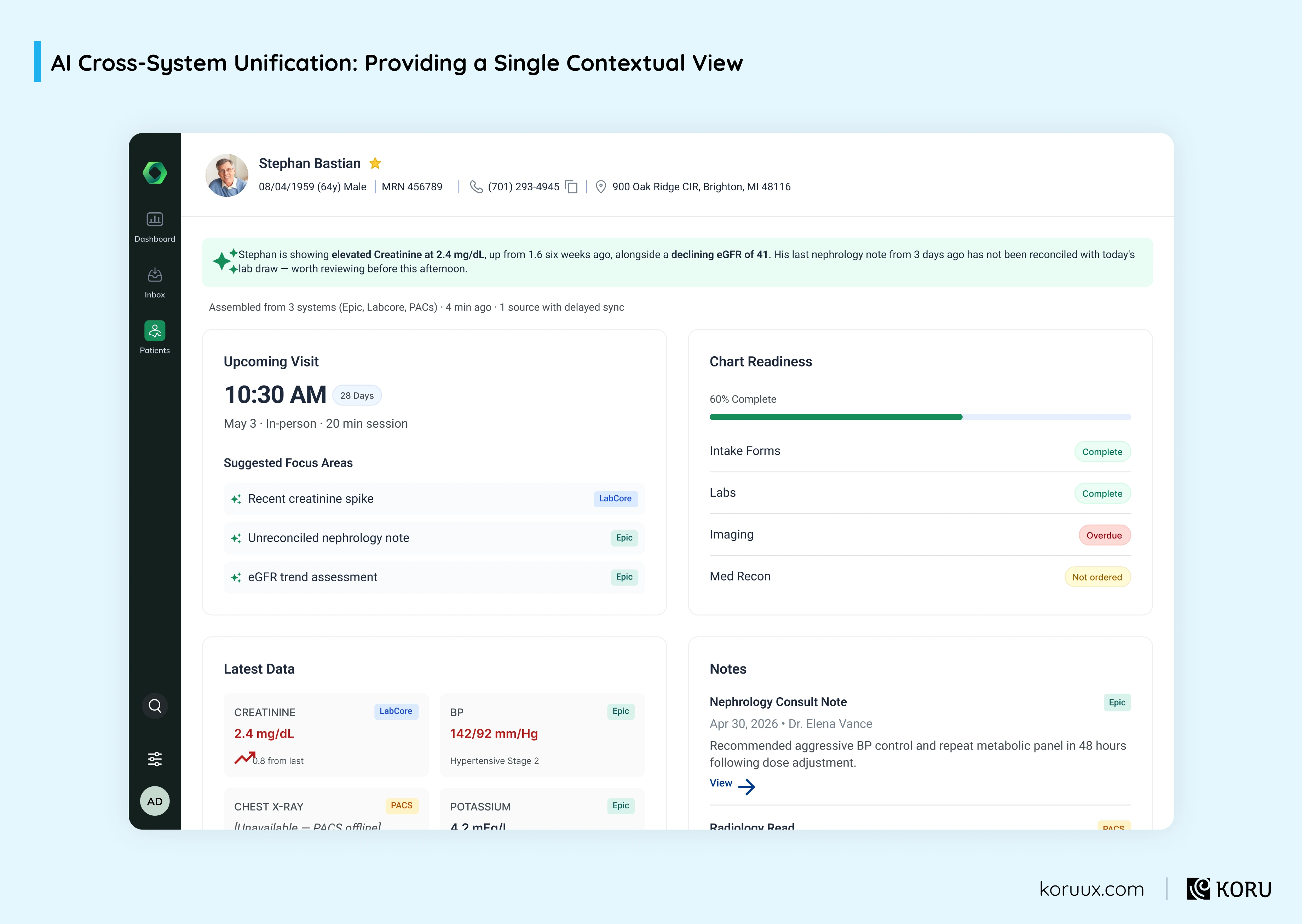
Your integrations and APIs connect systems on the back end. But users still jump between platforms to complete tasks.
In healthcare, assembling a clinical picture might mean pulling labs from one system, imaging from another and notes from a third. That’s multiple logins and context lost with every switch.
AI can pull relevant information from multiple systems into a single contextual view. But users need to know where each piece came from, how current it is and whether anything is missing. Get the attribution wrong and you’ve just created a different kind of trust problem.
Problem 6: Transfer of Expertise
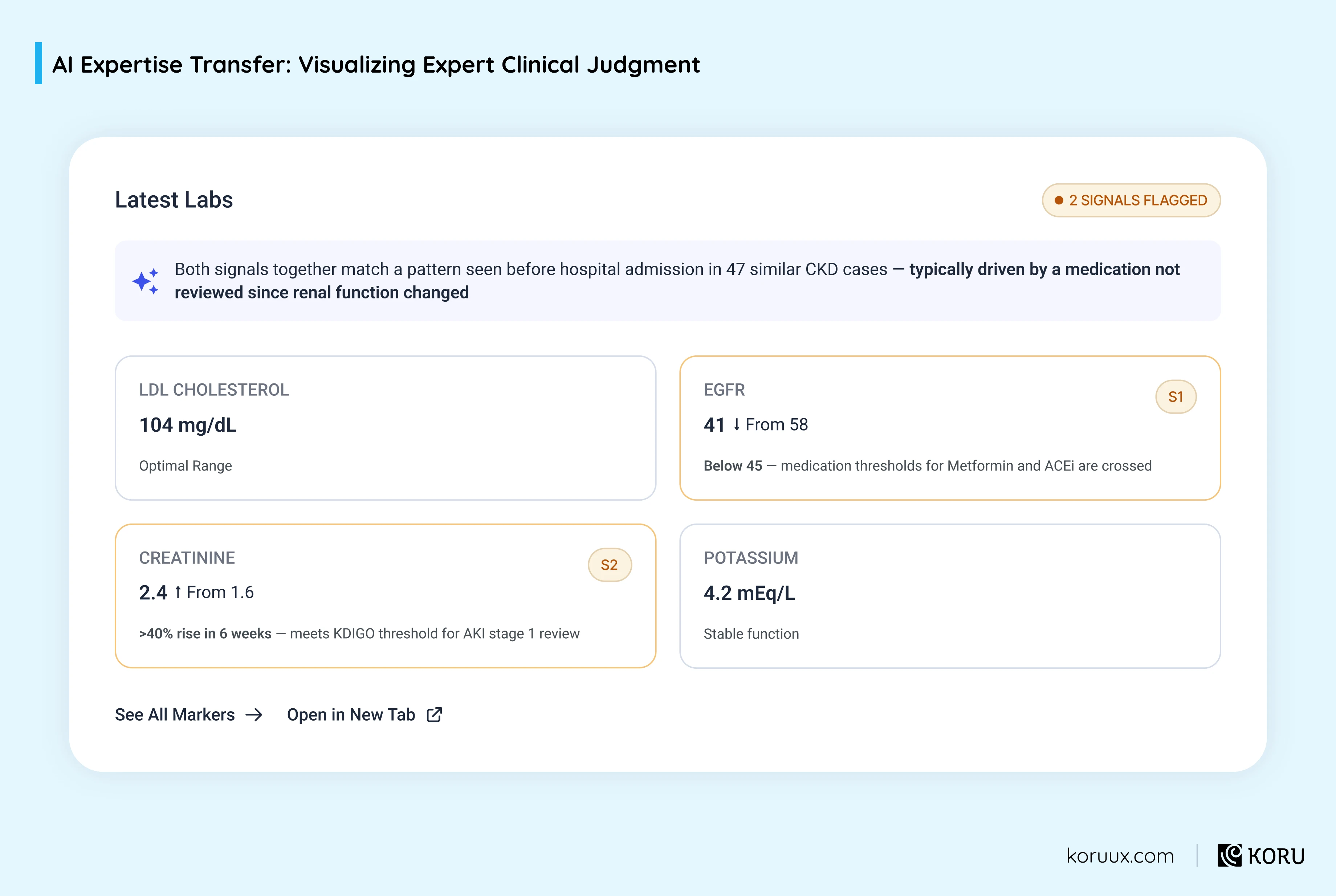
Your best users’ expertise stays locked in their heads. The pattern recognition, the workflow optimisations, the clinical judgment built over years. New team members take months to develop it, if they ever do.
AI can capture and distribute expert reasoning. Not by replacing clinical judgment, but by making it visible. “The AI flagged this because it matches a pattern associated with [condition]” is a teaching moment disguised as a clinical tool.
The trick is showing the reasoning without overwhelming the primary workflow.
The Thread Across All Six
AI can help, but only if the experience is designed so users understand what it’s doing, trust its output and can correct it when it’s wrong.
In the next chapter, we’ll look at the seven types of AI experiences and how to choose the right one for your product.
These six patterns form the foundation of every engagement, feeding into our Sense–Shape–Steer framework.
Download our freeSense-Shape-Steer FigJam workbook
Seven Types of AI Experiences (and How to Choose the Right One)
Once you've identified which problems AI can solve in your product, the question becomes how the AI should show up.
A copilot that helps clinicians make decisions is a fundamentally different design challenge from an agent that acts on their behalf. Choosing the wrong pattern is one of the fastest ways to burn trust with users.
1. AI Copilots
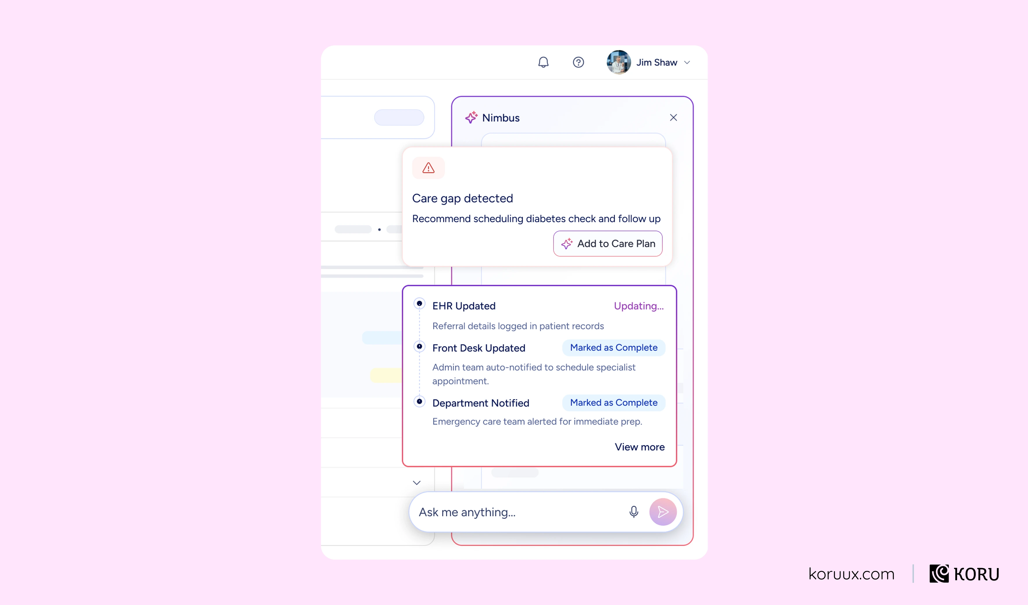
A copilot works alongside the user in real time, surfacing relevant information, options and recommendations while they work. It doesn’t take action on its own. It augments the user’s judgment.
In healthcare, copilots typically show up as clinical decision support tools that surface differential diagnoses, drug interactions or treatment options alongside the clinician’s existing workflow.

Best for: High-stakes decisions where the human needs to own the final call.

Wrong fit: Routine, repeatable tasks where users just confirm the AI’s recommendation every time. That’s an agent, not a copilot.
2. AI Agents
An agent takes action on the user’s behalf, either fully autonomously or with defined escalation points. Instead of helping the user complete a task, the user delegates the task to the agent entirely.
In healthcare, agents might handle multi-step administrative workflows like prior authorisation, appointment scheduling across systems, or triaging incoming referrals based on urgency and specialty.
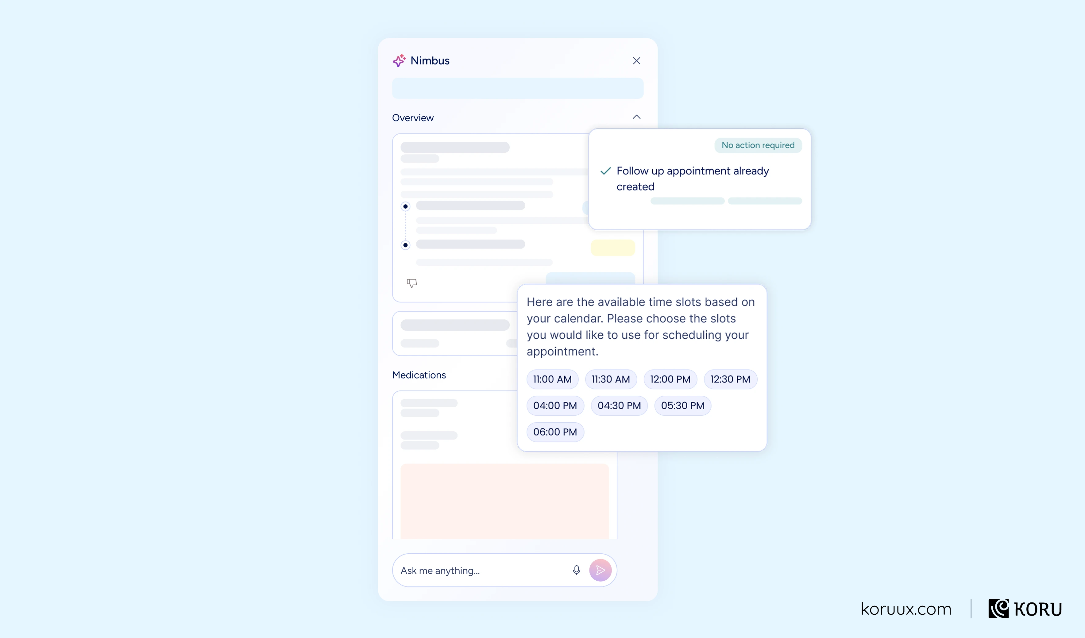
Best for: Multi-step workflows across systems where the steps are well-defined and individual actions are manageable or reversible.
Wrong fit: Anything where every action carries high clinical risk or where the user needs moment-to-moment control. If you can’t design a meaningful rollback, don’t use an agent.
3. AI Assistants and Chatbots
An assistant handles natural-language queries, either answering from a knowledge base or helping users navigate complex systems through conversation. The interaction is conversational rather than structured.
In healthcare, assistants show up as patient-facing symptom checkers, clinician knowledge base tools and internal support bots that help staff navigate policies and procedures.
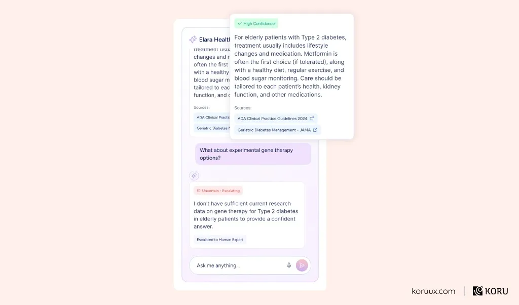
Best for: Varied, unpredictable questions where users need quick access to institutional knowledge.
Wrong fit: Information that’s structured and predictable enough to serve through a well-designed interface. A chatbot in front of a simple FAQ is adding friction, not removing it.
4. Ambient AI
Ambient AI works in the background, learning from behaviour and adapting the experience without requiring explicit input. The user may not even realise AI is involved.
In healthcare, ambient AI shows up as adaptive dashboard layouts, smart defaults that adjust to a clinician’s workflow patterns, and context-aware notification settings that learn which alerts a user actually acts on.
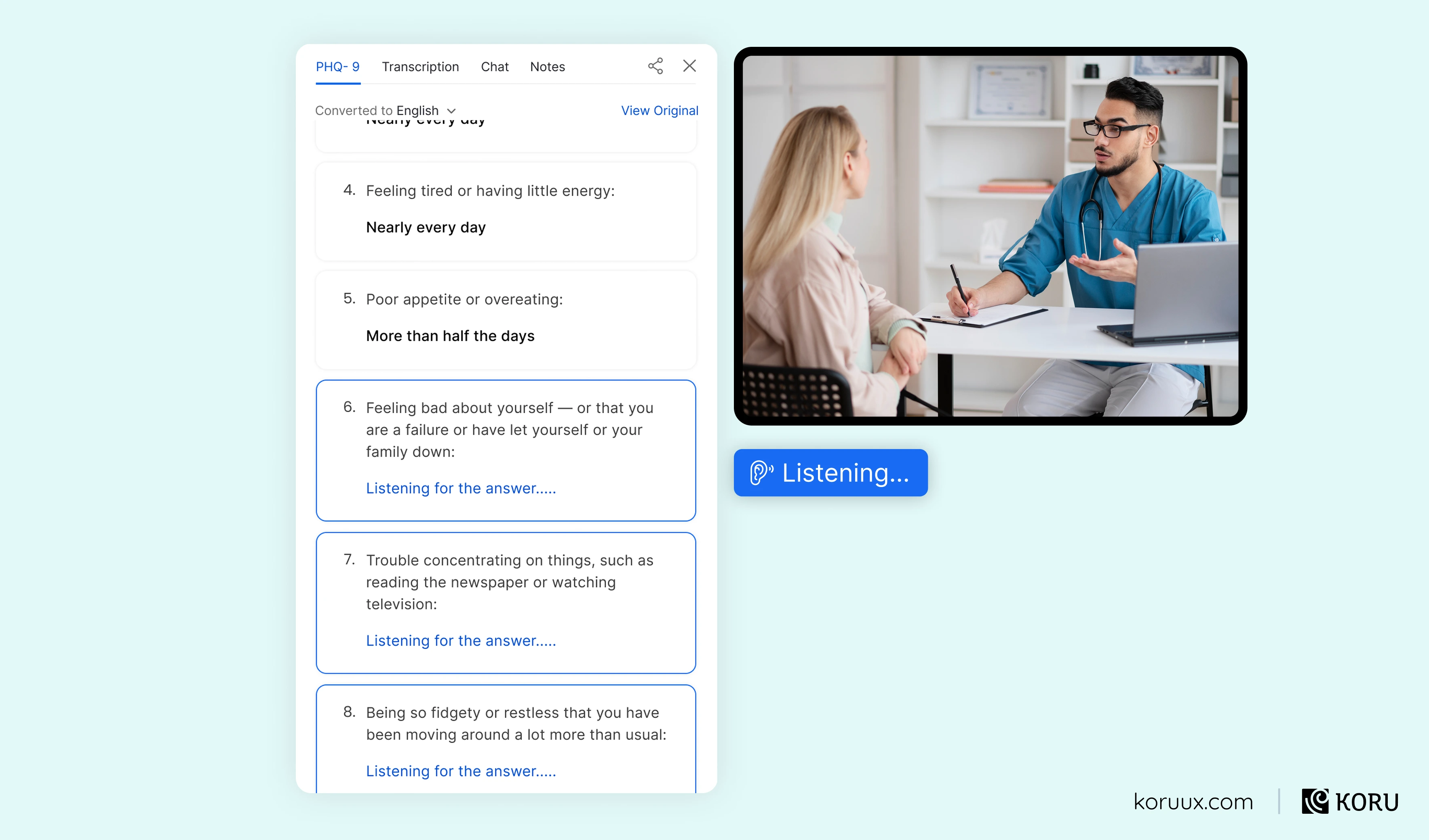
Best for: Personalisation where the signals are reliable and the consequences of getting it wrong are low.
Wrong fit: Anything high-stakes. You don’t want ambient AI silently adjusting medication alert thresholds. You also need to be careful about the line between helpful and invasive, especially in healthcare.
5. Predictive and Proactive AI
Predictive AI analyses historical and real-time data to flag risks before they materialise. It doesn’t wait for the user to ask a question. It surfaces information the user doesn’t yet know they need.
In healthcare, the most common examples are sepsis early warning systems, readmission risk scores and deterioration alerts.
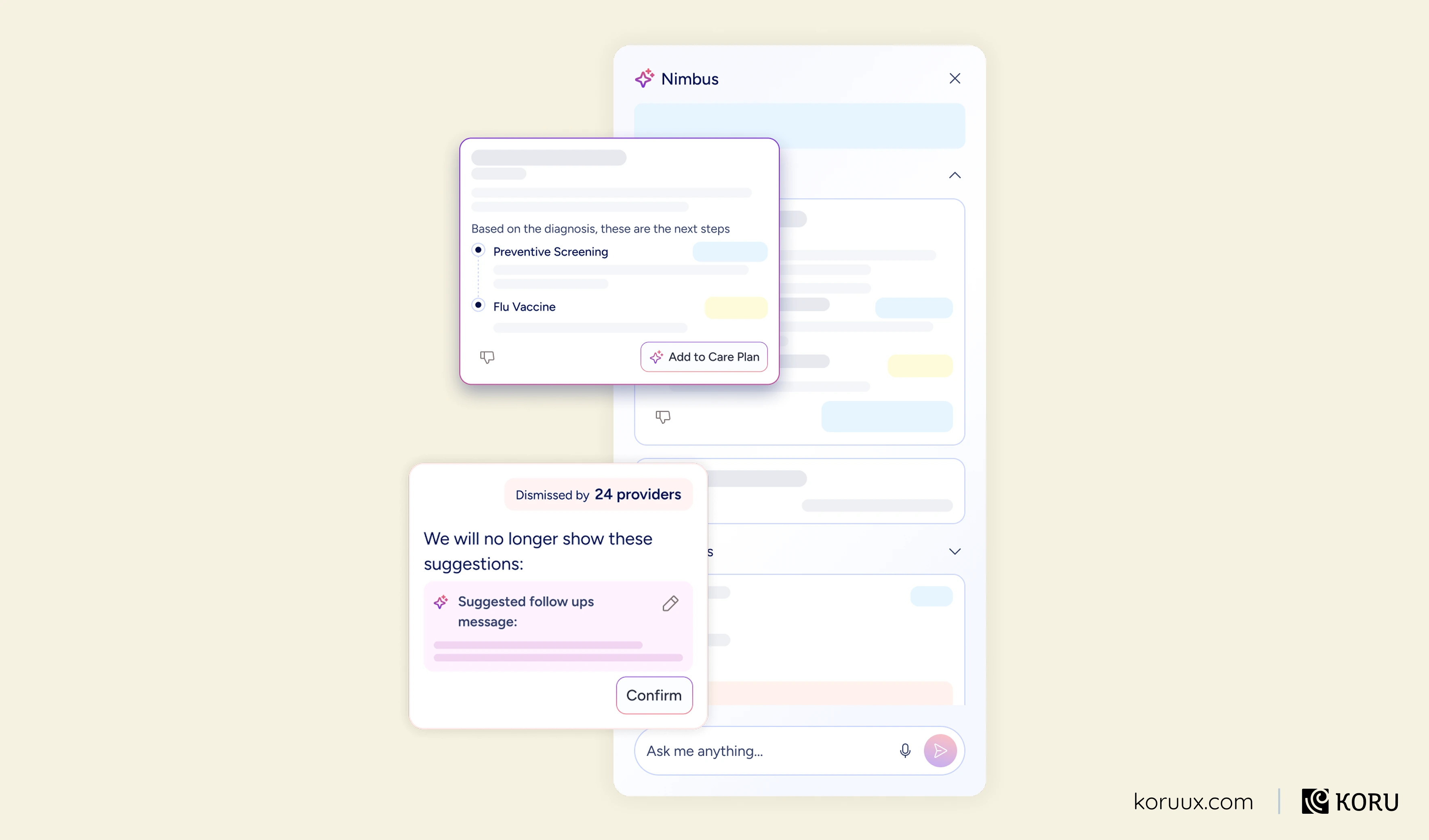
Best for: Situations where early intervention meaningfully changes outcomes and the prediction is reliable enough to act on.
Wrong fit: When false positive rates are high and the cost of alert fatigue outweighs the benefit of early detection. This is one of the most common failure modes in healthcare AI.
6. Generative AI
Generative AI produces new content rather than retrieving or analysing existing information. The output is original: drafted text, suggested responses, synthesised summaries.
In healthcare, generative AI is used for clinical note drafting, patient communication templates, discharge summary generation and educational content creation.
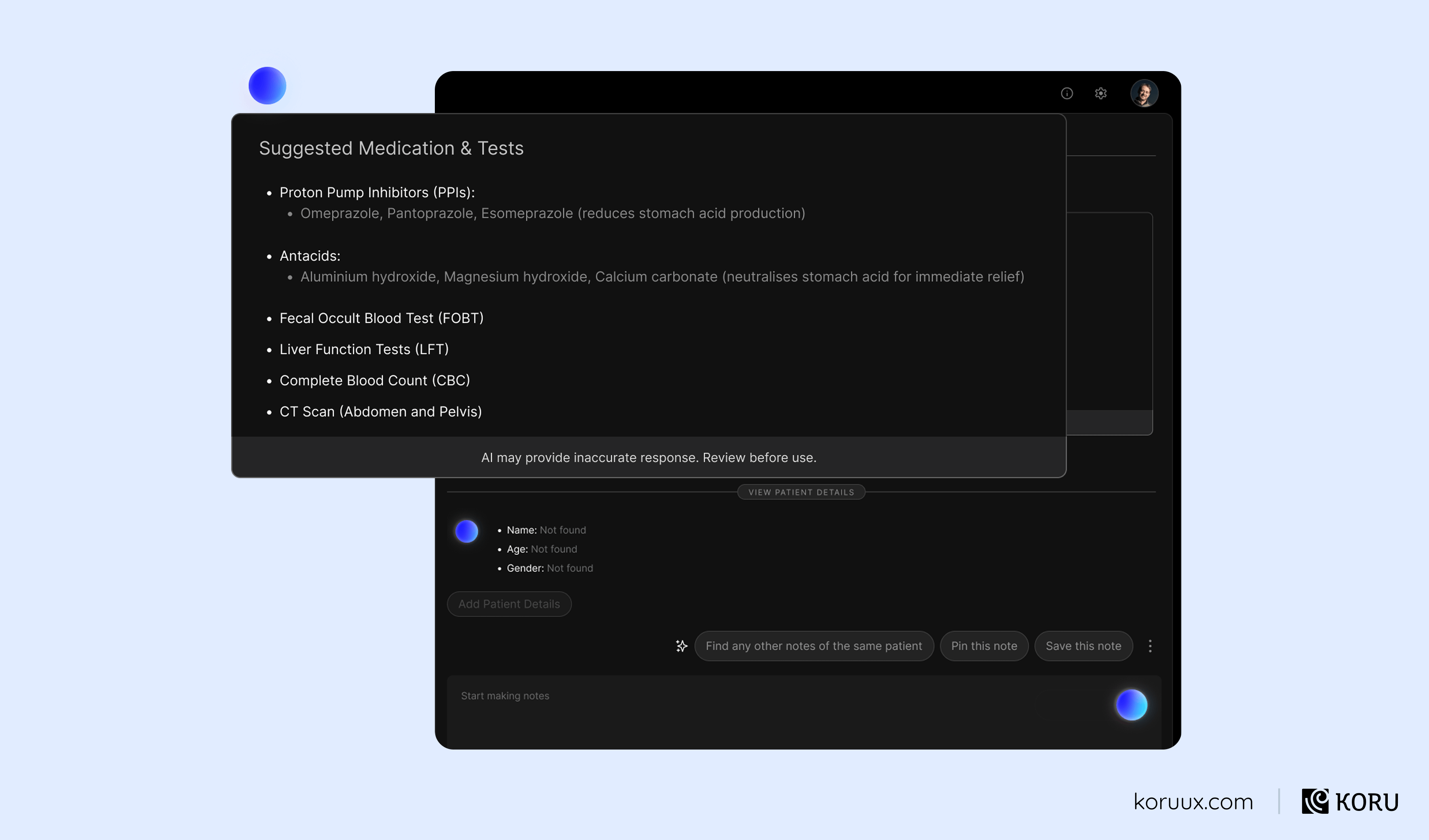
Best for: Repetitive content tasks where the output will be reviewed by a human before use.
Wrong fit: Any content that goes directly to patients or into clinical records without human review, or where accuracy requirements exceed what current models can reliably deliver.
7. Decision Support Systems
A decision support system presents structured information around a specific decision point. It highlights relevant factors, surfaces trade-offs and may recommend an option, but the interface is organised around the decision itself rather than around a conversation or a workflow.
In healthcare, decision support shows up as treatment option comparisons, risk-benefit analysis tools and diagnostic differential displays.
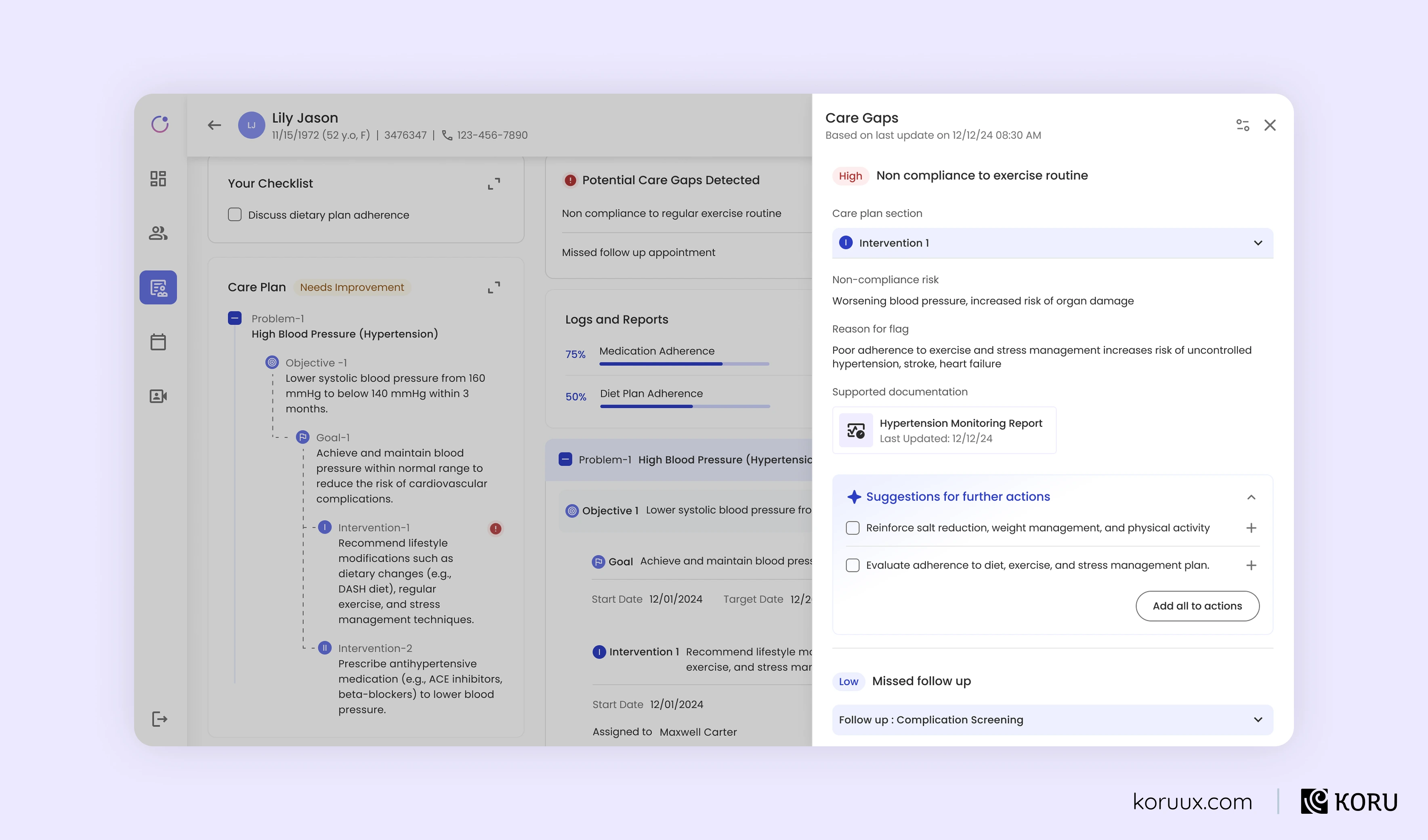
Best for: Complex decisions involving multiple data sources where professional accountability means the human must own the final call.
Wrong fit: Simple decisions that can be automated (use an agent) or situations where the user needs interactive back-and-forth exploration (use a copilot).
How to Choose the Right Pattern
These seven types aren’t mutually exclusive. Many healthcare products use several in combination. But choosing the wrong primary pattern can undermine trust quickly.
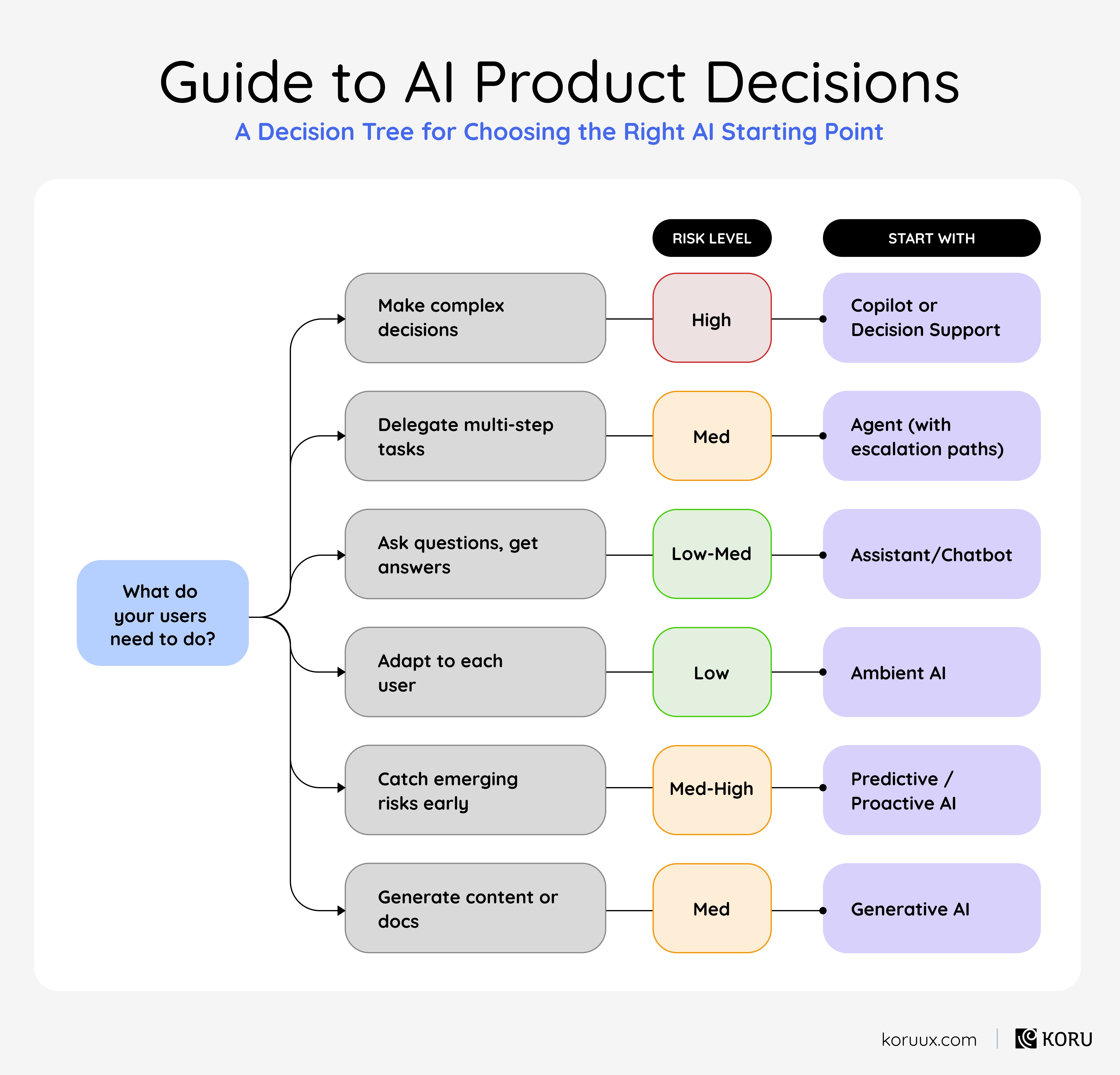
Check-out the AI Interaction Pattern Selector for a more in-depth guidance.
In the next chapter, we’ll get visual. Real examples of AI UX that builds trust alongside examples that erode it, pattern by pattern.
What Good AI UX Looks Like (and What Bad AI UX Looks Like)
Each example shows a common AI interaction done badly and done well, drawn from our 14 AI patterns for UI design. That guide goes deep on implementation. This chapter shows you what the quality gap looks like.
Pattern 1: Refine Output
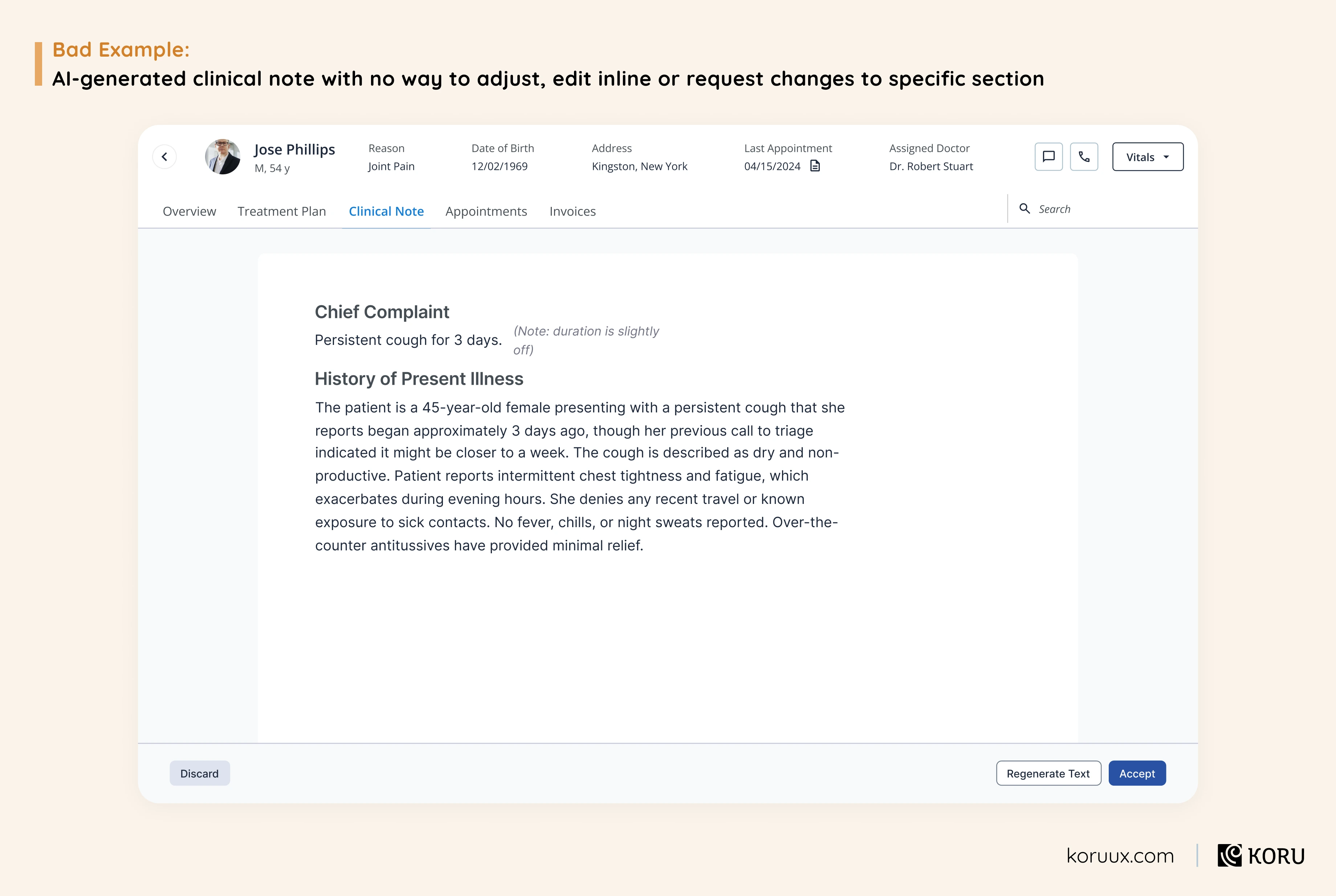
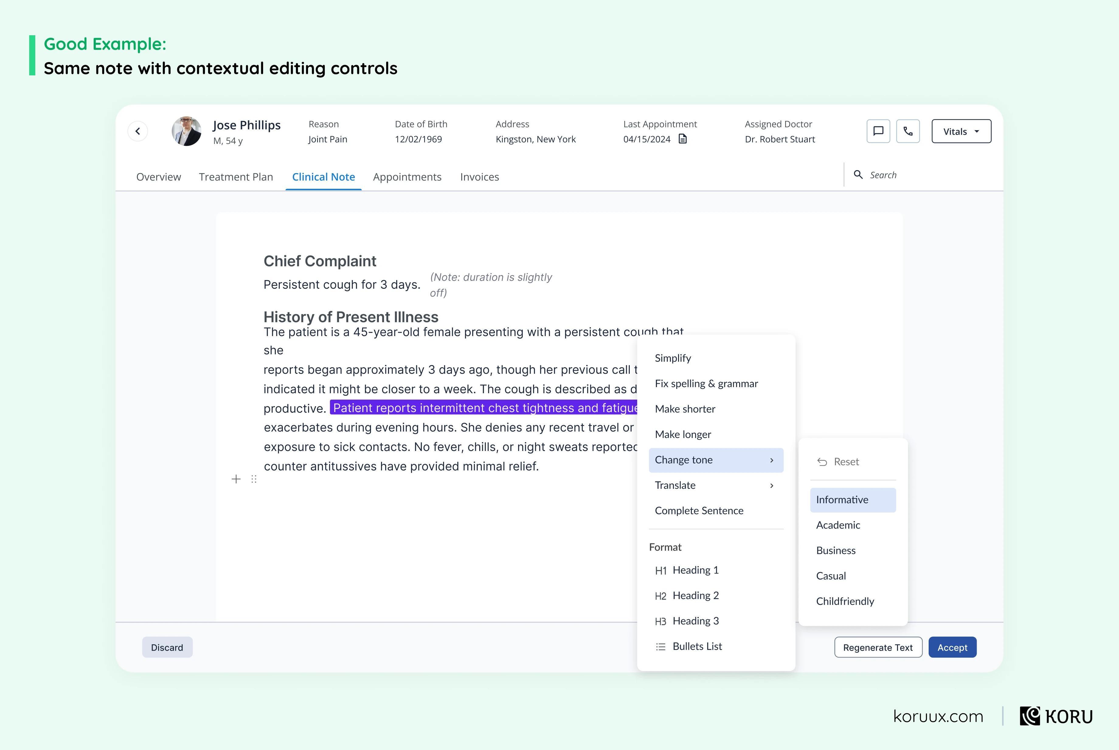
The lesson: If users can’t shape AI output to fit their needs, they’ll either accept something inaccurate or do the work manually. Either way, you’ve built an AI feature that adds a step instead of removing one.
Pattern 2: Human Verified vs AI-Generated
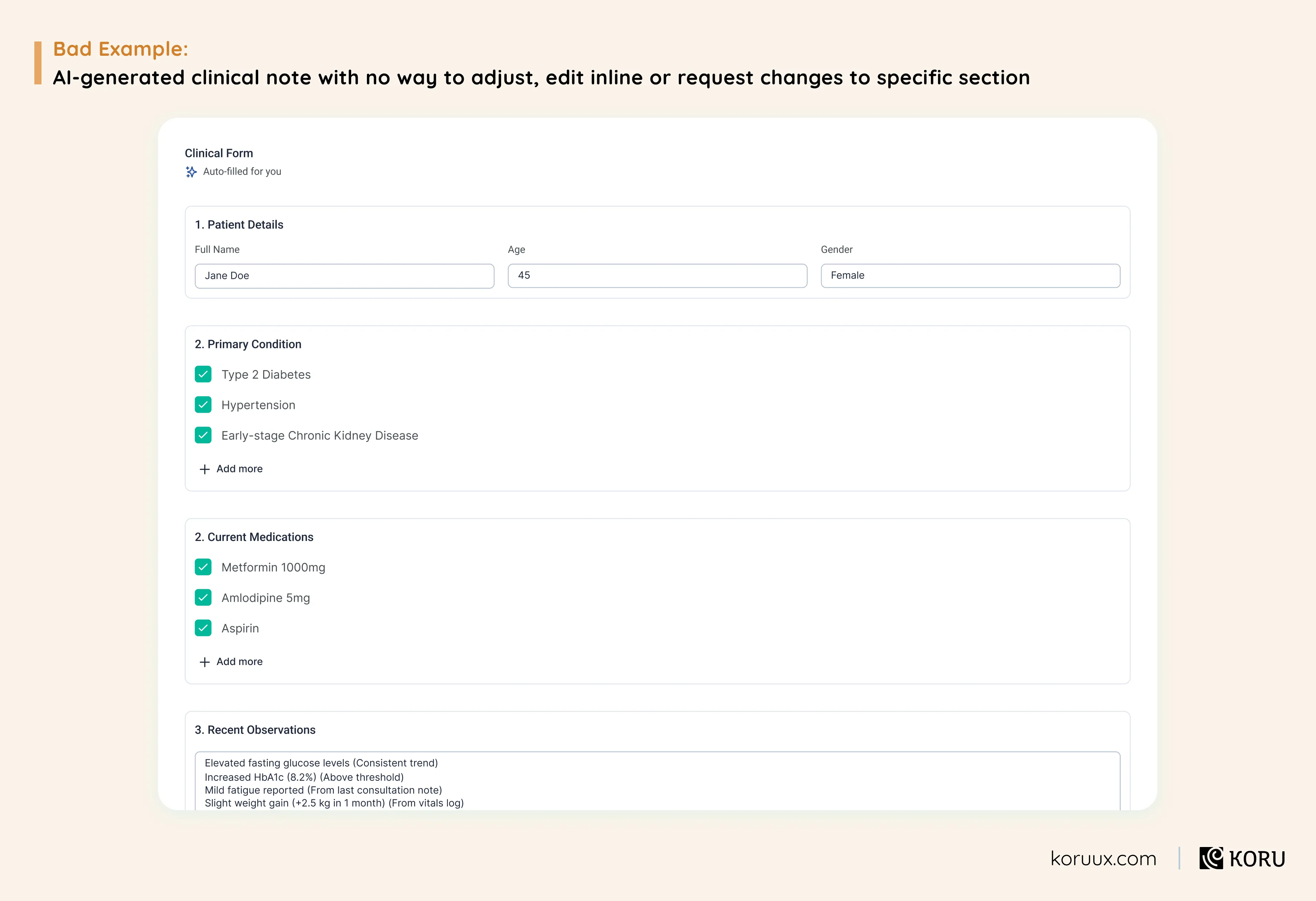
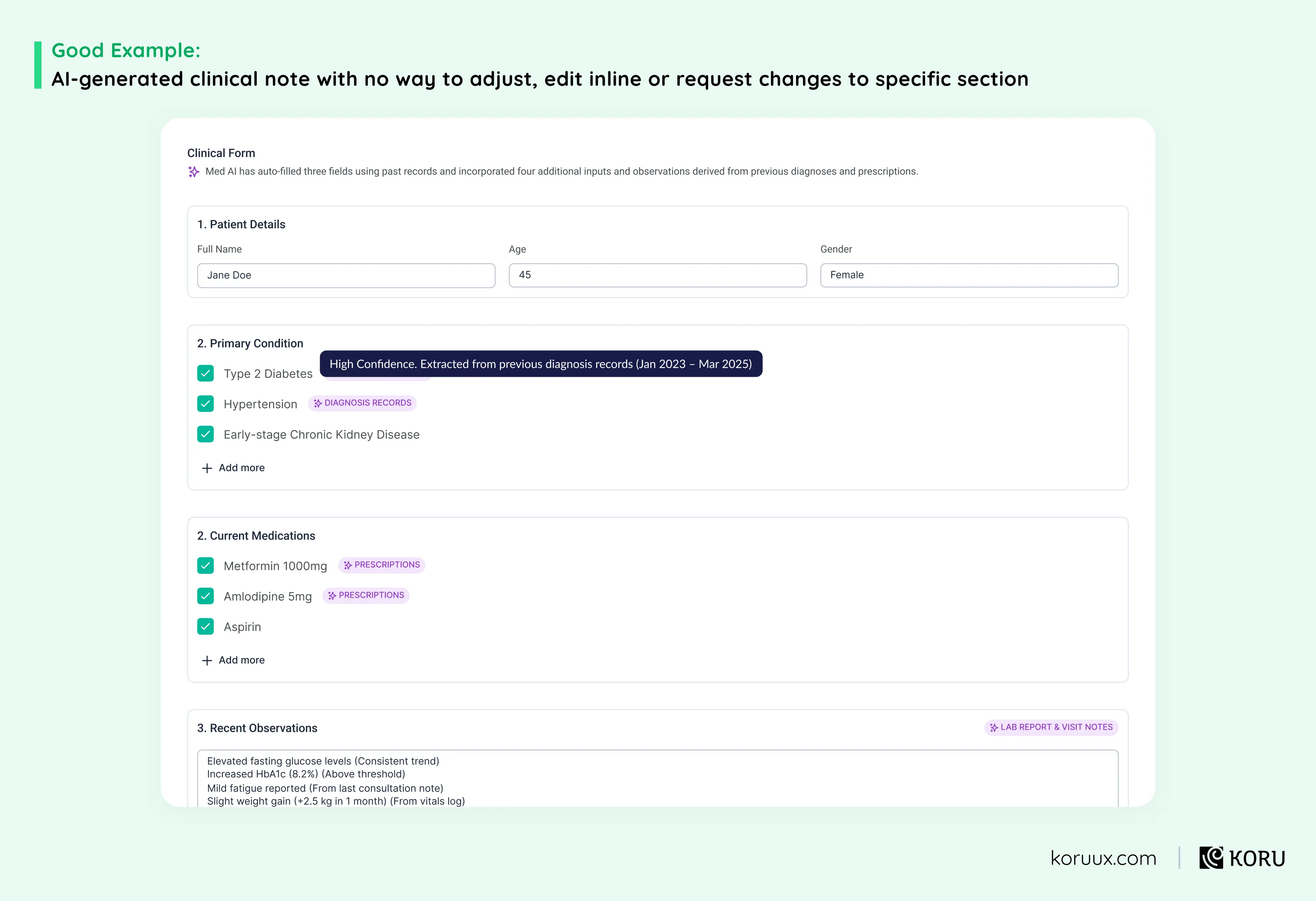
The lesson: When users can’t tell what came from the AI and what came from verified data, they lose confidence in all of it. You end up with clinicians manually re-checking every field, which wipes out the time savings you built the feature to deliver.
Pattern 3: Scoping
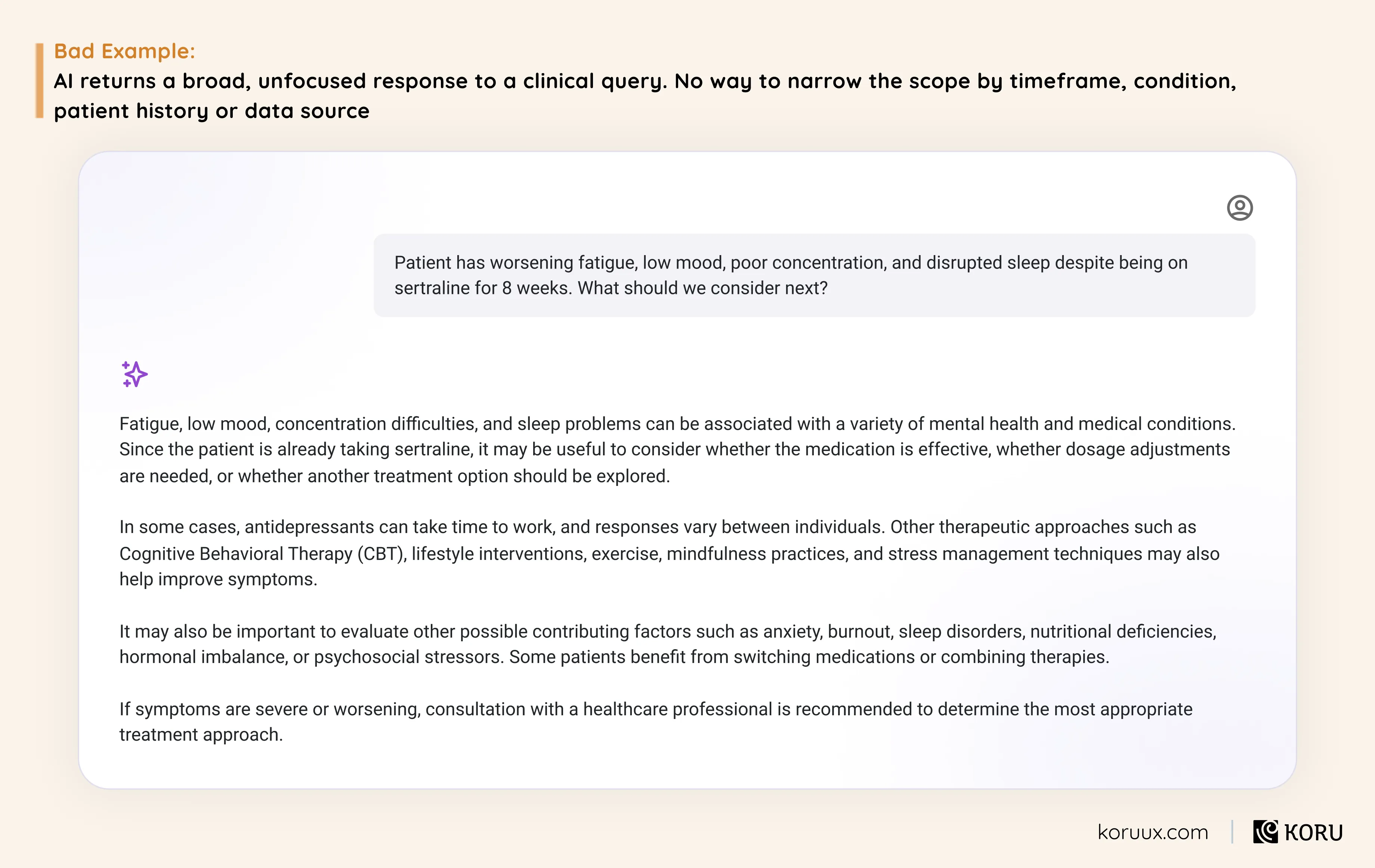
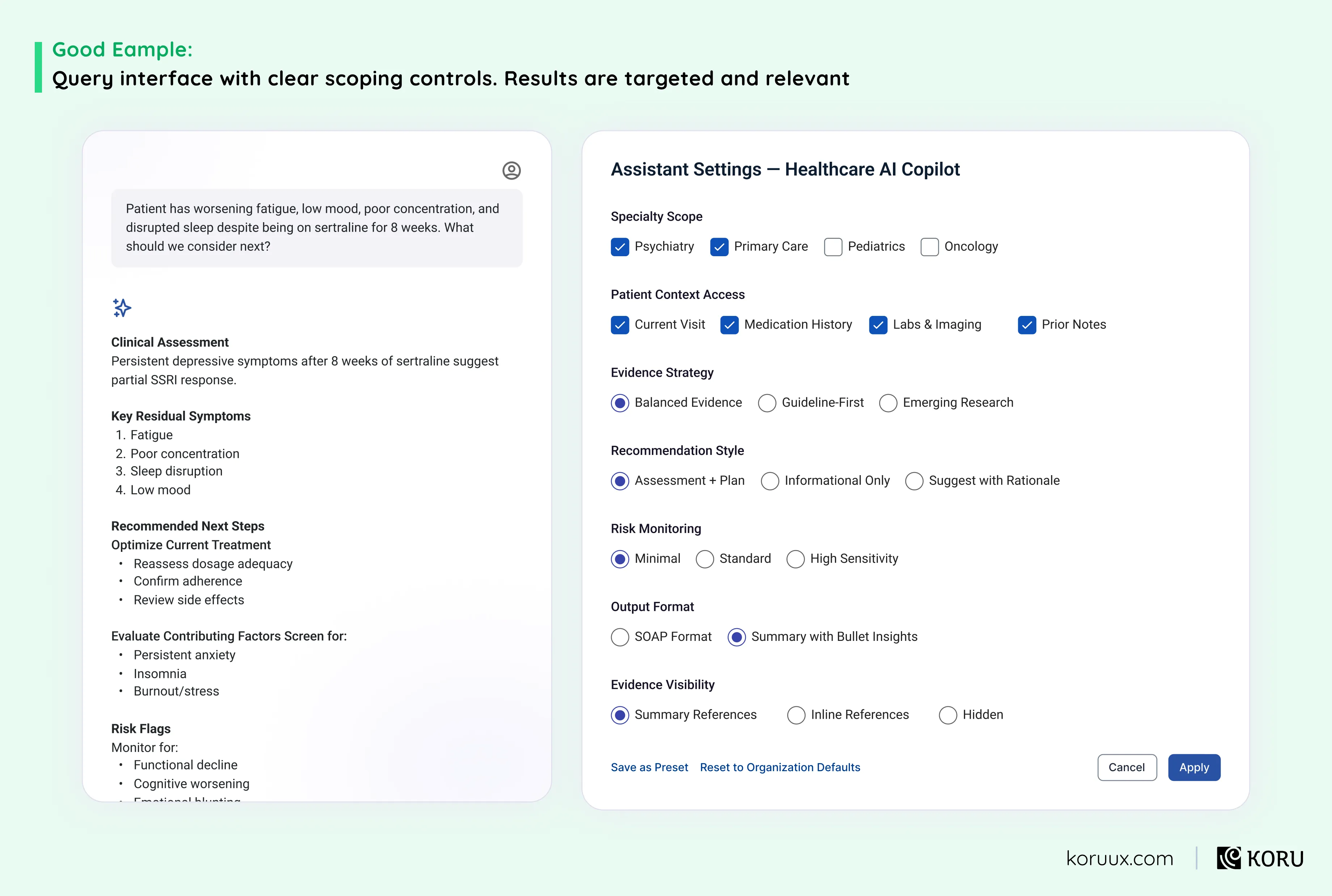
The lesson: An AI that returns everything when the user needed something specific doesn’t feel powerful. It feels like a search engine from 2005. If clinicians have to sift through irrelevant results to find what they need, they’ll go back to asking a colleague instead.
Pattern 4: Prompt Presets & Templates
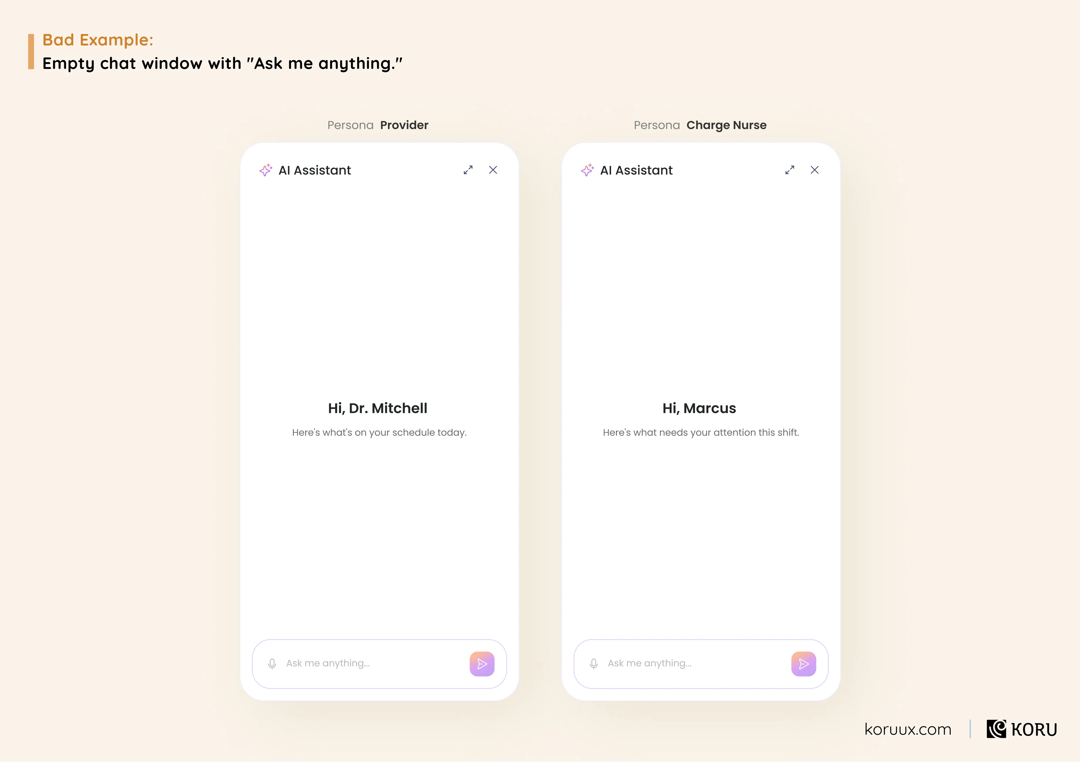
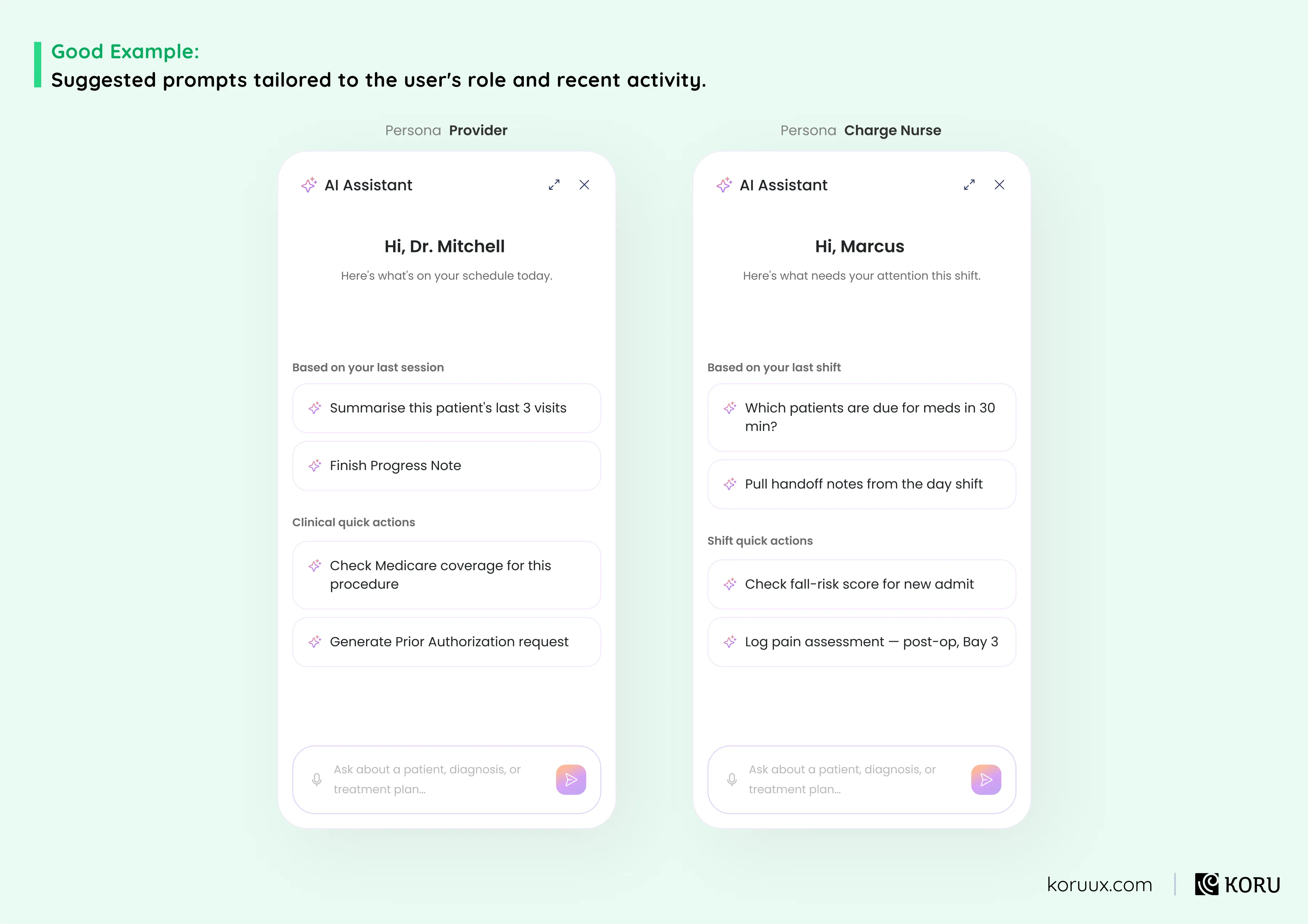
The lesson: An open prompt with no guidance doesn’t feel like freedom. It feels like a blank exam paper. Users who don’t know what the AI can do won’t experiment to find out. They’ll close the window and your activation numbers will reflect it.
Pattern 5: Style Lenses or Temperature Knobs
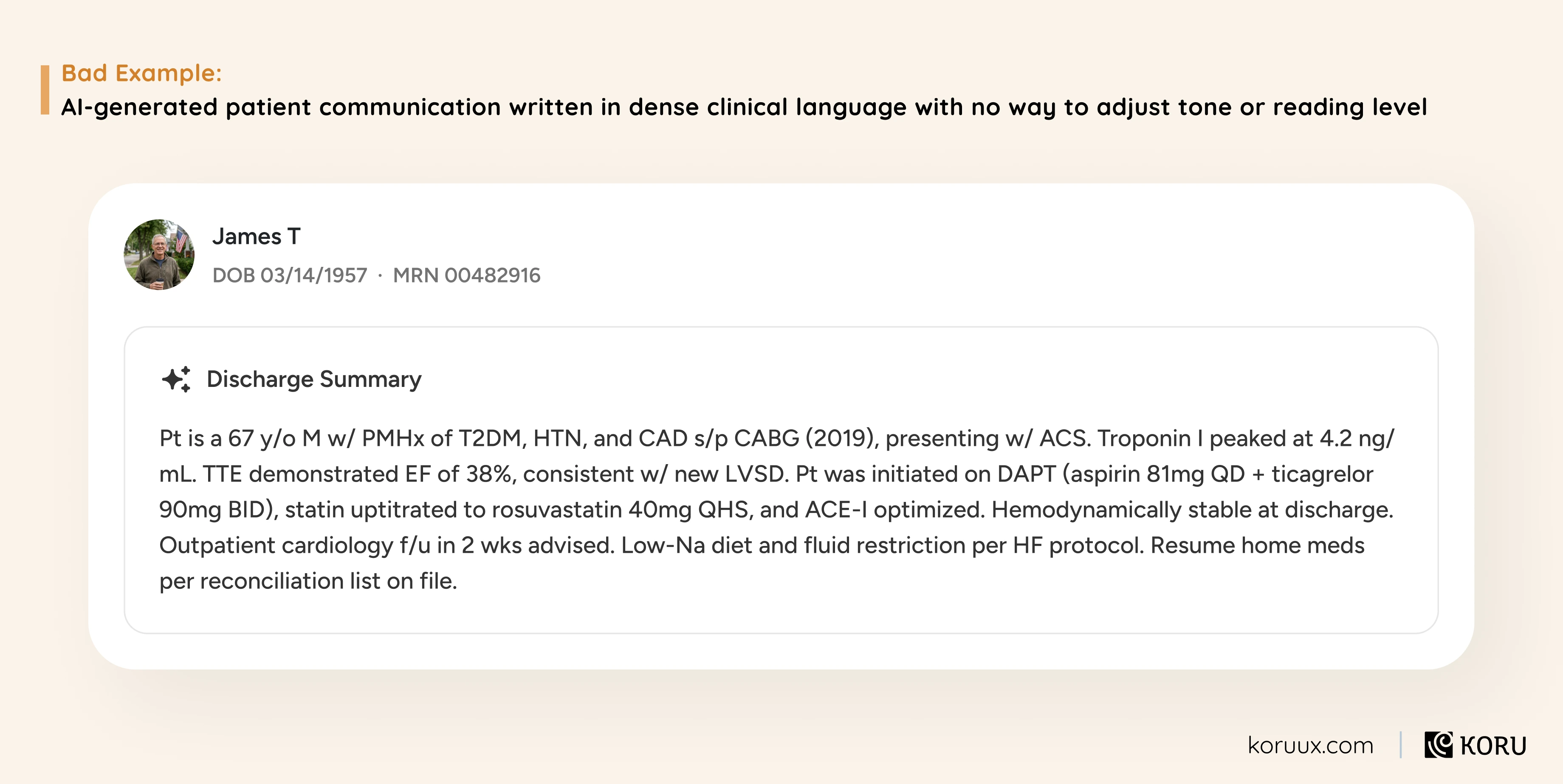
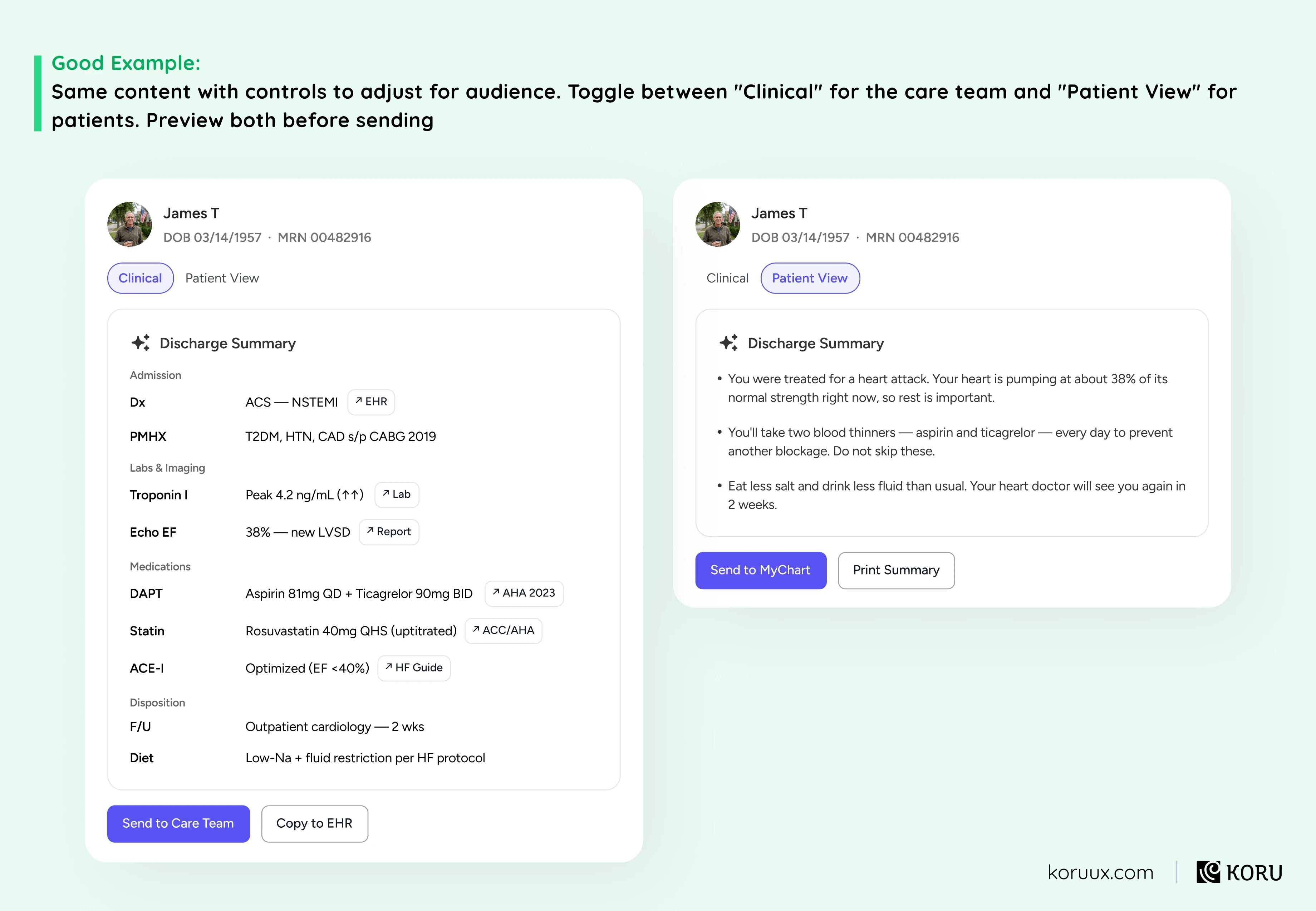
The lesson: A discharge summary written for a physician and a patient education leaflet need completely different language, even when they contain the same information. If your AI can’t adapt its output to different audiences, you’re forcing users to rewrite it themselves.
Pattern 6: AI Daemons
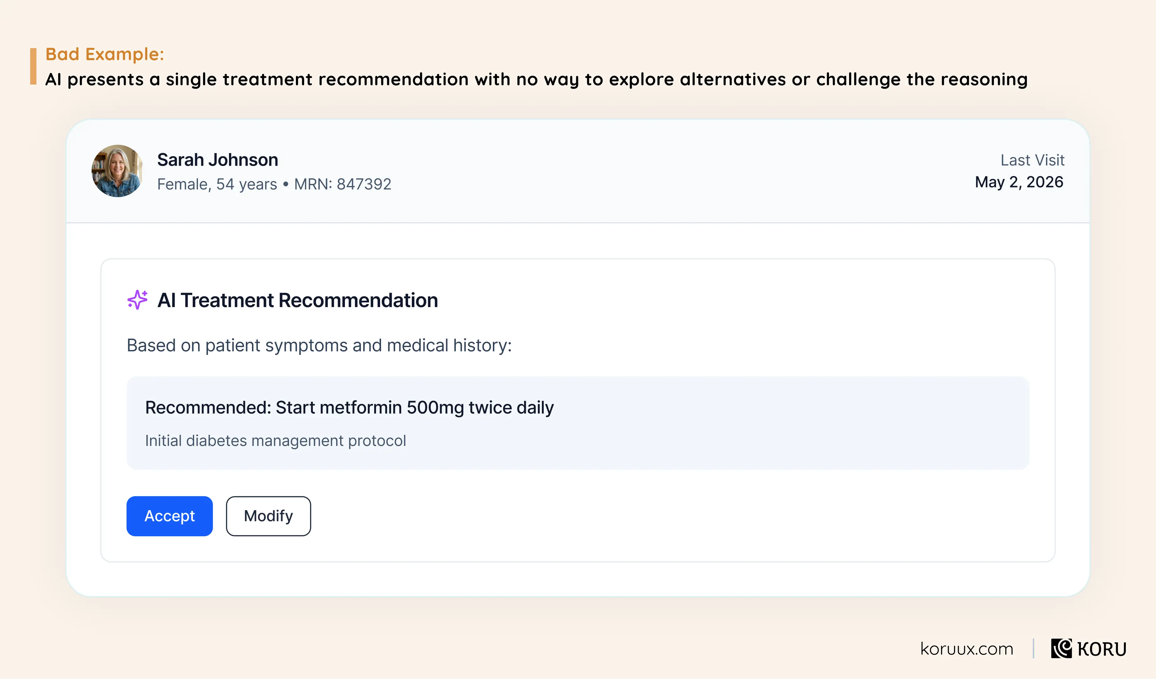
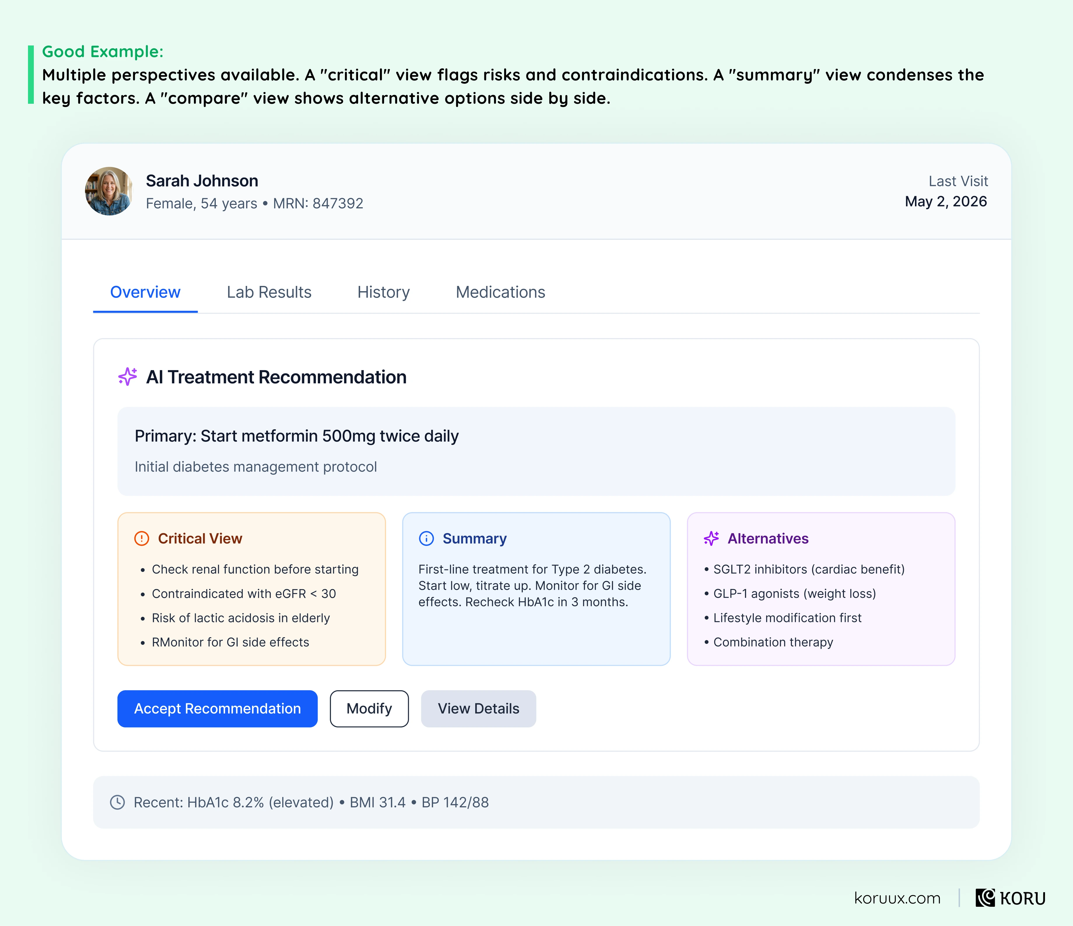
The lesson: Clinical decision-making is rarely about finding the one right answer. It’s about weighing options. An AI that presents a single recommendation without offering alternative perspectives doesn’t match how clinicians actually think, so they won’t trust it to help them think.
Pattern 7: Branching
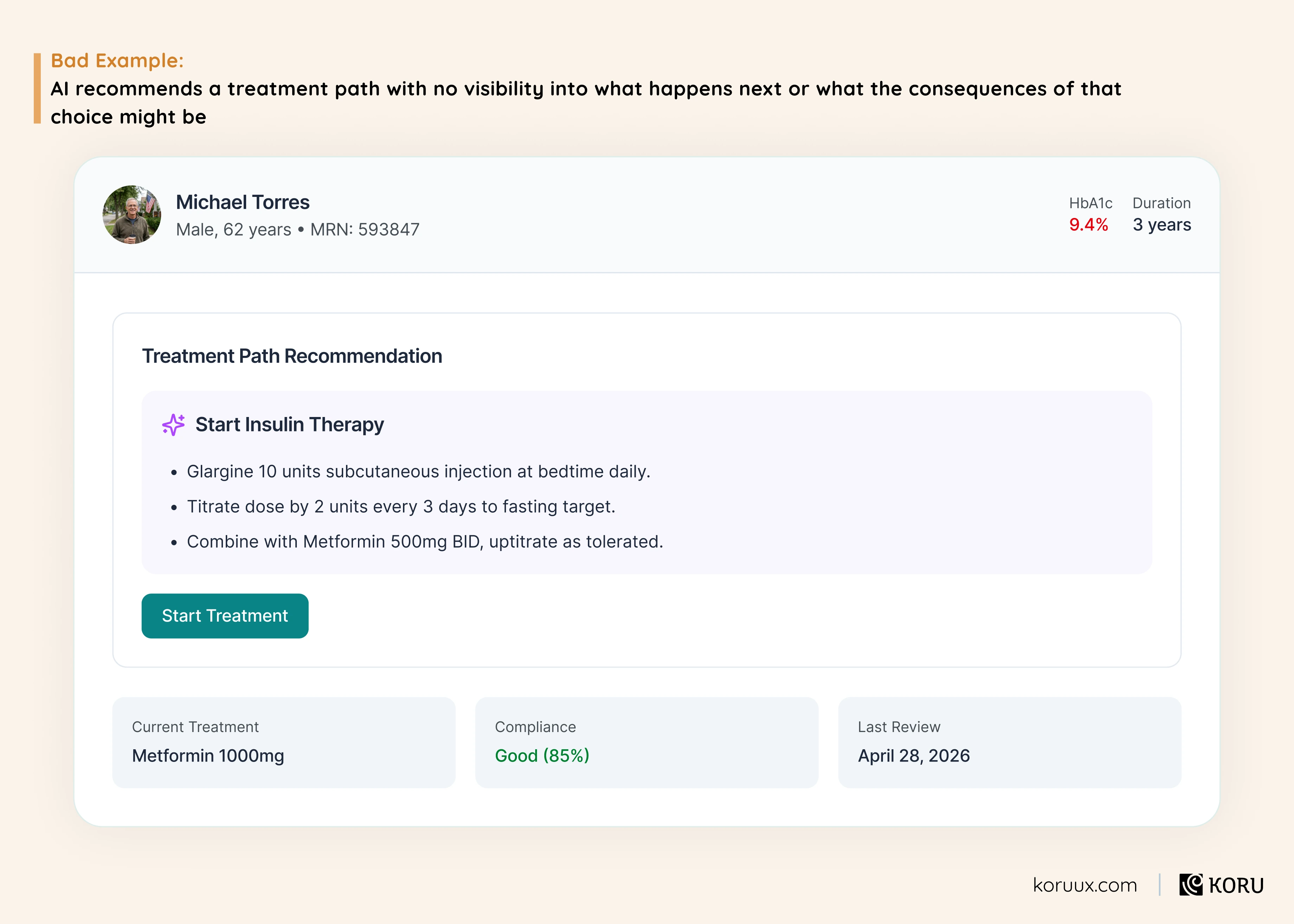
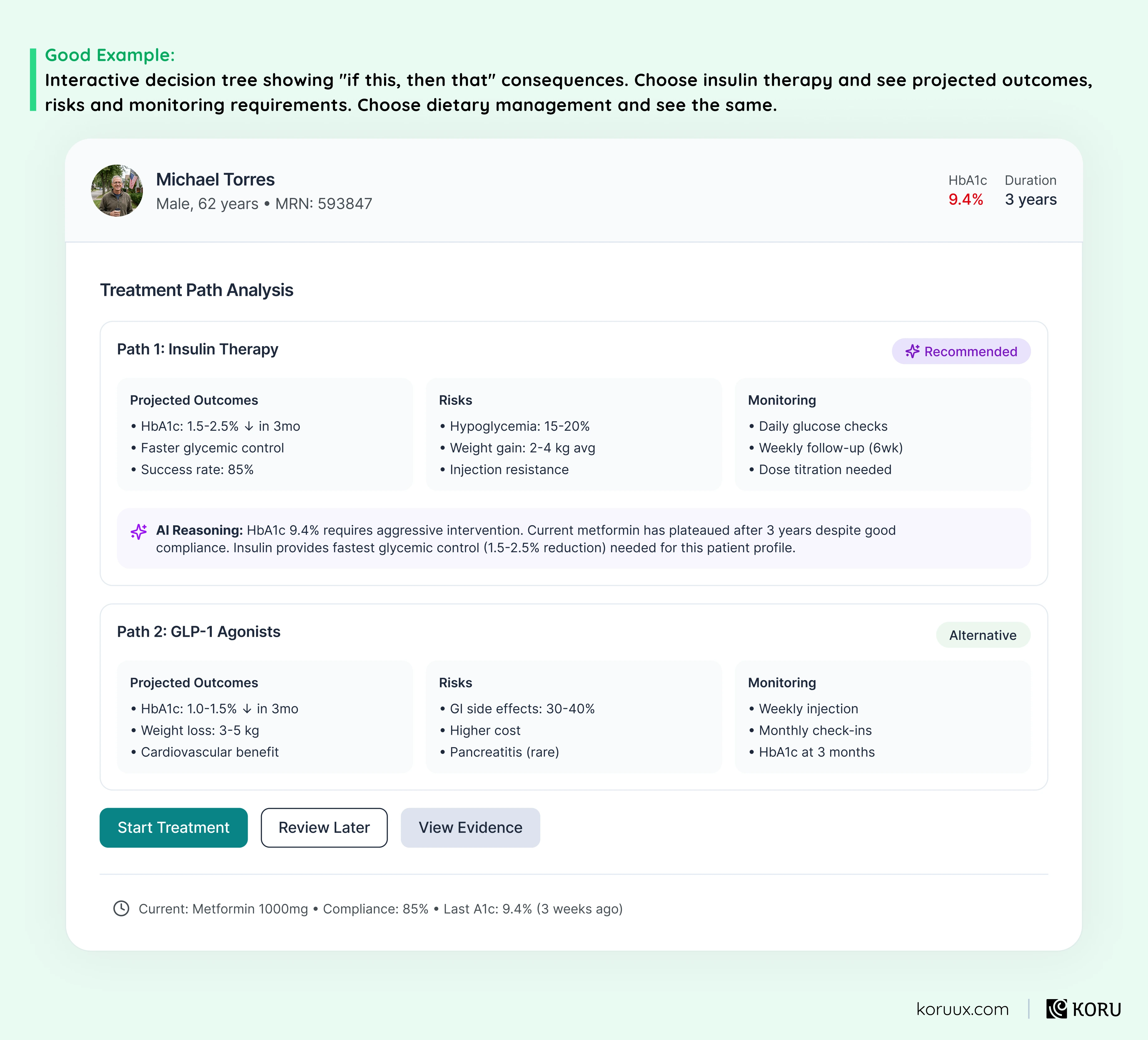
The lesson: Healthcare decisions have downstream consequences that compound over time. An AI that recommends action A without showing how it connects to outcomes B, C and D is asking clinicians to make high-stakes choices without the full picture.
Pattern 8: Explainability Layers
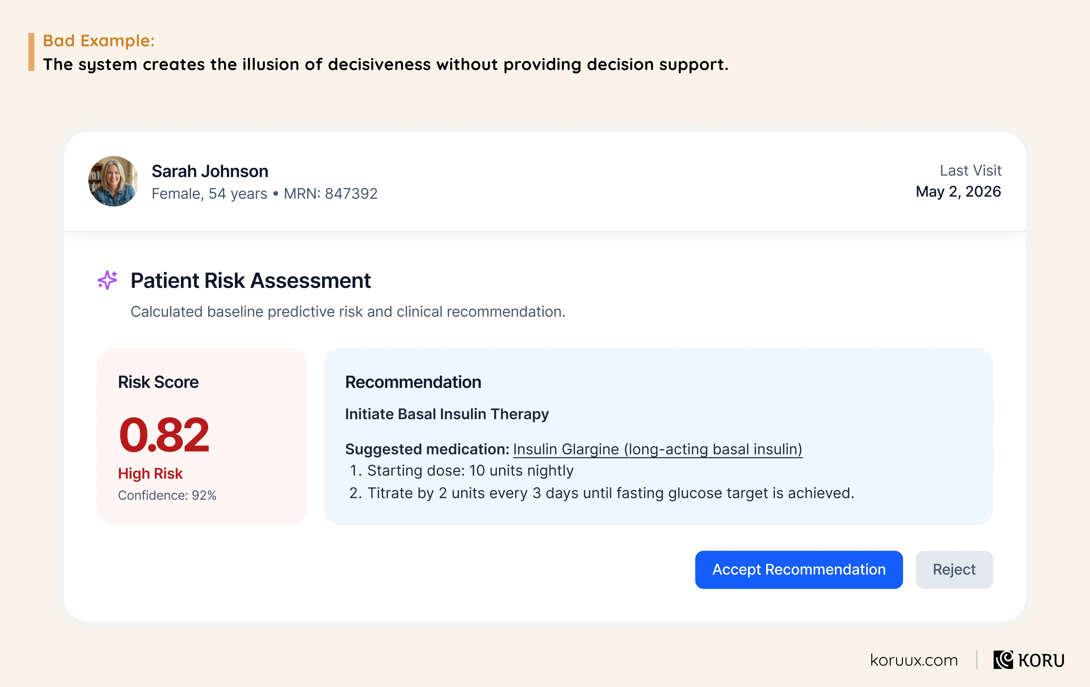
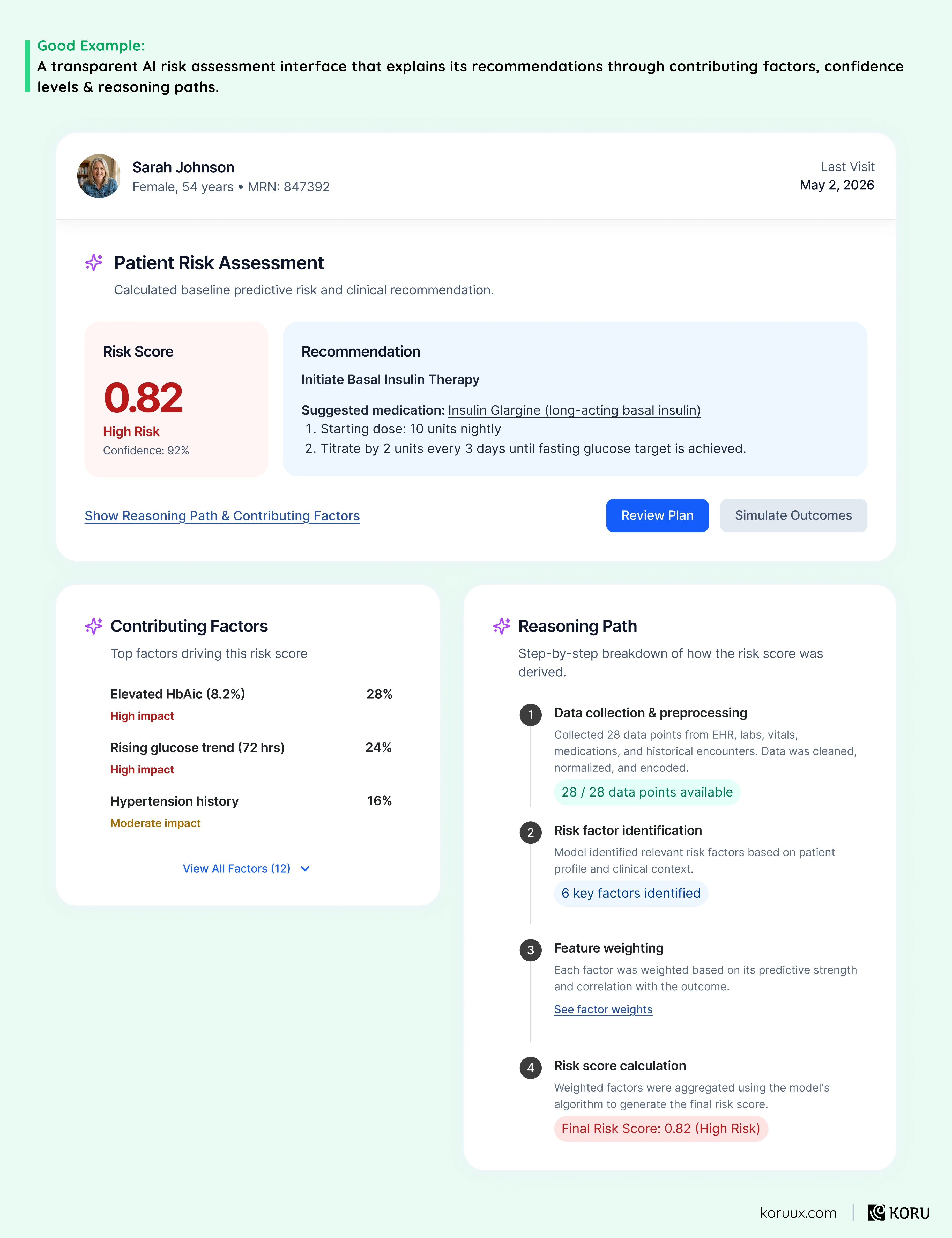
The lesson: A score without reasoning is a score nobody acts on. Clinicians won’t change their clinical plan based on a number they can’t interrogate. If your AI can’t show its working, the insight it produces has zero clinical value.
Pattern 9: User-Driven Training
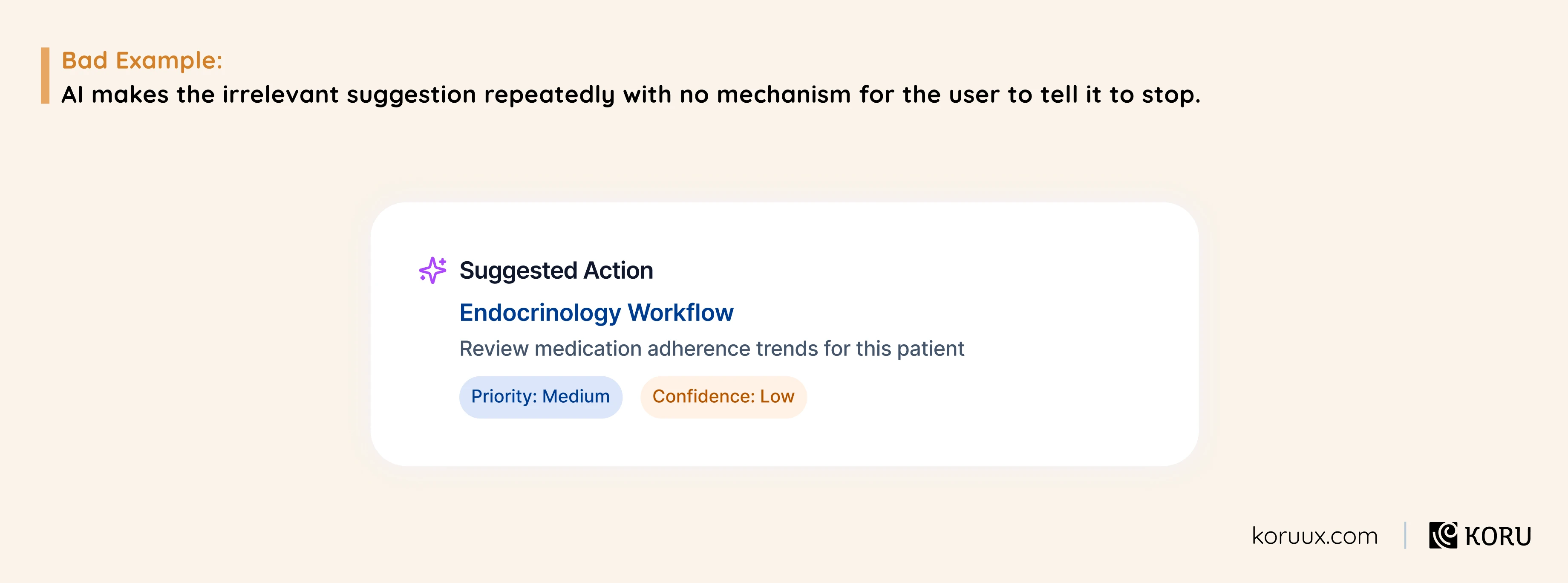
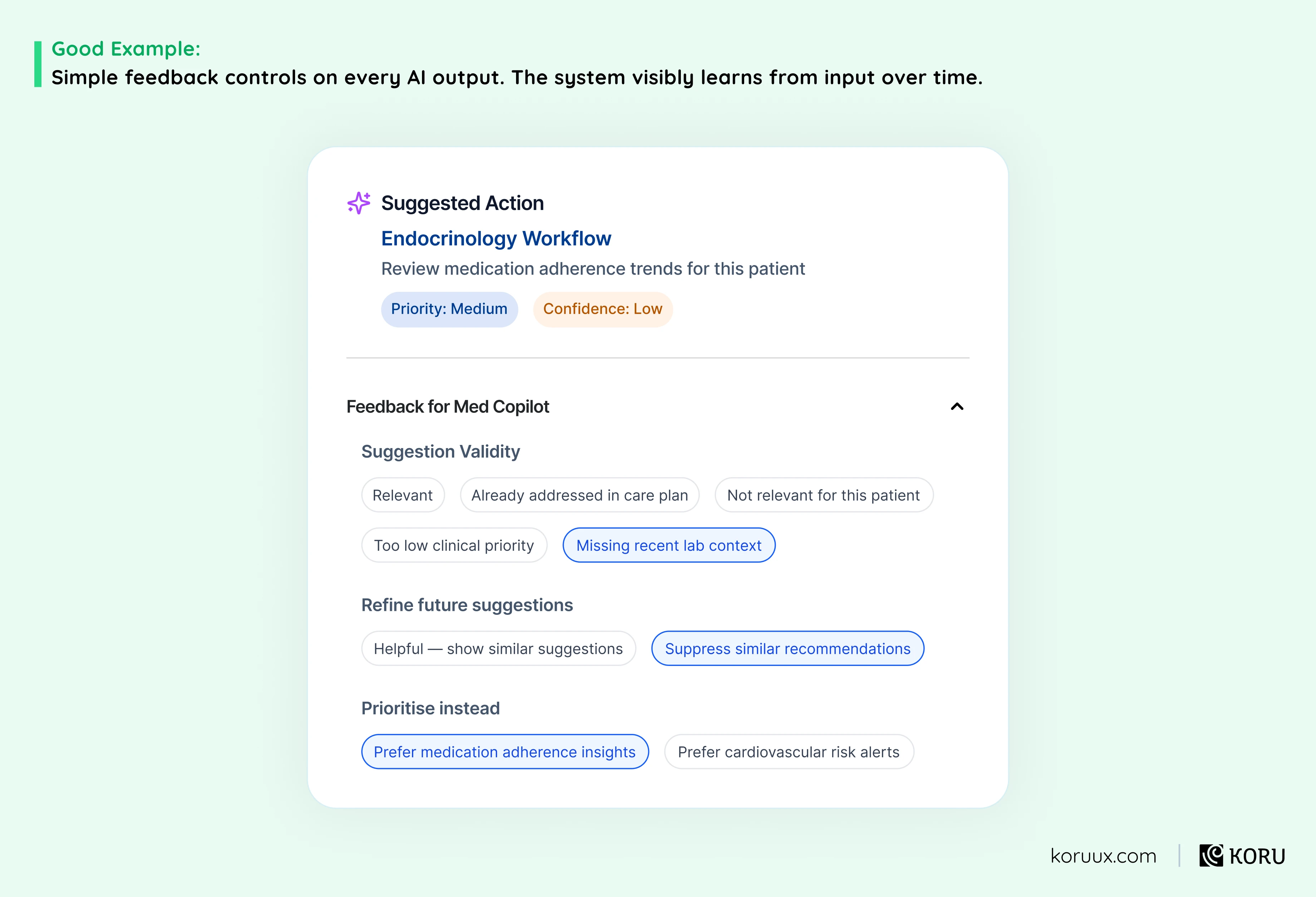
The lesson: An AI that can’t learn from its users will keep making the same mistakes. And users who feel like their feedback goes nowhere will stop giving it. You need a visible feedback loop, not just a data pipeline.
Pattern 10: Predictive Assistance
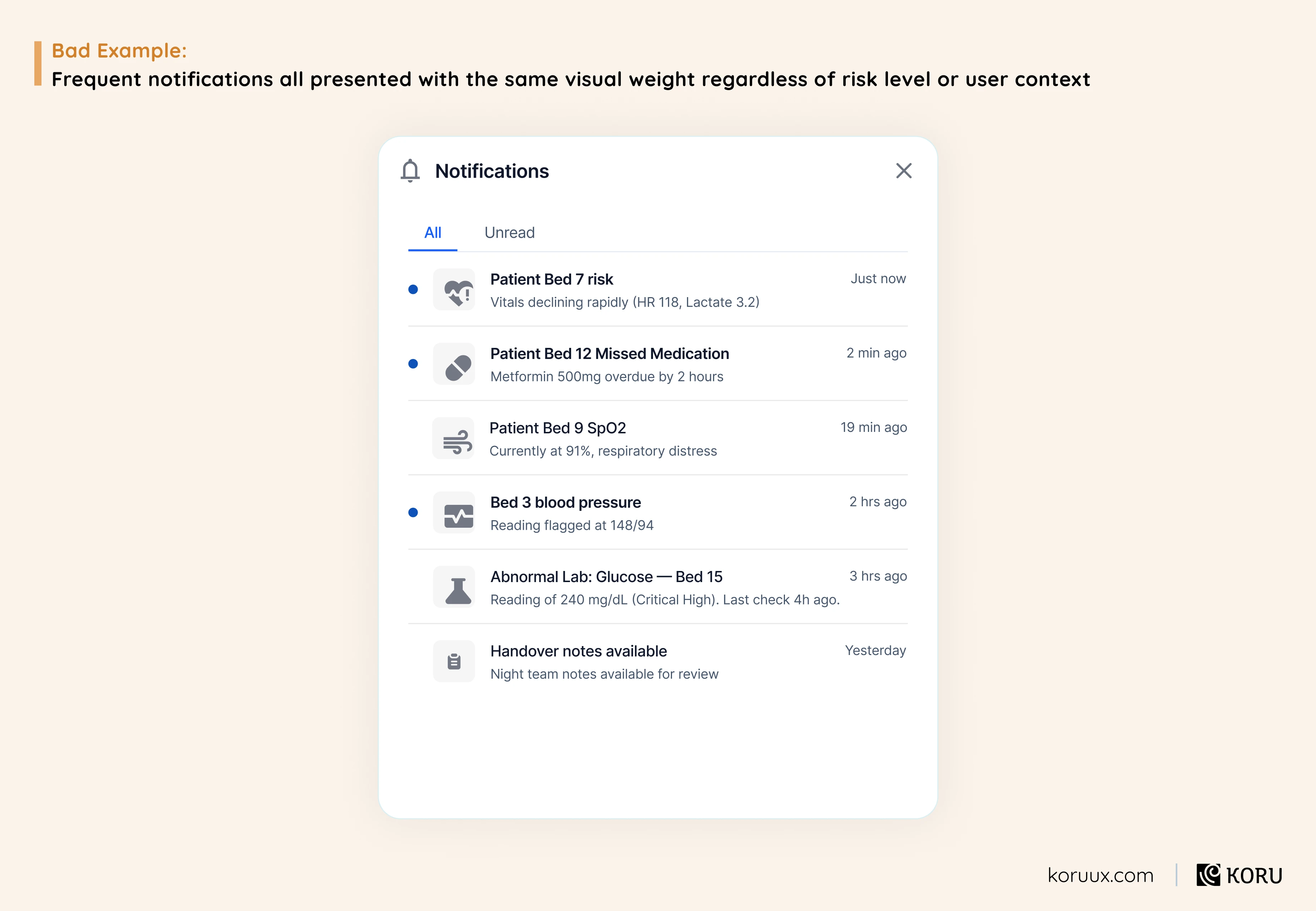
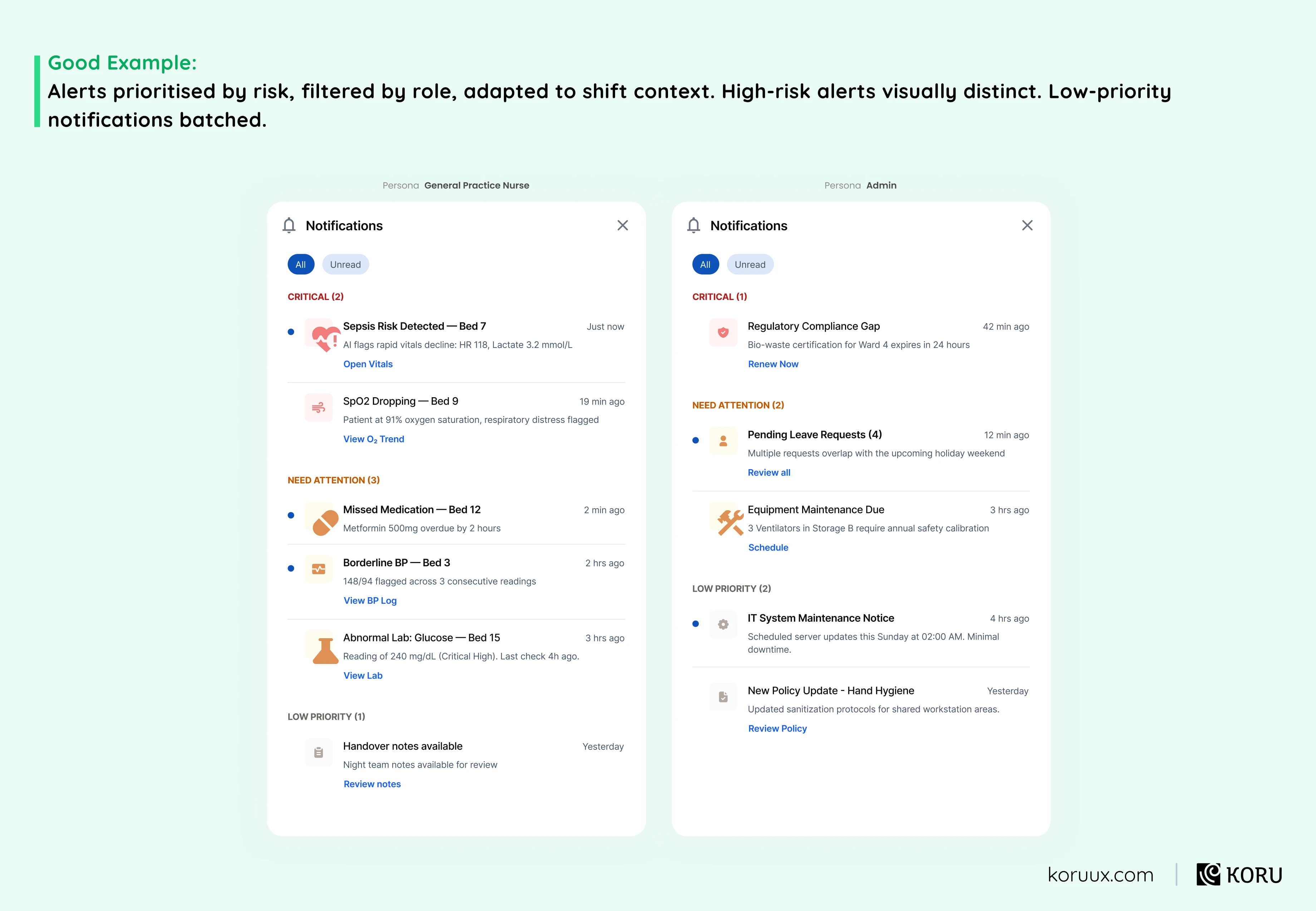
The lesson: Every alert that fires unnecessarily trains your users to ignore all alerts. In healthcare, the cost isn’t just poor engagement metrics. It’s a clinician missing the one notification that actually mattered because they’ve been conditioned to dismiss everything.
Pattern 11: Context Retention
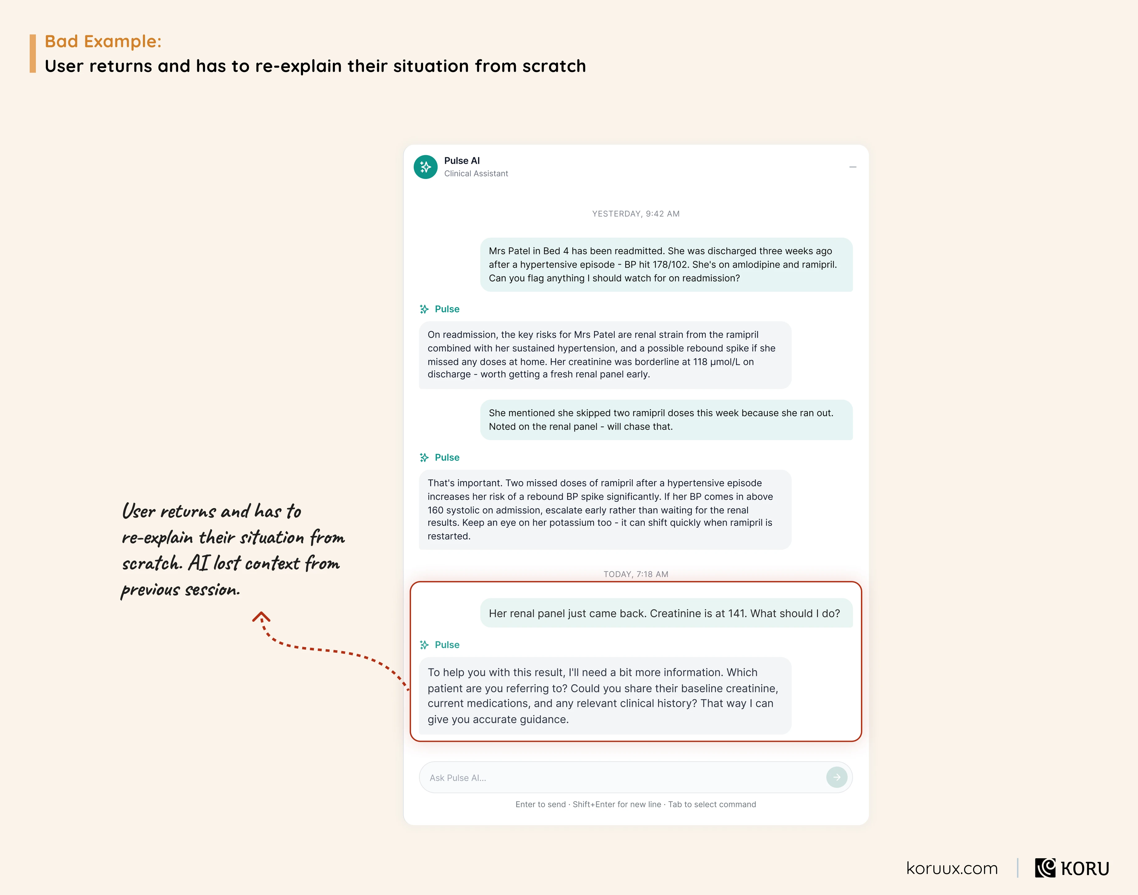
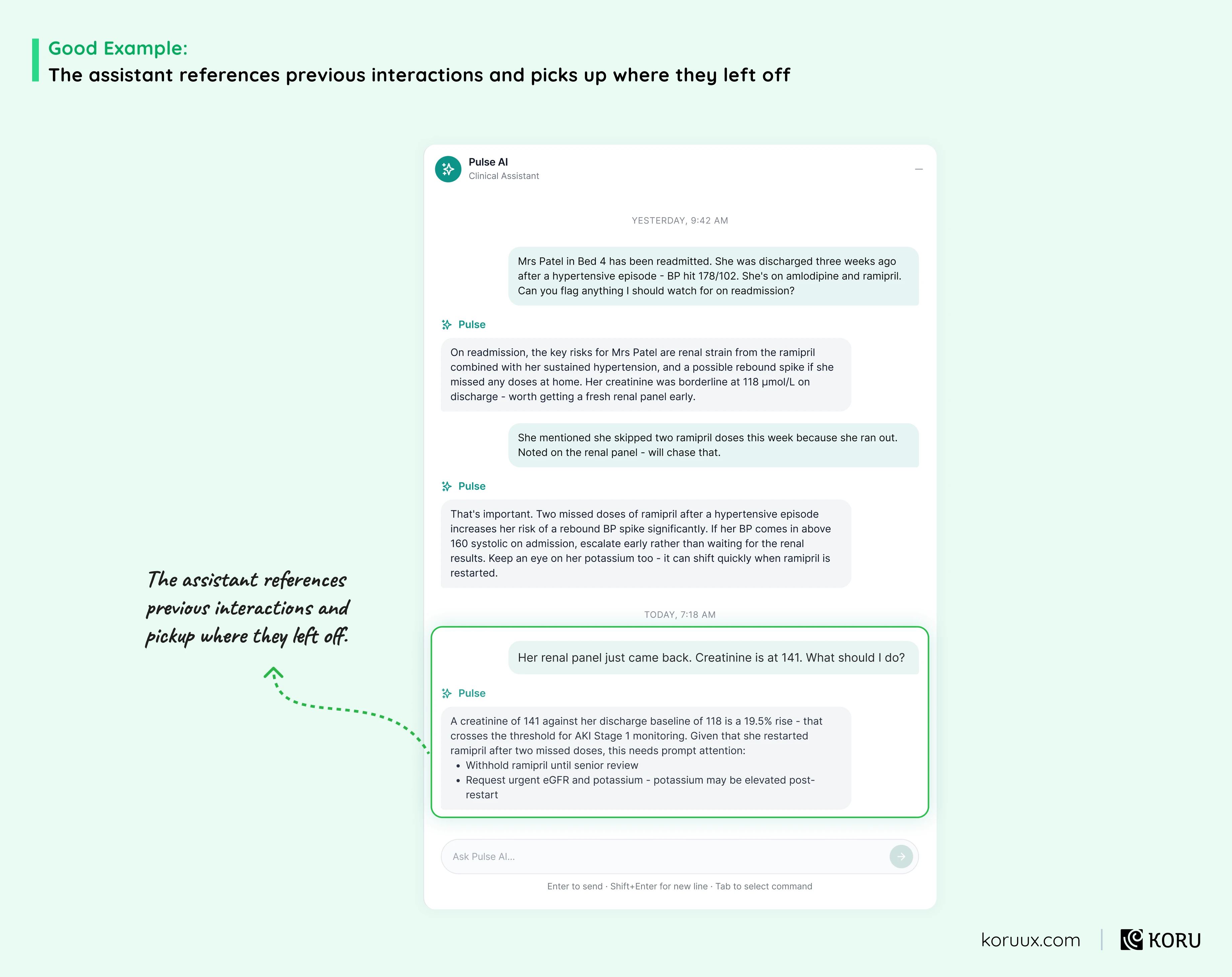
The lesson: If your AI forgets everything between sessions, it’s not an assistant. It’s a stranger your users have to re-introduce themselves to every time. Repeat that experience enough times and they’ll stop coming back.
Pattern 12: Data Privacy Controls
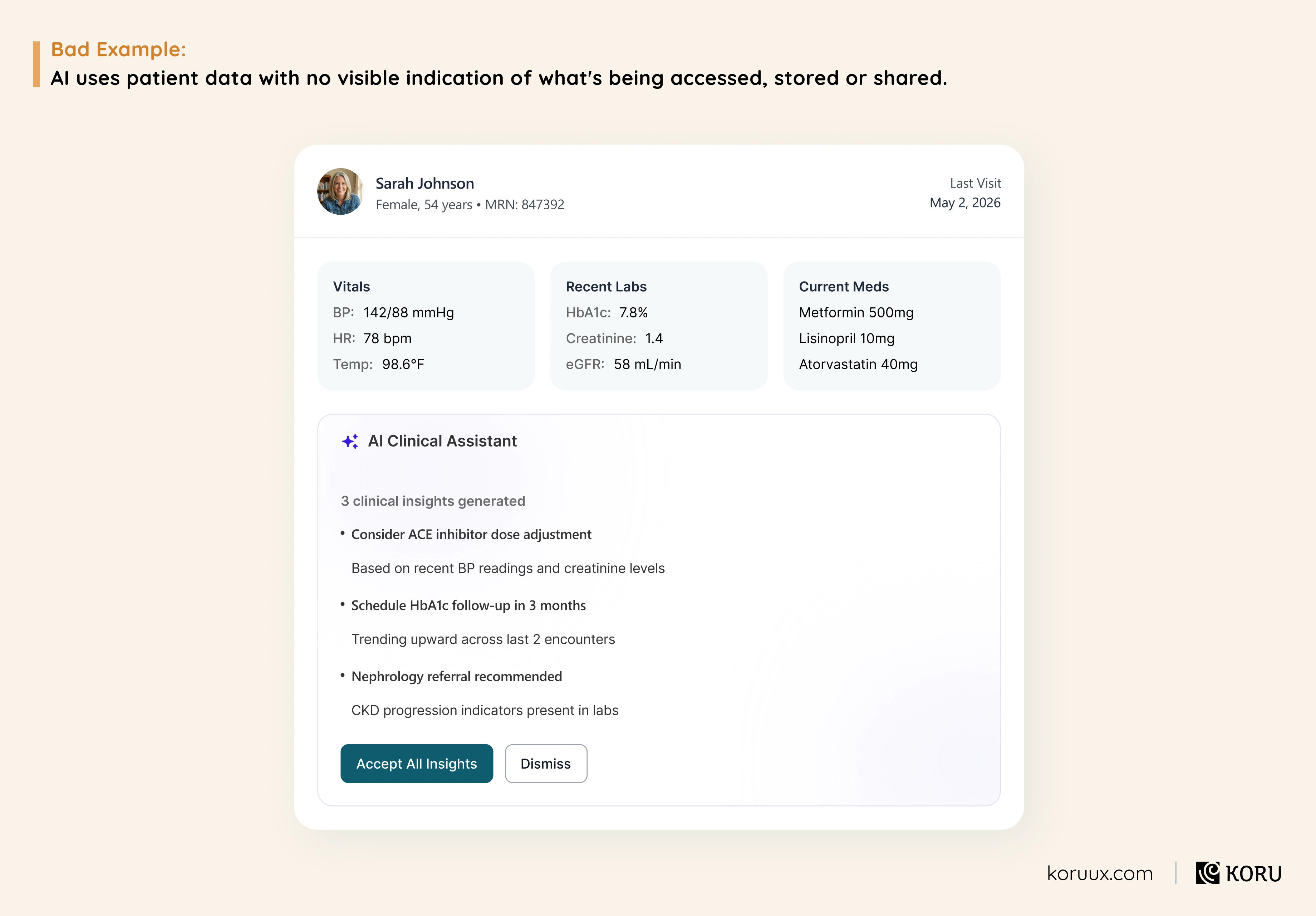
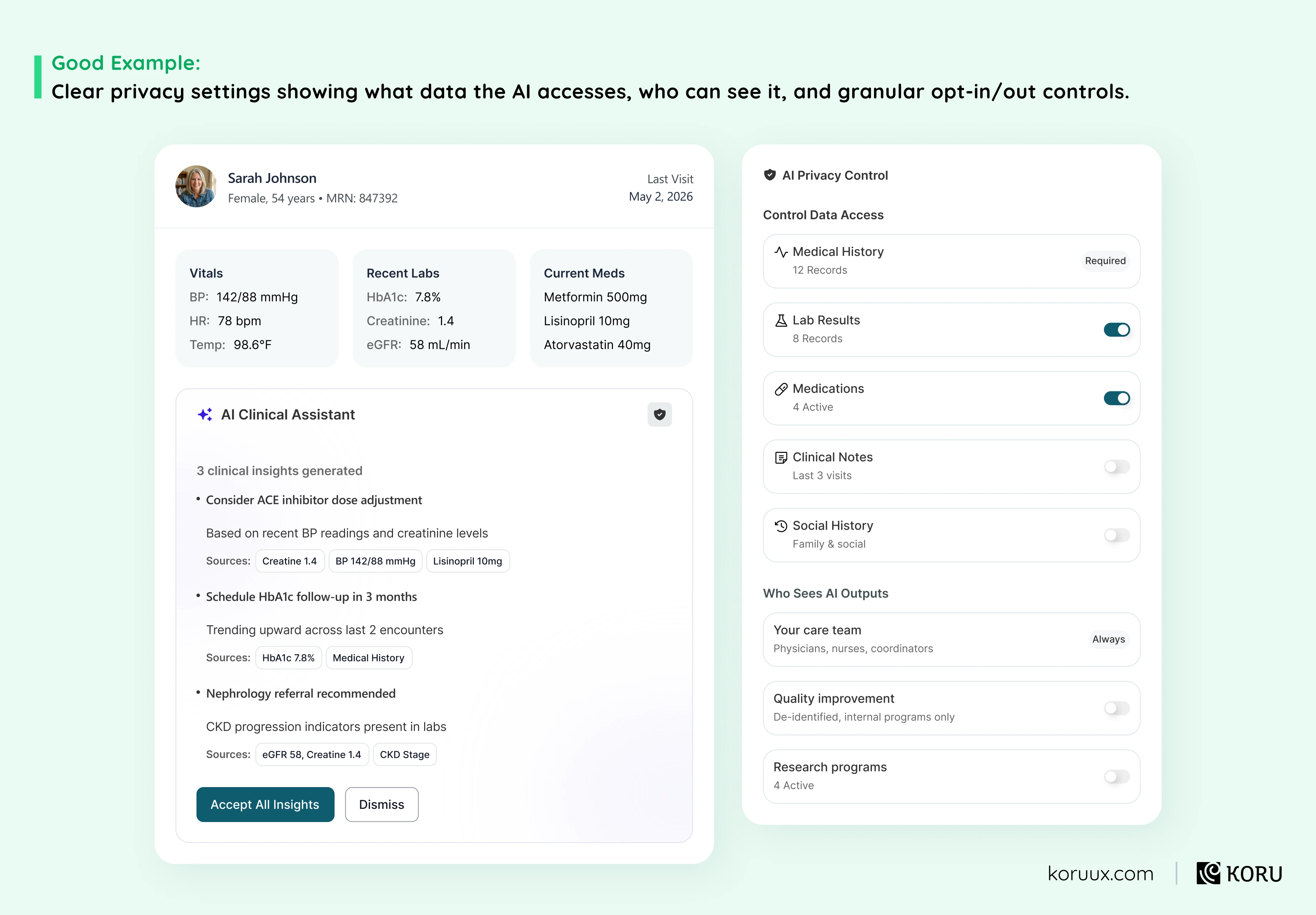
The lesson: In healthcare, invisible data handling isn’t just a UX problem. It’s a procurement blocker. Compliance teams will flag it. Security reviews will stall it. And clinicians who don’t trust how their data is being used won’t adopt it regardless of how useful the feature is.
Pattern 13: Error Recovery
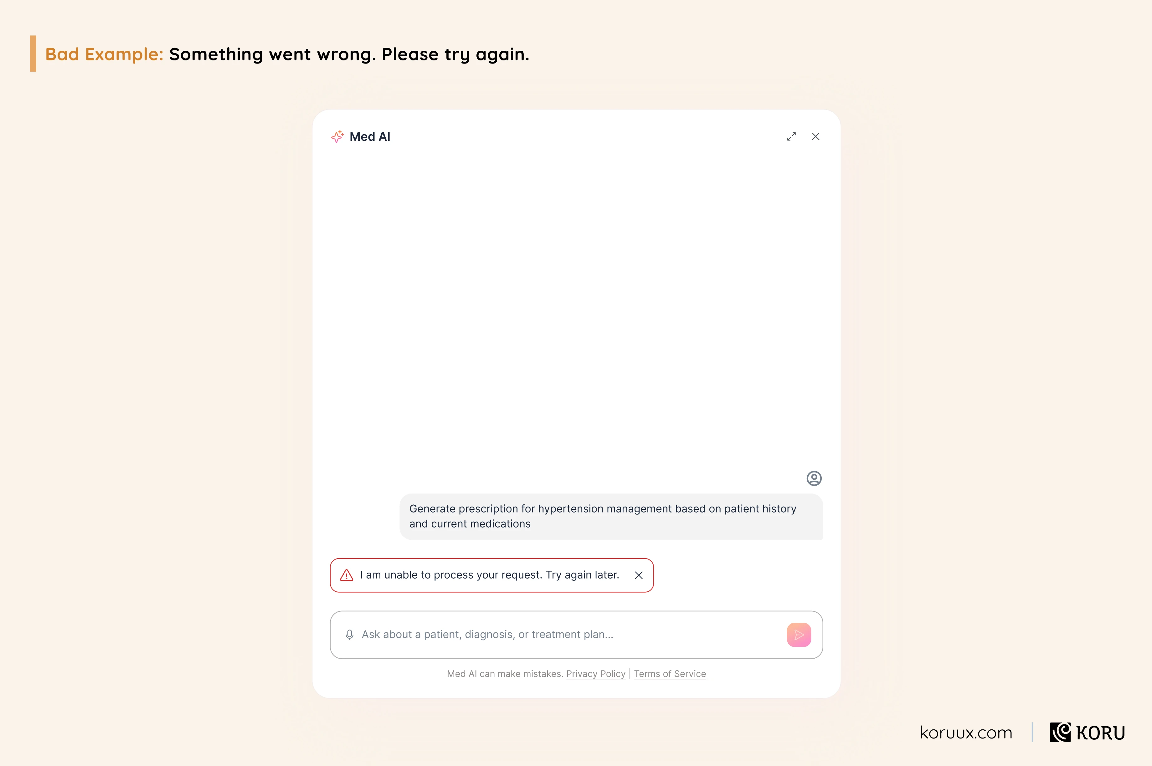
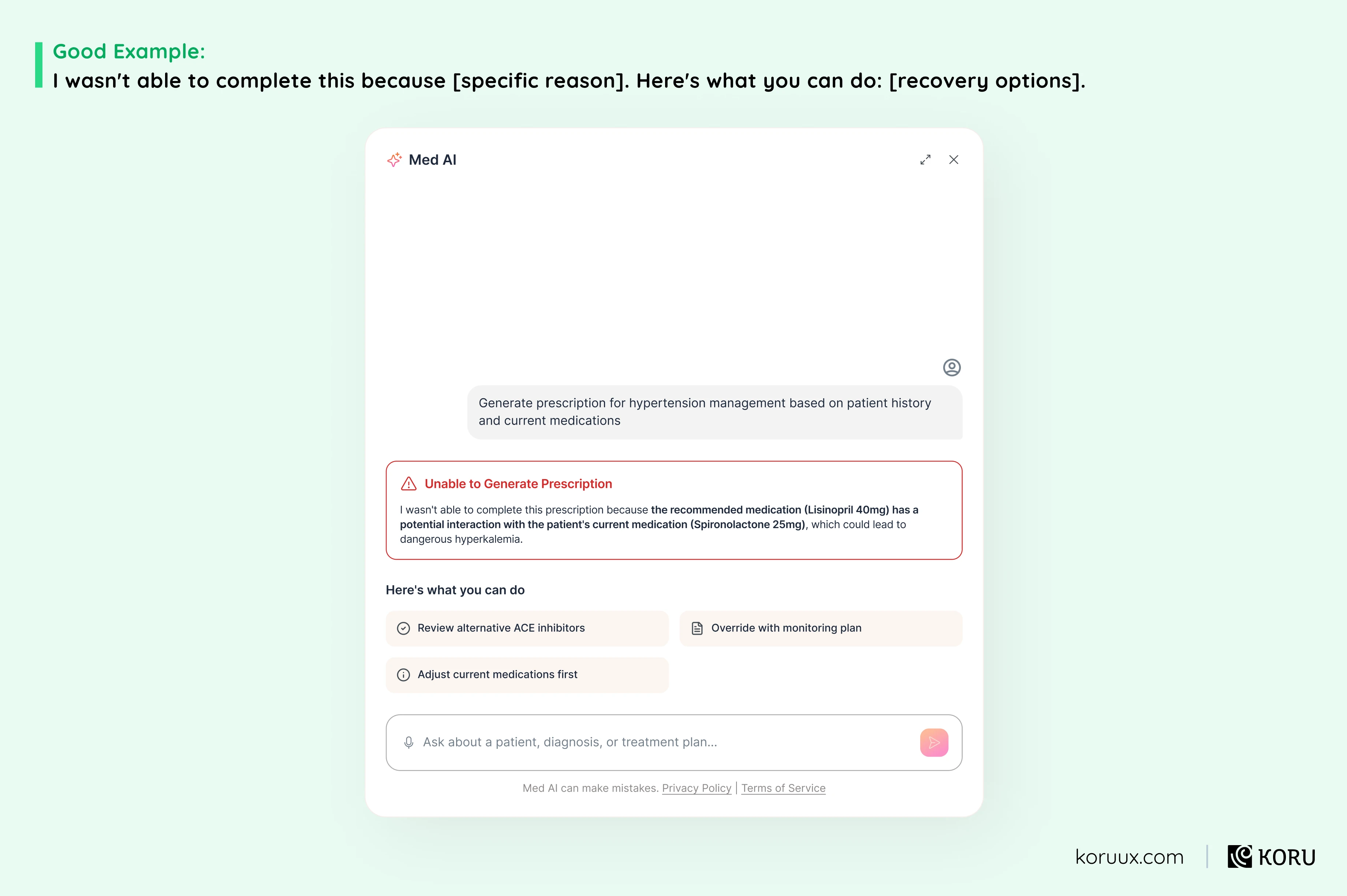
The lesson: Every unrecoverable error is a reason for users to stop trying. An AI that fails without explanation teaches users that the system is unreliable. An AI that fails transparently and offers a path forward teaches users that the system is honest. The second one gets a second chance.
Pattern 14: Assistant Pattern
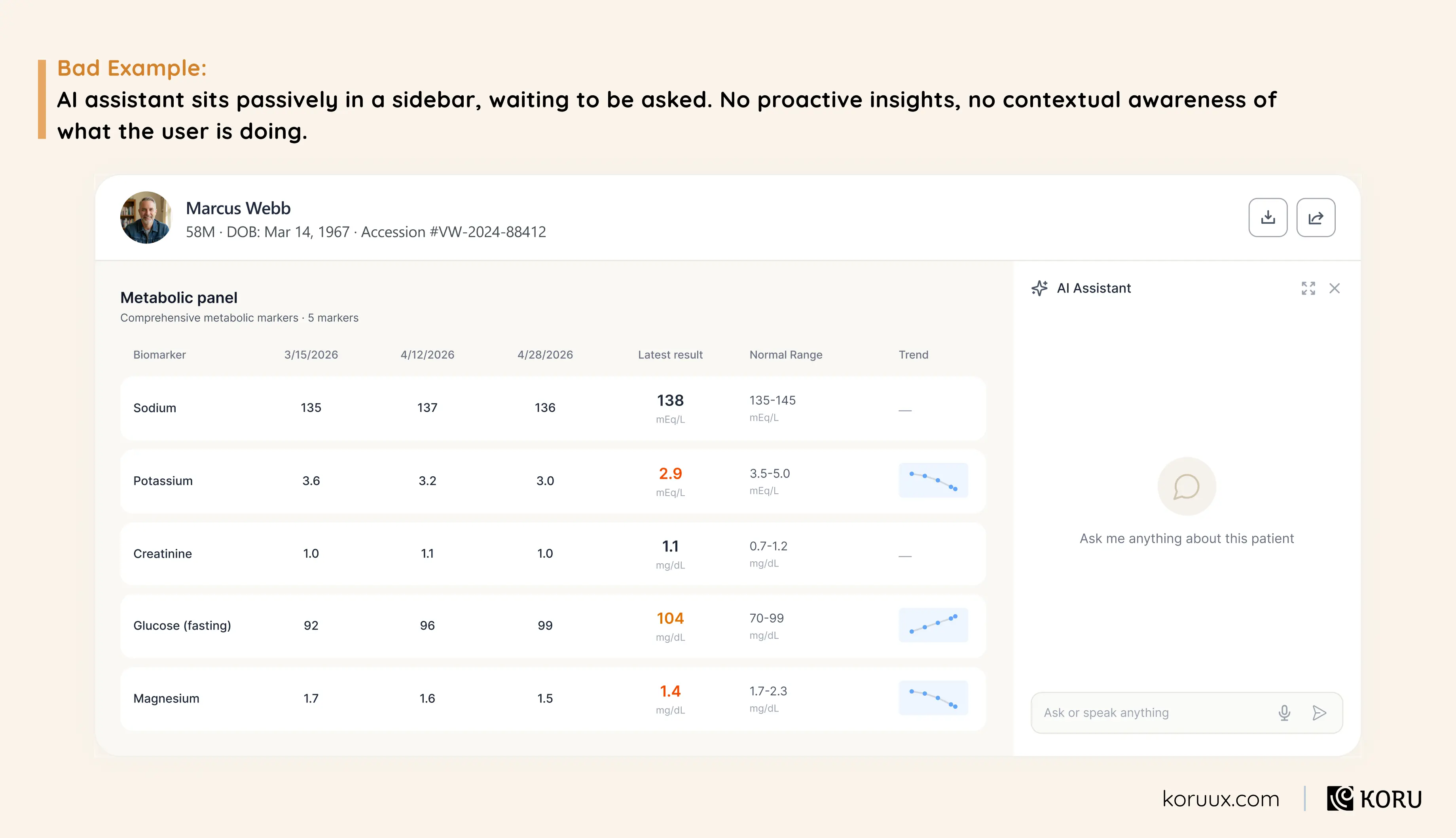
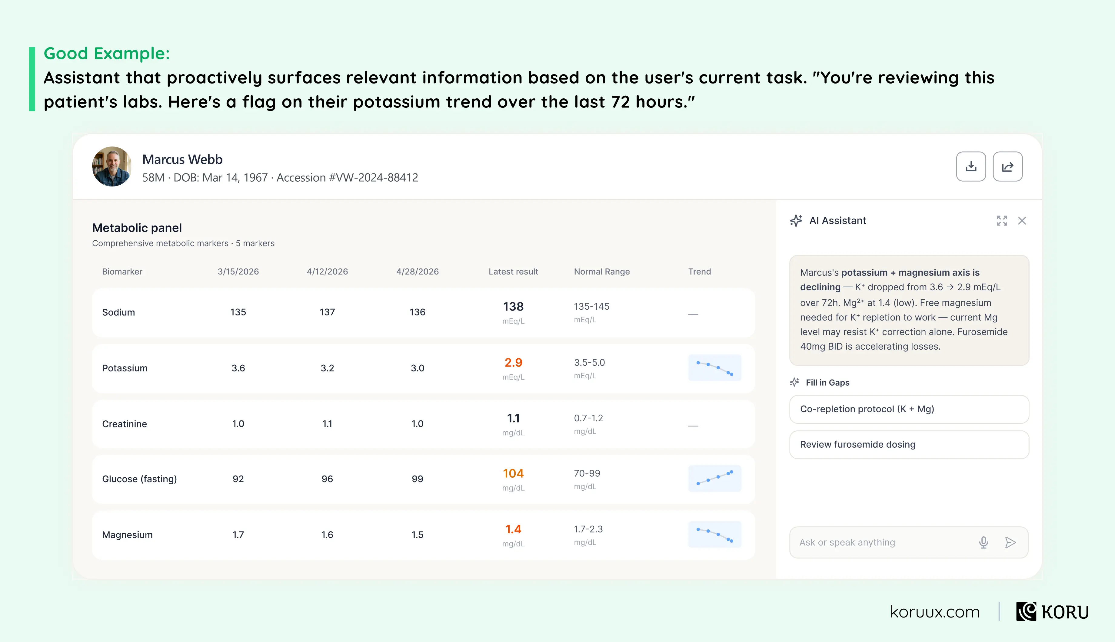
The lesson: The most useful assistant isn’t the one that answers questions best. It’s the one that surfaces what you need before you know to ask. In healthcare, where cognitive load is already high and critical details get buried, proactive guidance can be the difference between catching something early and missing it entirely.
The Thread Across All AI Design Patterns
Every bad example has the same root cause: the AI’s behaviour is invisible, unexplained or uncontrollable.
Every good example does the opposite: it makes the AI’s behaviour visible at the moments that matter most.
Not prettier interfaces. Not more features. Just making the system’s behaviour understandable enough that users can decide whether to trust it.
Want the full pattern library with implementation tips and real‑world examples?
Read our guide to 14 AI patterns for UI designWant the full pattern library with implementation tips and real‑world examples?
Read our guide to 14 AI patterns for UI design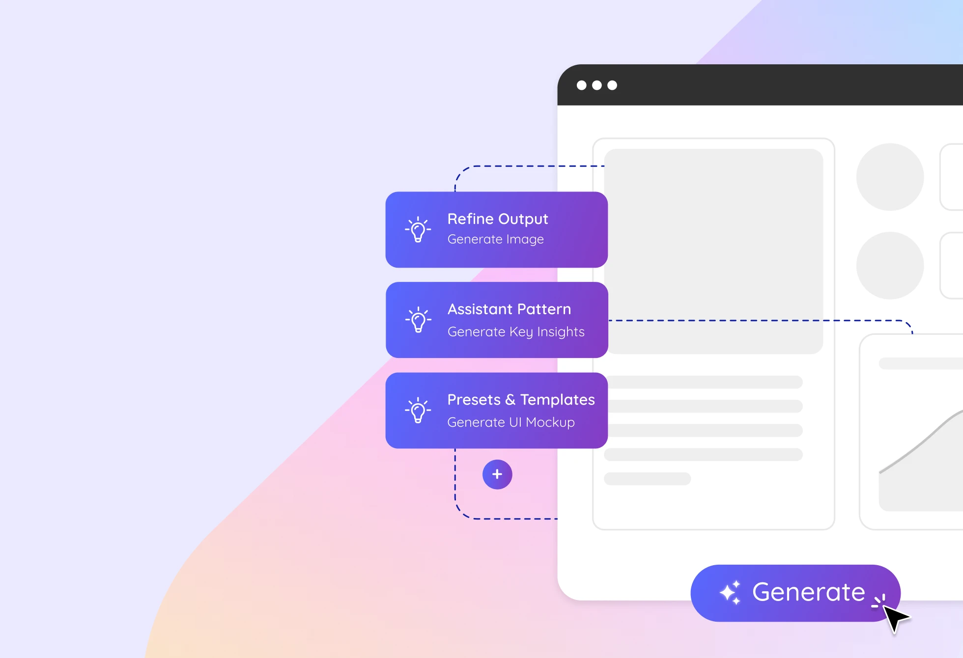
In the next chapter, we’ll show you the framework we use to design this kind of AI behaviour from scratch.
The Sense-Shape- Steer Framework
This is the methodology behind every AI experience we design. It’s also how we teach our clients’ teams to think about AI product design.
It’s available as a free video walkthrough and FigJam workbook that over 7,000 product teams downloaded in its first week.
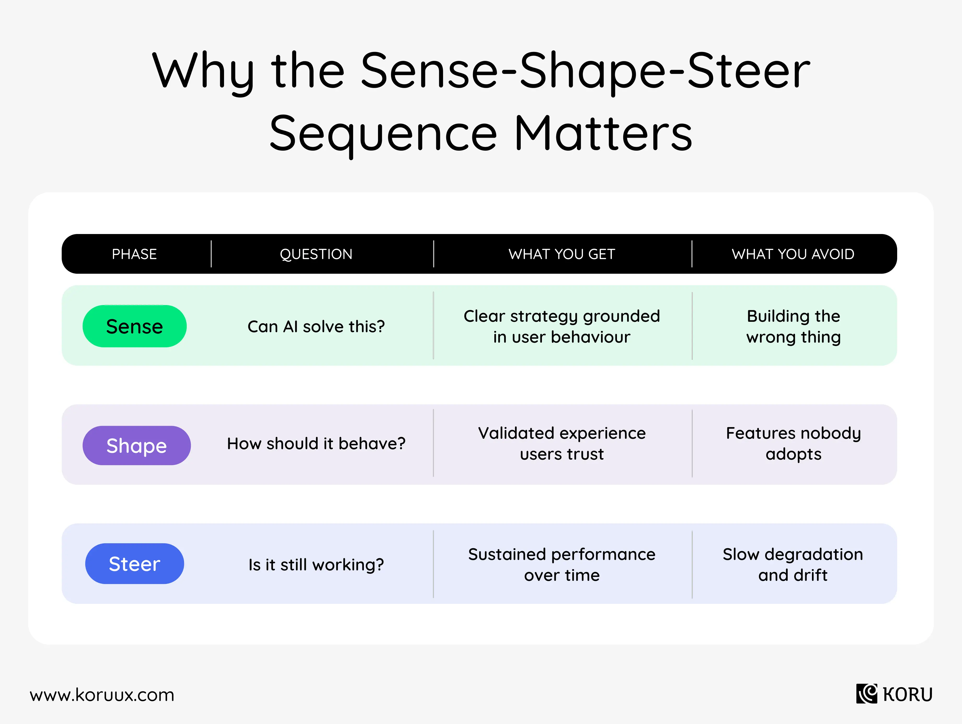
Most teams try to answer one big question: “How do we build our AI experience?” That’s too big.
You need three smaller questions, in the right order:
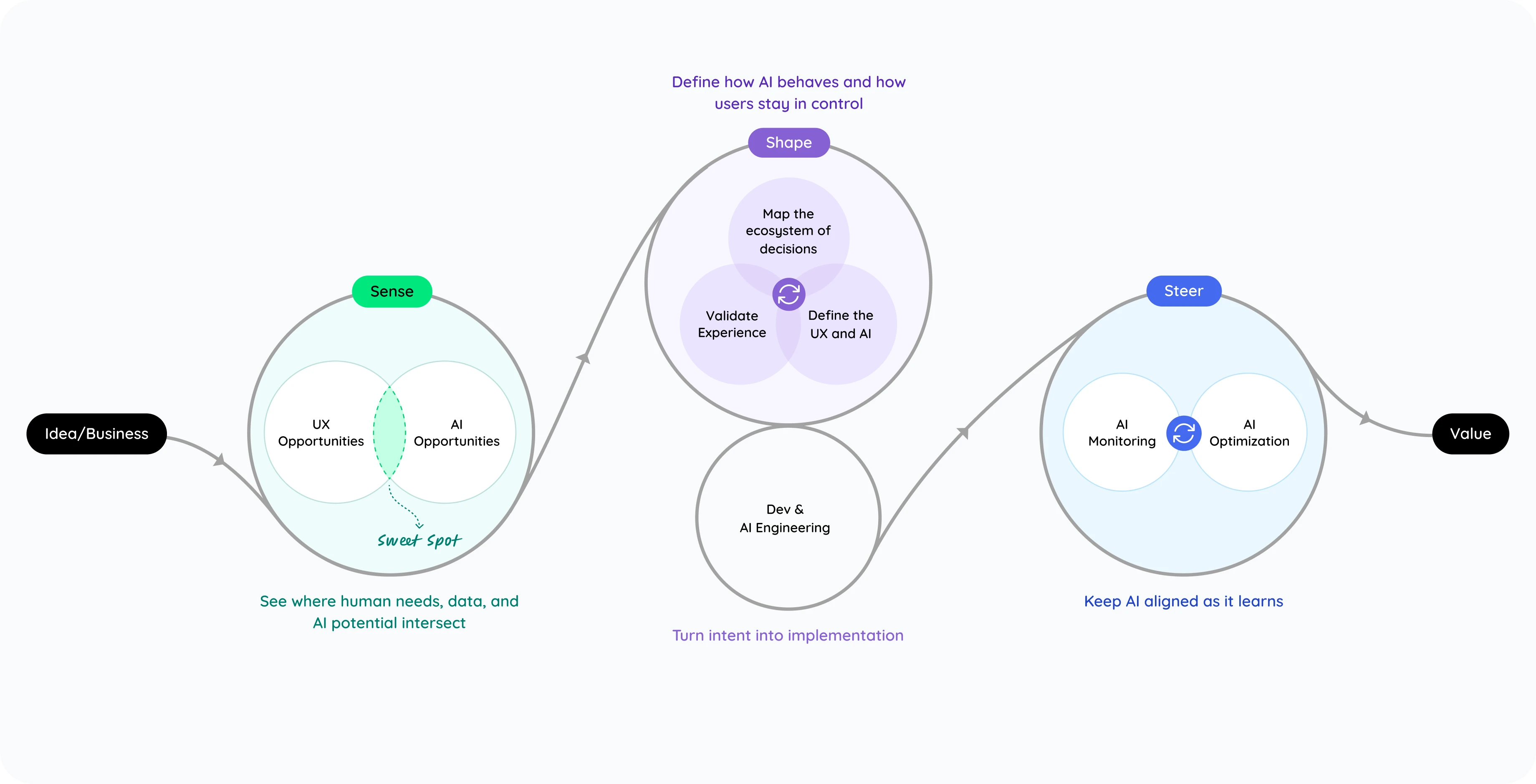
Each phase feeds the next. What you learn in Steer informs your next Sense cycle.
Before You Design, Listen
Sense uncovers where AI adds real value and where human judgment must lead. It blends research, data mapping and behavioural insights to define what the AI should understand and why it matters.
This is highly collaborative. Your team brings domain knowledge, business constraints and data realities. We bring structured research methods and pattern recognition from designing AI across healthcare products. Sense is about laying out all the pieces (constraints, capabilities, autonomy levels) so when we move to Shape, we know what we’re working with.
It works through five areas.
1. The problem space.
Ignore AI completely to start. Focus on the user. Who are they? What are their pain points? How are they solving the problem today?
That last question matters more than most teams realise. If users have already built workarounds for a problem, it means the system has gaps they’ve learned to live with. Those workarounds tell you exactly where AI needs to be careful, supportive and optional rather than taking over.
We dig into how work actually happens today: where effort piles up, what slows users down, and what success really looks like from their side. We map jobs-to-be-done to surface the tasks users actually need to accomplish, then identify friction patterns: information overload, manual work, personalisation gaps, adoption barriers, cross-system fragmentation, expertise that doesn’t scale.
Your product team is in the room as we synthesise findings in real time. Everyone sees the same patterns emerging.
2. The AI opportunity.
Now bring AI into the conversation.
In light of those pain points, where could AI bring relief? Not every friction point needs AI. Some are better solved with conventional UX. The goal is finding the specific problems where AI genuinely changes the equation.
Opportunities get scored in a working session across three dimensions:
- Business impact: what moves the needle on efficiency, cost or revenue?
- User trust: where does AI intervention feel natural vs intrusive?
- Technical feasibility: what can be built realistically with your data and current architecture?
This shared scoring helps teams see where AI will have the most meaningful impact and ensures everyone is aligned on why a particular direction is worth pursuing.
3. Data reality.
For AI to do the things just identified, what data would it need? And what’s actually available?
This is the question that grounds the opportunity. It narrows scope from “what’s theoretically possible” to “what’s buildable with the data and infrastructure that exist today.”
4. The AI role.
Copilot, agent, conversational AI or ambient?
And where in the user journey does AI assist vs where does it act autonomously?
This is also where model capabilities get assessed honestly:
- Model capabilities: what can the existing AI model do vs what’s still science fiction?
- Architecture options: thin LLM wrapper? Fine-tuned model? RAG-based? Custom training?
- Data infrastructure: what ground truth exists? Is it accessible? Where are the data gaps and bias issues?
- Technical and cost integration: what existing systems does AI get access to? Are computational costs scalable?
- Risk and expectations: what level of accuracy is acceptable? What happens when the AI is wrong?
These aren’t just engineering decisions. The answers determine confidence levels, what you can promise users, and what constraints shape the experience.
5. Risks and guardrails.
What happens when the AI is wrong? What oversight does it need? Where do its action boundaries lie?
This conversation feels premature at this stage. It’s not. Teams that skip it here have it six months later when something breaks in production.
By the end of Sense, we’ve connected the dots between what users need and what AI can reliably deliver. We know where AI fits best, what risks it carries, and what kind of experience it should enable.
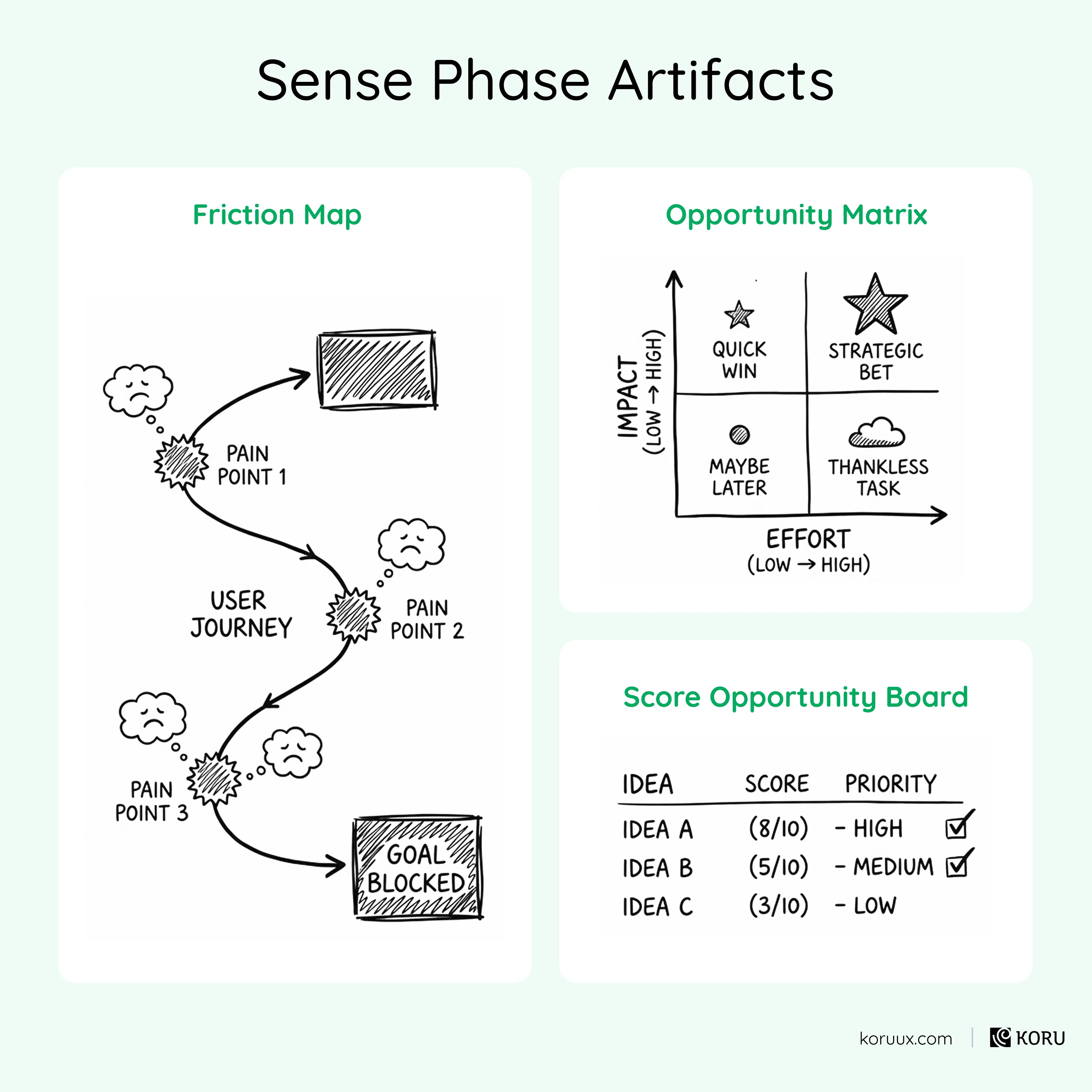
Skip Sense and you build the wrong thing.
Turn Insights into Experiences
This is where ideas take form.
Shape defines how the AI should act, respond and communicate: when it should take initiative, when it should pause, and how it should earn the user’s trust. It explores the balance between autonomy and oversight, shaping tone, visibility and control so the AI feels powerful yet predictable.
Design moves fast here. We prototype AI-driven interactions that mimic real model behaviour, then refine them through iterative, AI-specific testing. Each round helps us understand not just what works, but why users trust it (or don’t).
Shape works in two stages.
Stage 1: Define AI behaviour.
Map the ecosystem of decisions.
We start by mapping how work actually happens: who decides what, when, and with which information. This reveals where AI can assist, automate or amplify human judgment, and where it shouldn’t interfere.
- Trace decision flows: who needs what information, when, to make which choices? Which moments are repetitive, data-heavy or delay-prone (ideal for AI)? Which require context, empathy or expertise (best left human-led)?
- Define autonomy boundaries: low-risk tasks get high AI autonomy with light oversight. Medium-risk tasks get “AI suggests, human approves.” High-risk tasks get low AI autonomy with high human control.
- Surface data trust gaps: where does data quality, latency or coverage undermine confidence?
- Design interaction logic: through prompt and context engineering, define how AI understands intent, applies knowledge and communicates tone and confidence. Outline when it acts autonomously, when it pauses for input, and how it explains uncertainty.
- Design feedback loops: how the AI learns from users, what signals it collects (edits, confirmations, rejections), how those signals feed the model, and where human review is required.
We also take each pain point from Sense and run it through five evaluation questions:
- User clarity: does the user know what they need?
- AI context completeness: does the AI have enough information to help?
- Urgency: how time-sensitive is the moment?
- Disruption risk: what happens if the AI gets it wrong here?
- Risk radius: how far does a mistake cascade?
This prevents the two most common Shape-phase mistakes: using AI where it doesn’t belong, and over-automating things that should stay under user control.
From here, select the interaction pattern and mode that best fits each pain point. Assistant, guide, collaborator or executor. (The full set of patterns is in the 14 AI patterns guide.)
Stage 2: Translate behaviour into design.
Map how user and AI interact across the entire journey. Not at a single moment. User actions. AI responses. Decision points. Error recovery scenarios. Where does AI initiate? Where does it respond? Where does control return to the user? When storyboard. Each frame captures four things: user goal, user action, context, design decision. Then wireframe. Low-fidelity. The priority is validating the high-level solution, not polishing pixels.
Validate the experience.
Traditional mockups can’t capture how AI behaves in motion: how it reasons, hesitates or learns from users. They can’t show how AI handles unexpected inputs, whether users understand its reasoning, or how they react when it gets something wrong.
Shape uses five types of validation that don’t exist in conventional UX projects:
- AI workflow prototypes: mimic AI reasoning, tone and confidence before the model is live.
- Wizard-of-Oz testing: a human simulates the AI behind the scenes while real users interact with the interface
- Failure mode testing: deliberately expose low-confidence or incorrect responses to understand how users want to recover
- Trust testing: can users grasp why the AI suggested something and feel confident acting on it?
- Autonomy testing: finding the right balance between AI initiative and human oversight
Each iteration helps refine prompts, context and weighting so that user feedback becomes structured, useful input for the system to improve itself.
By the end of Sense, we’ve connected the dots between what users need and what AI can reliably deliver. We know where AI fits best, what risks it carries, and what kind of experience it should enable.
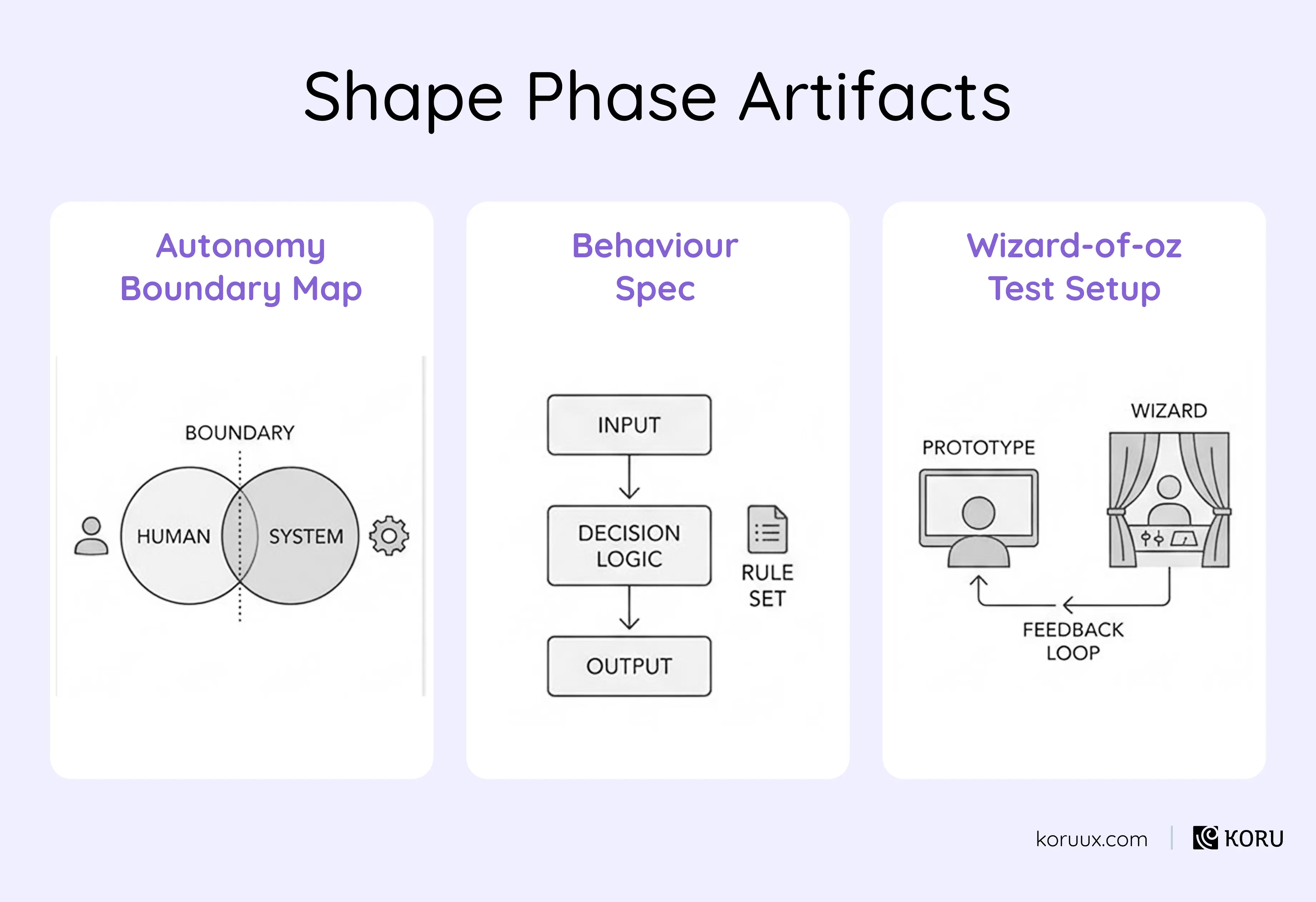
Skip Shape and you build something nobody trusts.
As Intelligence Grows, Guide It
AI keeps learning, and so must design.
Design doesn’t end when AI goes live. That’s when it truly begins to learn. Every interaction changes it. Every new piece of data shapes how it responds.
Steer isn’t about maintenance. It’s about governance through awareness. Establishing the guardrails that keep human accountability visible: how the AI decides, when it escalates, and who’s in control when confidence drops.
Embedded support.
When ideas move from design to build, intent can get diluted.
The UX team stays embedded with engineering to make sure what was designed (clarity, confidence, trust) stays intact as AI becomes operational.
- Join standups, reviews and pairing sessions to keep user experience tied to implementation decisions
- Collaborate on prompt and context refinement to ensure AI responses align with design intent
- Run early feedback cycles with real or simulated users to catch drift between designed and actual behaviour
- Define shared success metrics (confidence, accuracy, explainability, trust) so everyone measures the same outcomes
The seven things to measure.
Steer defines what “good enough” looks like across seven areas:

1. Accuracy.
Not just averages. Edge cases, complex inputs, patterns of failure. Where does the AI perform well? Where does it fall apart? We review real examples, compare outputs to expert judgment, track error patterns and retest after changes.

2. Fairness.
Does performance vary by user type, language, region or input type? Average performance can hide serious issues for specific groups. This isn’t about solving fairness globally. It’s about making sure quality doesn’t quietly degrade for certain users.

3. Usability.
Task completion rate. Time-to-decision. Error rate. Workflow disruption. Even the most accurate AI fails if it slows people down or interrupts their process.

4. Trust.
Adoption rate: are eligible users actually using it? Acceptance rate: how often do they follow suggestions? Override rate: how often do they reject them? Satisfaction: would they recommend it? If users override the AI constantly, something is broken, even if accuracy looks fine.

5. Safety and risk.
This is where you define what must never happen. Unacceptable errors. Hallucination rates. Confidence misalignment (the AI acting confident when it shouldn’t). Autonomy violations (acting without required oversight). Escalation behaviour (does it hand off to a human when risk is uncertain or high).

6. Feedback loops.
What counts as feedback. What should not be learned automatically. When expert review is required. How often the AI should be re-evaluated. Is user feedback clear and reliable enough for the AI to learn from? Without intentional feedback loops, AI either stagnates or degrades.

7. Operational metrics.
Latency: fast enough for the workflow? Failure rate: timeouts, crashes, failures to respond. Cost per use: sustainable as adoption grows? Performance under load. An AI that’s accurate but too slow or too expensive won’t survive real-world usage.
A note on precision.
Nobody walks out of the design phase declaring that accuracy must be exactly 73.3%.
That precision comes later through measurement and real-world usage. What Steer defines are directional thresholds and boundaries. Is 60% accuracy acceptable? Probably not. Is 95% required? Maybe, if the task is high-risk. Is a 5% high-risk error rate non-negotiable? Possibly.
Without this conversation, teams either over-engineer or ship without clarity.
Measure and iterate.
As AI meets real-world use, the focus shifts from designing behaviour to guiding it.
- Observe real interactions to see where AI helps, hinders or confuses
- Track how new data affects accuracy and model behaviour, because as data changes, so does the experience
- Monitor for bias, drift and adoption patterns to ensure fairness and dependability
- Refine thresholds, tone and messaging as confidence grows or falters
- Keep learning safe and intentional: adjust how often the AI learns from feedback and how much human oversight is built in
- Designers, engineers and data scientists stay in rhythm, tuning prompts, flows and metrics together as patterns emerge
Every insight from Steer feeds the next Sense cycle. That’s what makes it a closed loop: listening better, designing smarter and steering with more confidence each time around.
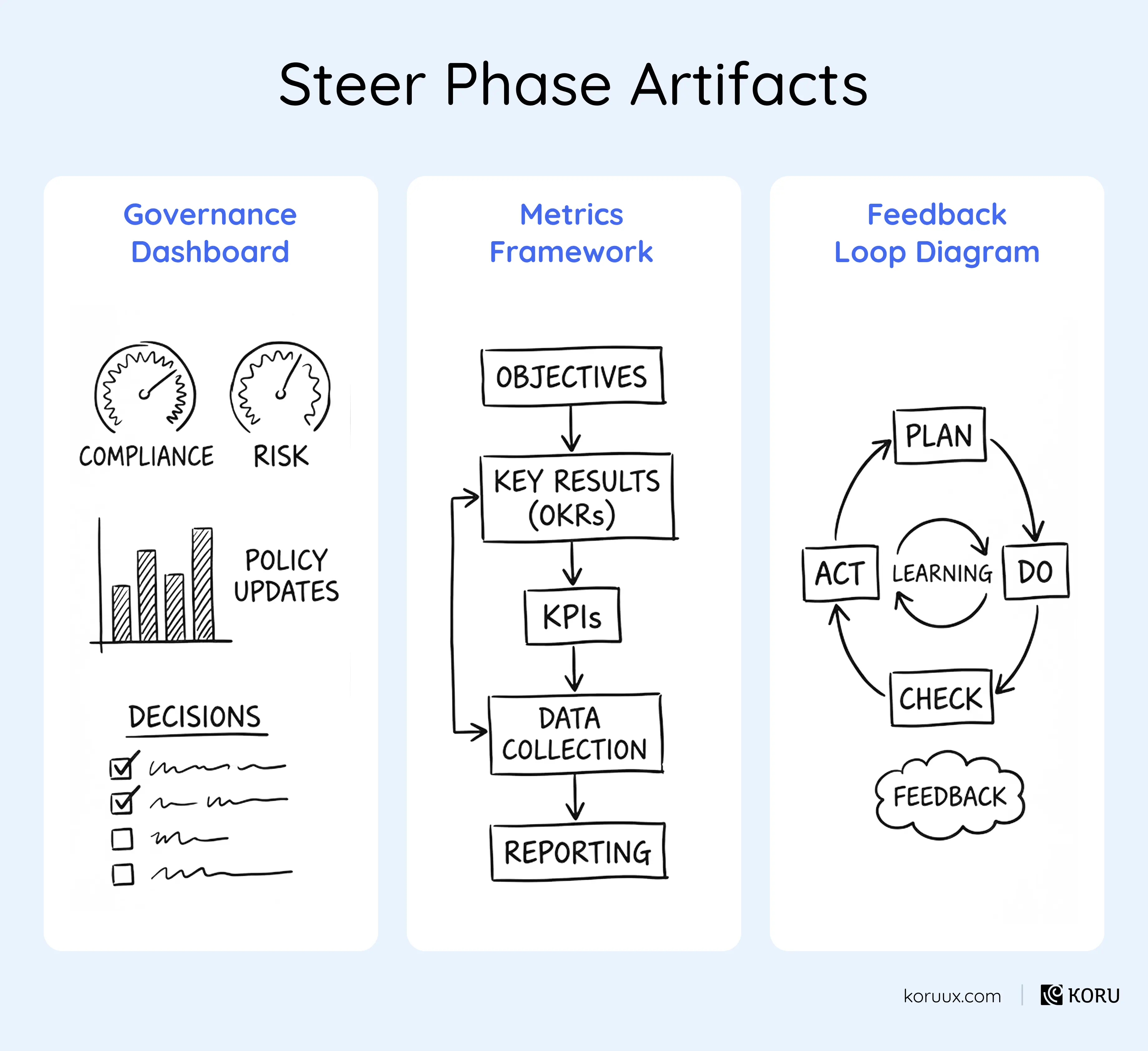
Skip Steer and you build something that degrades slowly.
What You Walk Away With
At the end of a full Sense-Shape-Steer cycle, you don’t have ideas. You have:
- Defined AI experience scope: What the AI will do vs what it won’t, with explicit boundaries between AI responsibility and human judgment
- Validated concepts and user flows: key journeys with AI touchpoints, triggers, responses and fallback behaviours
- Success and quality criteria: agreed definitions of “good enough” for accuracy, fairness, performance and risk, plus clear indicators of failure
- Reference scenarios and edge cases: documented assumptions, risks and the situations most likely to go wrong
That’s the shift from ambiguity to build-ready clarity.
Running This as a Sprint
One practical way to apply Sense-Shape-Steer is as a time-boxed AI Design Sprint.
Five days. 90-120 minutes per session.
Core team: UX researcher, UX designer, product manager, AI/ML engineer. Additional stakeholders from business, engineering, compliance and subject matter expertise join as needed.
The format is flexible. Three days for simpler opportunities. Seven for complex ones.
The video walkthrough and FigJam workbook guide your team through every step: the specific questions, frameworks and scoring templates for each phase.
Download the AI Design Sprint FigJam workbook.
Download Now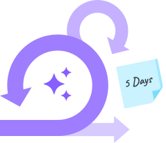
In the next chapter, we’ll cover the four most common mistakes teams make when designing AI experiences, and how to avoid them.
The Four Mistakes That Kill AI Adoption
You can get the strategy right, choose the right pattern, and design a solid experience, and still watch adoption flatline.
These are the four mistakes we see most often.
Mistake #1:
Too Much Autonomy Too Fast
It’s tempting to ship the most impressive version of your AI feature. The one that does everything automatically. The one that wows in a demo.
In practice, users don’t trust a system that takes over on day one.
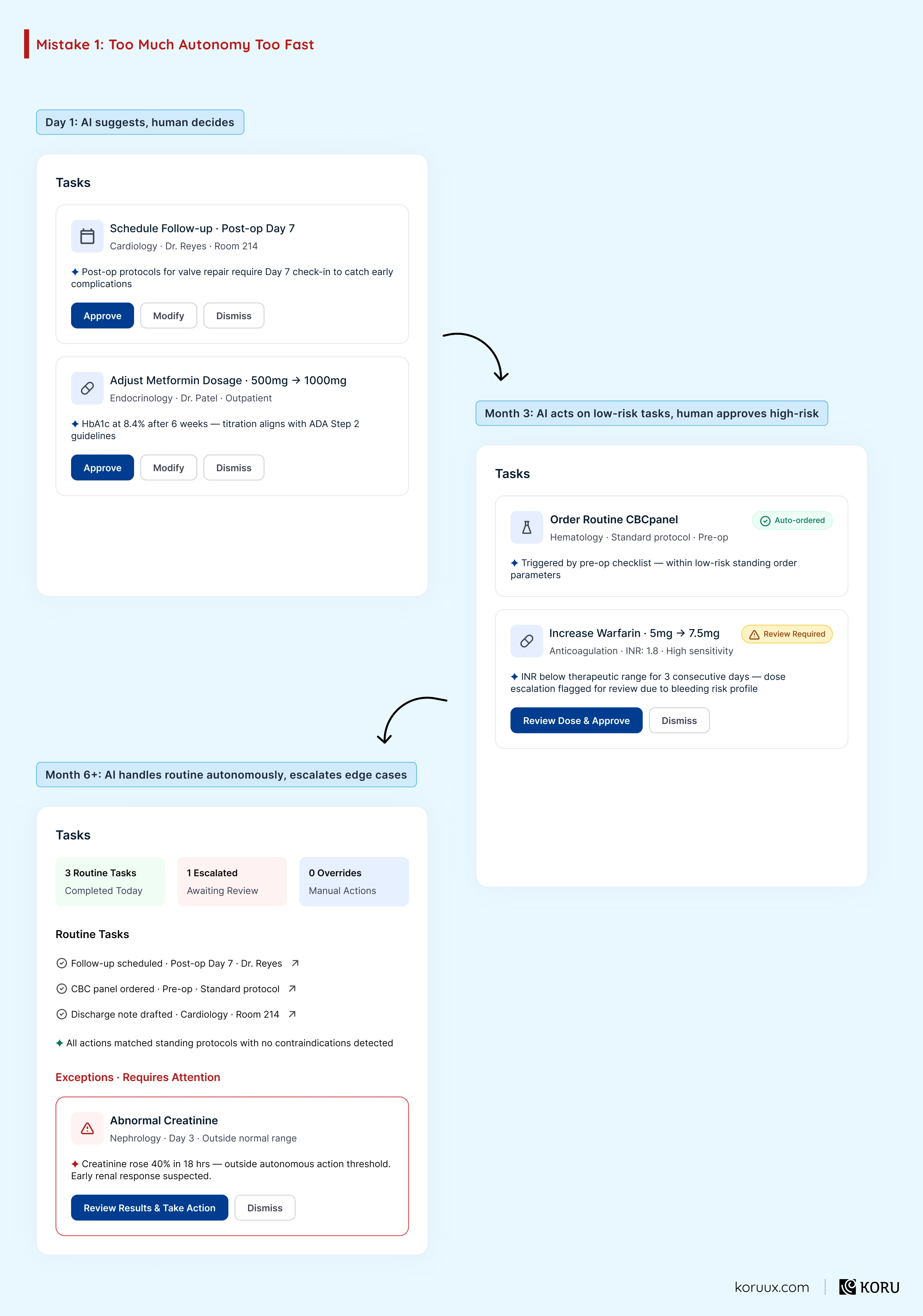
The teams that get adoption right start with the AI in a supporting role and let it earn more autonomy over time. Users grant trust incrementally, based on experience. The AI that starts by saying “here’s what I’d recommend” earns the right to eventually say “I’ve gone ahead and done this for you.”
The one that starts with “I’ve gone ahead and done this for you” never earns anything.
Mistake #2:
No Explanation of Reasoning
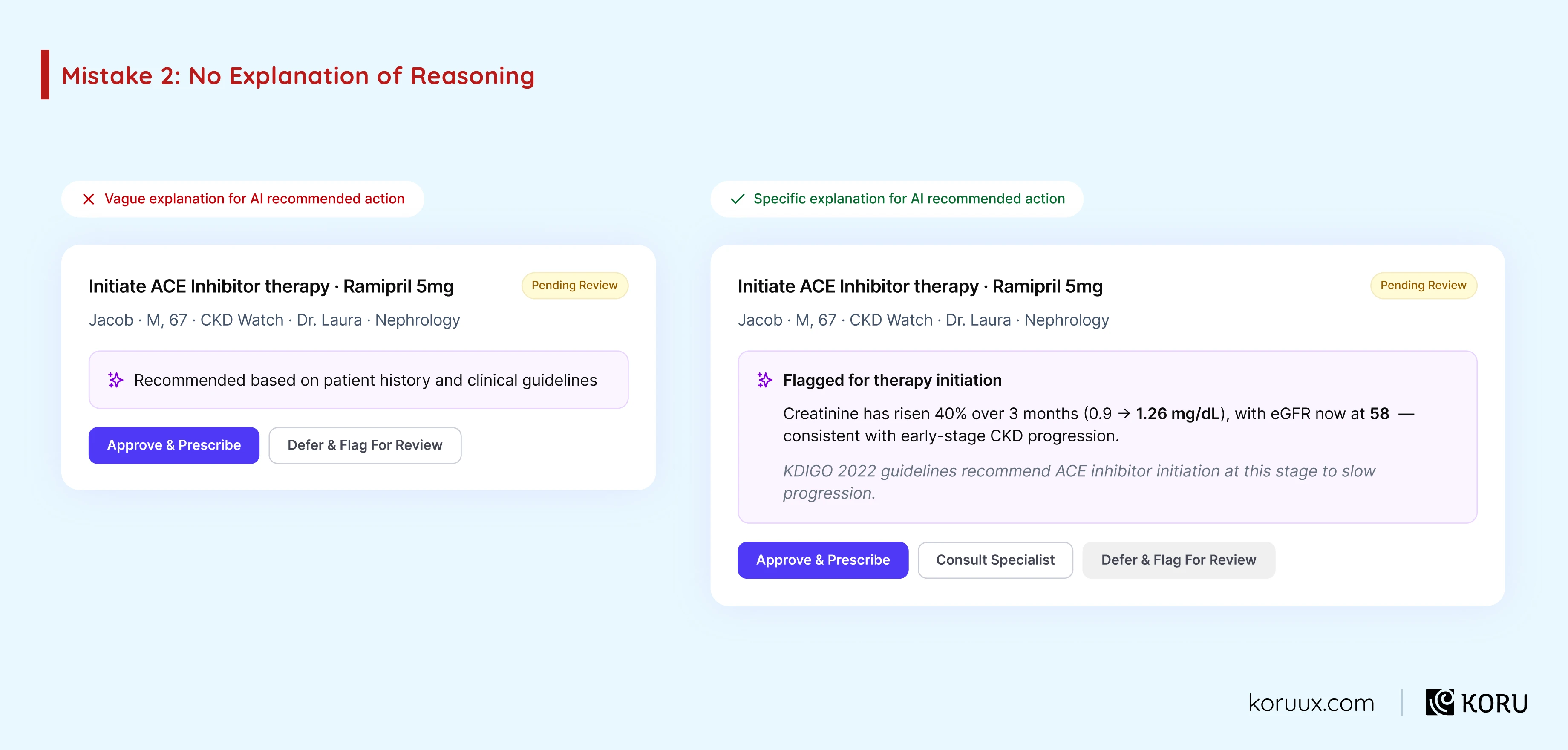
Most teams assume that if the AI gives the right answer, users will trust it. But research tells a different story. A 2023 PLOS Digital Health study found that poorly designed explainability can actually decrease error detection. Users see an explanation, assume the AI must be right, and stop thinking critically.
The fix is designing them properly.
Explainability done well gives users enough information to form their own judgment, not just a label that says “here’s why.” There’s a big difference between “recommended based on patient history” (vague, encourages blind trust) and “flagged because creatinine has risen 40% over 3 months, consistent with early CKD progression” (specific, invites clinical evaluation).
Mistake #3:
All-or-Nothing Interactions
Most AI features give users two options: accept the recommendation or reject it.
That’s not how humans make decisions. Especially in healthcare, where the answer is rarely a clean yes or no.
A clinician might agree with 80% of an AI-generated care plan but want to adjust one medication. A nurse might trust the AI’s triage recommendation but want to bump the priority level based on something they noticed that isn’t in the data.
If the only options are “accept” and “reject,” you’re losing all of that nuance. And you’re training users to either rubber-stamp everything or dismiss everything.
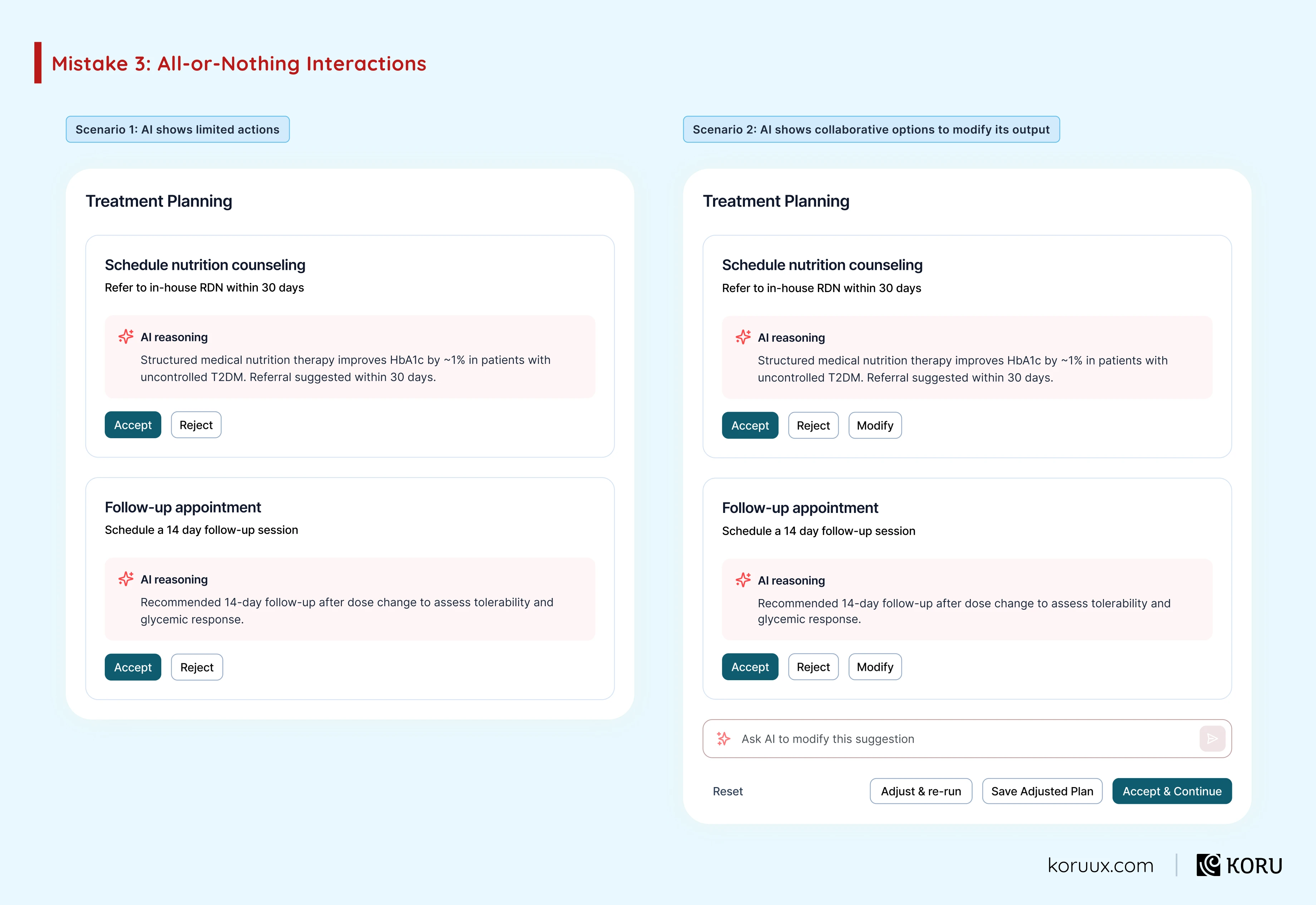
Give users the ability to shape the AI’s output rather than just thumbs-up or thumbs-down it.
Mistake #4:
Ignoring Failure States
Every AI feature will fail. The question is whether you’ve designed for that moment or not.
Most teams don’t. They focus on the happy path and treat failure as an edge case.
In healthcare AI, failure isn’t an edge case. It’s a certainty. The model will encounter inputs it hasn’t seen before. Confidence will drop below useful thresholds. Data will be missing. The user will ask something outside the system’s scope.
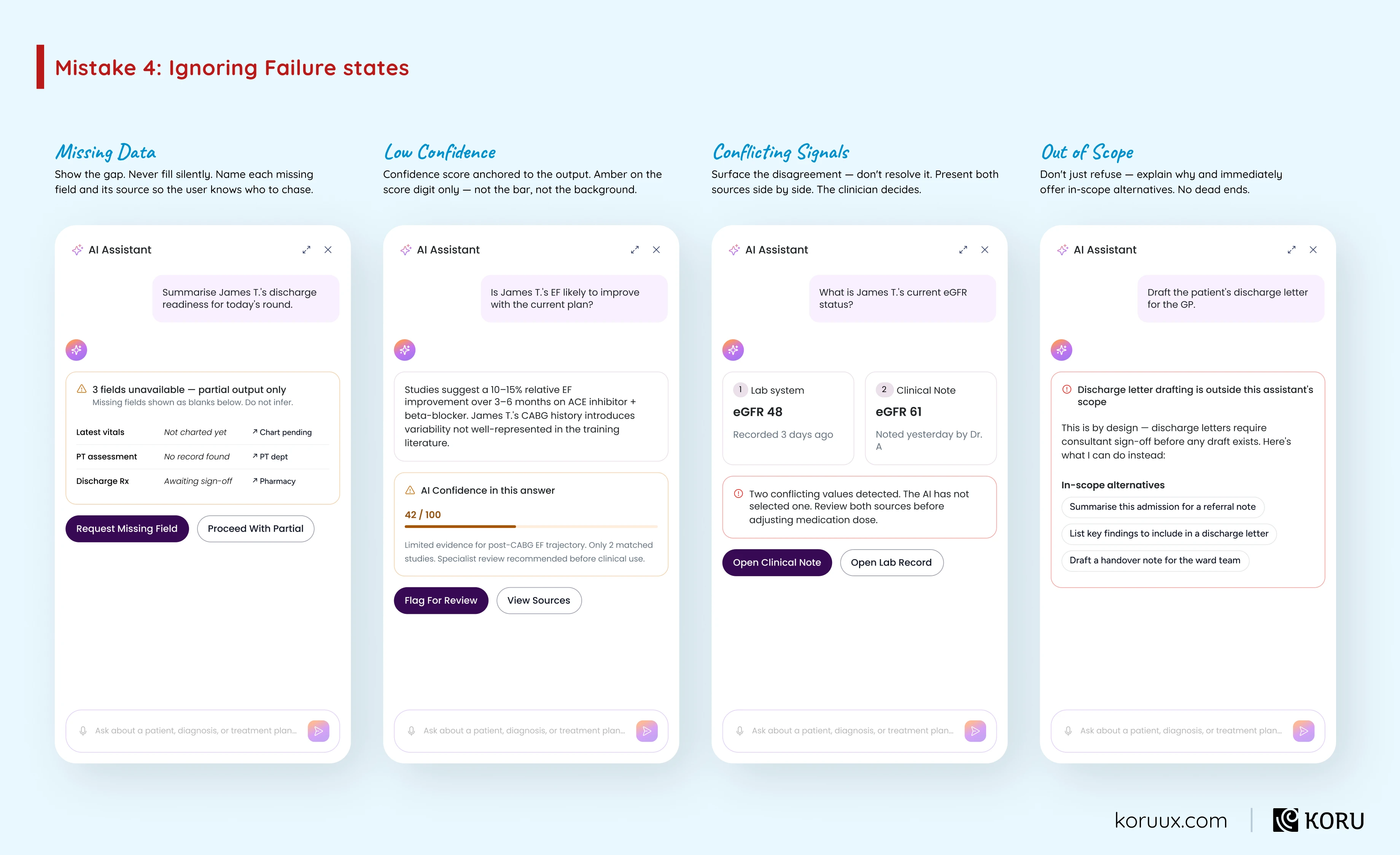
The teams that design for failure build more trust than the ones that pretend it won’t happen. An AI that says “I don’t have enough information to make this assessment, here’s what I’d need” is more trustworthy than one that gives a confident answer based on incomplete data.
We typically design somewhere between 15 and 30 distinct failure states for a single AI feature. Each one gets its own explanation and recovery path.
The Thread Across All Four
Every one of these mistakes comes from the same mindset: designing for the AI’s capabilities instead of the user’s experience.
The AI can act autonomously. But should it, on day one? The AI can give an answer without explaining. But will users trust it? The AI can present a binary choice. But does that match how decisions actually work? The AI can ignore failure scenarios. But what happens when it fails?
Trust builds the same way it always has: gradually, through transparency, with the ability to push back, and with honest acknowledgment when things go wrong.
In the next chapter, we’ll look at why conventional UX agencies struggle with these challenges, and what to look for in an AI UX capability.
Why Conventional UX Agencies Struggle with AI
There’s a real capability gap between UX for conventional software and UX for AI.
AI demands a different practice altogether (i.e. designing how the system behaves, when it acts, when it defers, what happens when it gets something wrong).
Most agencies haven’t built that practice yet, and from the outside it’s hard to tell which have. Unless you know what to look for, that gap may not be obvious until you’re mid-project and warning signs of misalignment start to surface.
So finding the right partner comes down to what you ask before you start.
The Capability Gap
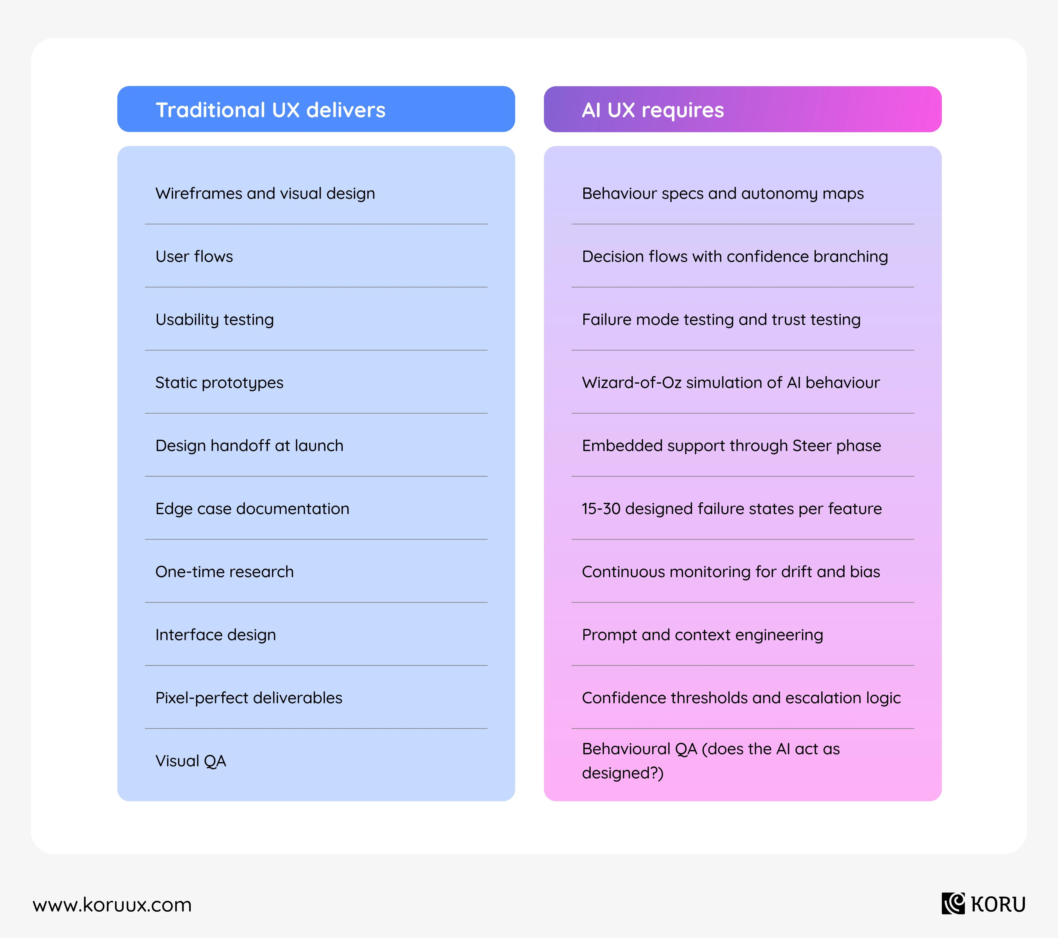
Traditional UX skills are foundational. They’re just not sufficient for AI products.
Where It Breaks Down in Practice
A traditional agency can design a beautiful interface for an AI feature. Clean layout, clear typography, intuitive navigation.
But when the product team asks “what should happen when the model’s confidence drops below 70%?” the agency doesn’t have a framework for answering that question.
When someone asks “how should the AI explain its reasoning to a clinician vs a nurse vs a patient?” the agency defaults to what it knows: different screen layouts. The real answer is different information architecture, different confidence displays and different levels of detail — all from the same underlying recommendation.
When the AI starts drifting after three months in production and user trust begins eroding, the agency’s contract ended at launch. There’s nobody designing the response.
Ten Capabilities to Look For
Whether you’re evaluating Koru or anyone else, these are the capabilities that matter for AI UX work:

Behaviour design, not just interface design.
Can they define how the AI should act, not just how it should look?

Confidence and uncertainty design.
Can they design for graduated confidence rather than binary right/wrong?

Failure state design.
Do they proactively design for failure, or treat it as an edge case?

Wizard-of-Oz testing.
Can they validate AI behaviour before the model is built?

Trust testing methodology.
Do they have a way to measure whether users trust the AI’s output, and why?

Autonomy calibration.
Can they design progressive autonomy that earns trust over time?

Prompt and context engineering.
Do they understand how to shape AI behaviour through prompts, not just pixels?

Healthcare domain expertise.
Do they understand clinical workflows, regulatory constraints and multi-stakeholder trust?

Post-launch embedded support.
Do they stay involved through the Steer phase, or hand off at launch?

Feedback loop design.
Can they design how the AI learns from users, not just how users interact with the AI?
A partner who can’t speak to most of these is bringing a traditional UX toolkit to an AI UX problem. It might produce a nice-looking interface. It won’t produce a trusted AI experience.
In the next chapter, we’ll go deeper on evaluation: what to ask, what to look for, and what should make you walk away.
How to Evaluate an AI UX Design Partner
Yes, this is the shameless pitch. If you’re doing interesting work in healthcare AI, we want to be there collaborating with you when you change the world.
Most product leaders have never hired for AI UX before. The questions you’d ask a traditional UX agency won’t surface the gaps that matter.
Five Things to Look For
1. Healthcare domain expertise.
Not “we’ve worked in regulated industries.” Actual healthcare. Actual clinical workflows. Actual regulatory experience.
The reason this matters is specificity. A team with healthcare experience knows that HIPAA doesn’t just affect what data you store, it affects what you can show in a tooltip. They know that a clinical decision support tool triggers FDA Human Factors guidance. They know that EU AI Act classifies healthcare AI as high-risk with specific transparency requirements.
You can’t learn this on the job without it costing your timeline.
Ask them:
“What’s a specific design decision you’ve made that was shaped by a healthcare regulation?”
2. AI behaviour design capability.
Can they design how the AI behaves, or only how it looks?
Ask to see a behaviour specification from a previous project. It should include things like confidence thresholds, autonomy boundaries, escalation logic and failure state definitions. If the deliverables they show you are wireframes and visual design comps, they’re bringing the wrong toolkit.
Ask them:
“Show me a behaviour spec from a previous AI project. What did the AI do when its confidence dropped below your threshold?”
3. Measurable outcomes from previous work.
Adoption rates. Task completion time. Error reduction. Trust scores. Clinician satisfaction.
Any AI UX partner worth hiring should be able to point to specific metrics from previous engagements. Not just “the client was happy” but “chart review time dropped from X to Y minutes” or “adoption went from X% to Y% after we redesigned the confidence display.”
Ask them:
“What’s a specific metric that improved as a result of your AI UX work?”
4. Methodology for the full AI UX lifecycle.
Design, test, launch, monitor, iterate. Not design and hand off.
AI products change after launch. The model learns. User behaviour shifts. Data patterns evolve. If your UX partner’s engagement ends at launch, nobody is designing the response when things start drifting.
Ask them:
“What happens after launch? How do you stay involved as the AI evolves?”
5. Honesty about limitations.
This is the one that separates the good partners from the ones who’ll tell you what you want to hear.
A good AI UX partner will tell you when AI isn’t the right solution. They’ll push back on use cases where the data isn’t ready, the risk is too high, or the problem would be better solved with conventional UX.
Ask them:
“Tell me about a time you advised a client not to use AI for something.”
Three Red Flags

They treat AI UX as regular UX with a chatbot.
If their approach to your AI feature is “design the chat interface,” they’re solving the wrong problem. AI UX is behaviour design, not conversation design.
They can’t explain their failure state testing process.
If you ask how they test for AI failures and the answer is “we do usability testing,” run. Usability testing catches interface problems. It doesn’t catch the moment the AI gives a confident wrong answer and the user doesn’t notice.
They don’t ask about your data, model or regulatory environment.
An AI UX engagement that starts with “show us your screens” instead of “tell us about your data and model capabilities” is starting in the wrong place. The experience design can’t be separated from the technical and regulatory reality.
Ready to talk?
Book a free AI UX assessment. We'll discuss where you are, where you want to go, and whether we're the right fit.


Next up: the questions product leaders ask most often about AI UX design, answered directly.
Table of Content
FAQs
AI UX design is the practice of designing how AI systems behave, communicate and interact with users. Unlike traditional UX, it goes beyond screens and interfaces to define how the AI decides, when it acts and how it builds trust over time.
Resources and Next Steps
You've made it through the full guide.
Here's where to go next.
Learn the Methodology
Download the Sense-Shape-Steer training and FigJam workbook. It walks you through the full framework with exercises you can apply to your own product. Over 7,000 product teams downloaded it in its first week.

Go Deeper on Patterns
Explore our 14 AI patterns for UI design for implementation tips and real-world healthcare examples. Or use the AI Interaction Pattern Selector to find the right pattern for your specific use case.
See Our Healthcare UX Work
Browse 50 healthcare UI examples from real projects across EHRs, telehealth, patient portals, clinical decision support and more.

Ready to Build a Scalable UX Practice?
Our embedded team model empowers you to transition from tactical UX fixes to a fully scalable, strategic UX practice - aligned with your business goals and built for healthcare's unique challenges.



QUICK LINKS
VERTICALS
FIND US AT
INDIA
6/8, Kumar City, Wadgaon Sheri, Pune 411014

© 2026 Koru UX Design LLP