

The Interaction Design Foundation defines ease of use as a basic concept that describes how easily users can use a product. A usability concept, ease of use covers UX elements concerning the ease with which users can learn, discover content and do more with a design/product.
“Ease of use may be invisible, but its absence sure isn’t.”
– IBM
Ease of use is a primal requirement for any successful product. But it’s historically been found lacking in enterprise software, as is demonstrated by the rigorous and extensive training sessions and users devising shortcuts despite them.
We at Koru have specialized in enterprise UX design, and especially healthcare UX projects over the past decade. We’ve partnered with businesses to bring usability and user experience into the enterprise software development process. From revamping legacy systems to enhancing the experience for existing products, or introducing exciting new features, we’ve helped companies diminish usability challenges and embrace opportunities.
In this blog, we’ve collated some of our healthcare experience design projects to demonstrate how ease of use for complex, rigid processes need not be a pipedream. Usability considers numerous aspects such as accessibility – which is designed for people with all kinds of abilities; or simplified UI patterns which reduce stress and enable easier decision-making; or even natural mapping which replicates the users’ expectations of real-world functionality.
1. Multi-functional search box
A search box is a combination of the input field and a submit button. It is also one of the most frequently used design elements on content-heavy applications(such as an EHR), and therefore its usability is critical.
Our Smart Search function provides an advanced filtering option for providers to search & retrieve patient details. As the provider clicks on the search bar, the patient list appears based on the recent activities & searches. One can also search the patients based on their demographics and/or location by clicking on the advanced search option. While entering the details, the patient list gets auto-populated on the right section of the screen. So, the provider is not required to click a search button until they need to review the in-detail record of each patient.
2. Dashboard that informs better decision-making
A must-have attribute of an EHR dashboard is that it should be a one-stop-shop for high-level, contextual information in real-time. The objective is to display information in an optimal manner to enable its users to make quick, informed decisions and not be inundated with irrelevant data.
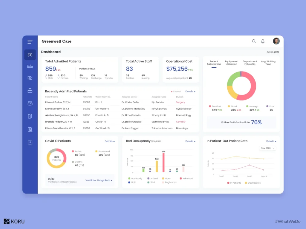
This hospital management dashboard helps resolve the complications of paperwork arising from all the departments of the hospital. It provides a no-fuss view of the current status and helps to cover everything in simple intuitive clicks. It can maintain & manage patient clinical records, track bill payments, and monitor inventory supplies as well. An additional function is that it can monitor new patient admissions and track COVID-19 patients.
3. Efficiency-enabling dashboard
Here’s another seamless interaction in a dental practice management dashboard. The provider simply has to select the affected tooth, examine the treatment details that pop up in the options & select the action to be taken. The provider can also view & download the essential report from the display popup. This unified dental management software has been designed to make the practice more efficient and convenient.
4. Contextual data in a patient portal to save time
Time is of the essence when it comes to designing the functionality of EHR, and so is the context of the information provided. Physicians have to filter through voluminous patient data during the actual visit, which only ends up being a distraction and hinders their decision-making.
Here is a patient portal that displays a list of patients to be treated. Clicking on an individual record shows a patient’s predisposition to a particular illness, along with their real-time insights. Furthermore, healthcare practitioners can easily access/preview their documents with the Document Preview section. This data assists healthcare professionals to make the best possible decision at the point of care.
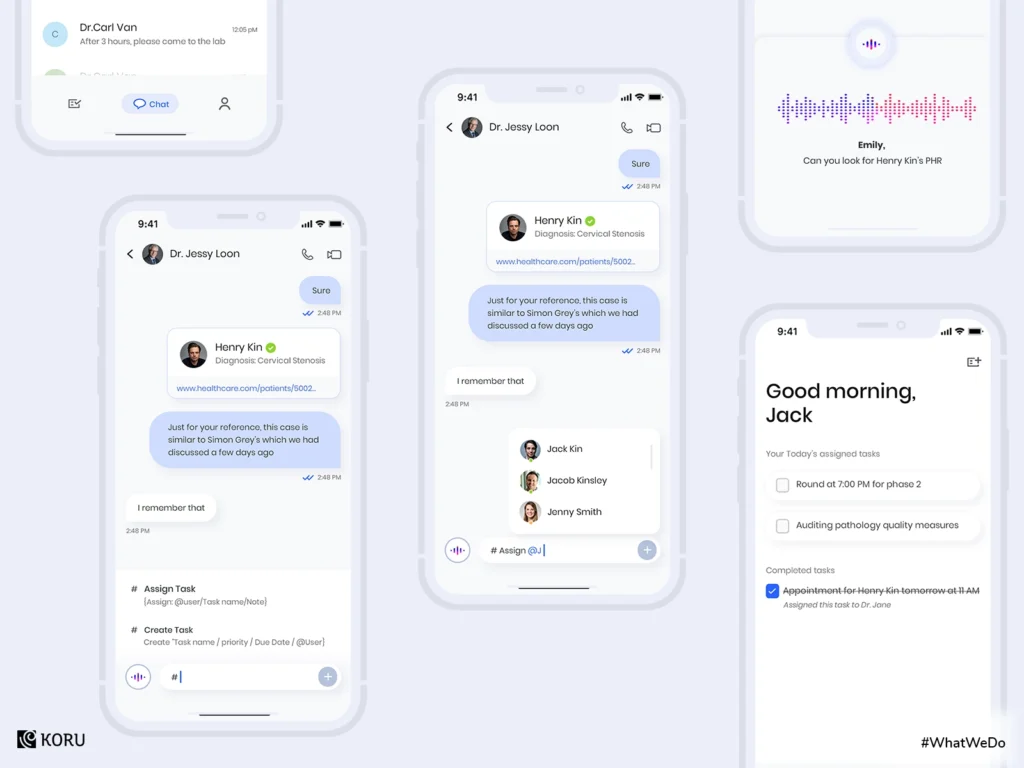
5. Communication platform for healthcare professionals
This clinical communication platform has comprehensive functionality that helps medical professionals to connect with each other. Doctors can view their tasks with ease and chat with colleagues within the facility. There’s also the added ability to assign and create new tasks within the chat section. Communication tools have to be simple to use and high on functionality. Designing these requires in-depth user research to identify active as well as latent needs.
A well-designed user interface is what enables ease of use in an application, and it is especially crucial in the case of healthcare management products. It highlights the most important details in a contextual manner, guides users through the steps, and suggests what to do next, resulting in necessary action. If you have any queries or want to know more about designing healthcare product design, do get in touch with us here, and we can get the discussions rolling.


