


Ever wonder why some SaaS tools are universally loved while others barely get a nod?
It often boils down to the design and user-centricity of a product.
“Design methodology tailored to organizational needs is the gateway to successful user adoption.”
Steve Judge and Brian Thompson
This insight is particularly poignant today, where employees navigate multiple application interfaces daily, each boasting its unique way of working. Such an environment can be overwhelming and fraught with pitfalls. In fact, inappropriate software use and onboarding challenges contribute to a staggering 91% of enterprise software errors.
Besides, did you know, that 49% of workers in the U.S. would leave their jobs out of sheer tech frustration?
High product adoption rates aren’t just bragging rights; they signal an alignment between user needs and product design. Conversely, a low product adoption rate can serve as a distress signal, indicating fleeting engagements and unmet expectations. Let’s dive into the hurdles of user adoption for SaaS apps and highlight the design strategies that can elevate your SaaS product/app from being another name on a list to a trusted user favorite.
5 Challenges of User Adoption for SaaS Apps and Strategies To Overcome
Discover 5 UX strategies for successful SaaS user adoption and avoid costly oversights.
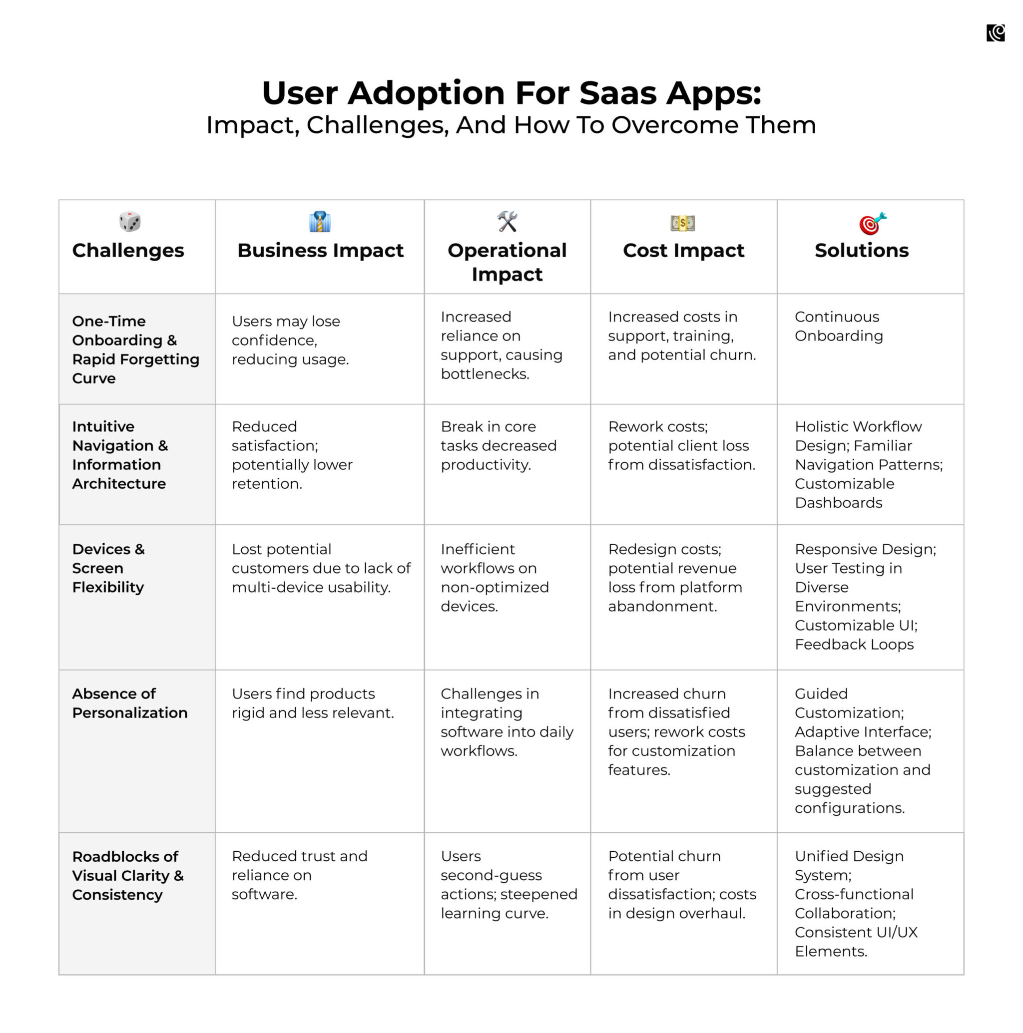
Strategy 1: Redefine Onboarding for the Long Haul
One of the most significant pitfalls for SaaS platforms is the belief that a single, initial user onboarding session is enough. But, the rapidity at which human memory deteriorates is unsettling. To put it starkly: Ebbinghaus’ Forgetting Curve indicates users forget 50% of what they learn within an hour, and a staggering 90% after a month.
Tackle the Challenge through Continuous User Onboarding
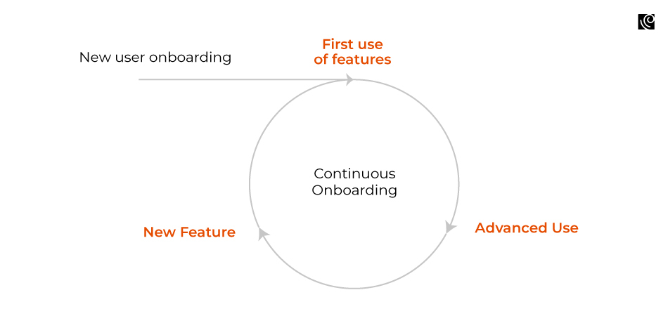
Continuous user onboarding is the practice of consistently guiding users beyond their initial interaction with the software. It’s a dynamic approach to user education, ensuring they’re not just introduced to a tool, but also evolve with it.
Take Trello for instance. For the first-time user, Trello might introduce its core features: boards, lists, and cards. But the learning doesn’t stop there. As users become more advanced, they are introduced to power-ups, integrations, and other advanced features, ensuring they continually unlock the platform’s potential. Periodically, Trello pushes helpful hints or showcases less-known features directly within the platform. This serves as bite-sized, digestible knowledge reinforcement.
However, the principle of continuous user onboarding isn’t restricted to periodic updates. It’s about ensuring smooth workflows to minimize friction. Whenever users stumble or encounter ambiguity, they should be met with intuitive solutions. Streamlined user onboarding workflows help diminish potential frustrations.
Make sure that the new features are woven seamlessly into the user journey, preventing any feelings of displacement. And don’t overlook the power of familiar UI elements. Recognizable symbols and actions dramatically reduce the learning curve, letting users engage with a sense of familiarity and confidence.
Strategy 2: Streamline Your App’s Navigation and Information Architecture
One of the most common pitfalls in SaaS product design is the disconnection between the product’s information structure and the users’ core tasks.
Consider this scenario: A user needs to create an order, get multiple approvals, source from two vendors, and manage internal communications. If the product’s interface segments these related tasks into different areas, it increases friction. Users have to jump from one section to another, losing the natural workflow. For a SaaS product that handles tasks like these, segregating order creation from vendor management could hamper the user’s efficiency.
You can overcome this with Design
Through the design thinking lens, intuitive navigation is more than just user-friendly design. It’s about empathizing with users, understanding their daily tasks, and ensuring the product reflects their workflow. When we observe and listen to our users, we can create interfaces that feel intuitive because they align with their natural behaviors and expectations.
“Good information architecture can do more than just help people find objects and information. It can empower people by making it easier for them to learn and make better decisions.”
— Donna Spencer
- Holistic Workflow Design: Understanding the user’s journey from start to finish is paramount. When designing, ensure that related tasks follow a logical sequence. In our scenario, the process of order creation, vendor selection, and internal approvals could be streamlined into a singular, step-by-step workflow, guiding the user effortlessly from one task to the next.
- Use Familiar/Intuitive Navigation Patterns: Implementing common and recognizable navigation structures (like sidebars, top-bar menus, or tab structures) can help users instinctively know where to go next. For instance, a tabbed interface might separate ‘Order Creation’, ‘Vendor Management’, and ‘Approvals’ but keep them within the same overarching ‘Order Process’ view.
- Customizable Dashboards: For power users or those with specialized roles, allowing them to tailor their dashboard or main interface to prioritize their most frequent tasks can greatly reduce navigation time.
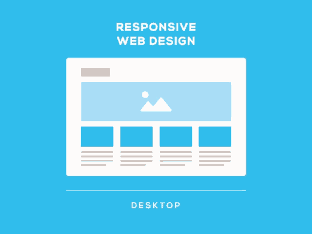
Strategy 3: Responsive Design Across Devices & Screens
While working with a client, our design team encountered an enlightening example of device adaptability. The SaaS product we were working on was primarily designed for the web, tailored for the precise clicks of a mouse. However, during user interviews, a revelation struck us. A significant portion of the client’s sales representatives, always on the move, predominantly accessed the product via tablets. They didn’t have the luxury to open laptops during field visits. This was a design oversight we hadn’t anticipated.
SaaS products, by nature, are designed to streamline operations, enhance productivity, and simplify workflows. When they are not accessible or optimized for various devices, it directly impacts these core objectives. Plus your product is less likely to be adopted widely. Users will seek out alternative solutions that fit their environment and workflow better.
Responsive Design is the linchpin in averting these problems
It’s a design philosophy that inherently adapts to the device and screen size, guaranteeing a consistent user experience. But it doesn’t stop there. To fortify your SaaS app’s adaptability, you should embark on a journey of User Testing across diverse environments. This entails regularly subjecting your product to various devices and screen setups, pinpointing pain points, and continuously refining the design.
Additionally, a human-centered design approach acknowledges the diverse contexts in which users access SaaS products. Design thinking encourages us to prototype for different devices and environments, ensuring our software is adaptable and inclusive.
Strategy 4: Craft a SaaS Experience as Unique as Your Company
Imagine this scenario: three individuals, all from the same organization, log into their HR software. One is an employee, the next a project leader, and the third a member of the HR team. Each has different objectives:
- The employee may want to bookmark attendance and payroll, tasks they frequently access.
- The project leader may be more focused on organizational reports and overall employee performance.
- The HR team member, managing a gamut of tasks, might prioritize recruitment dashboards and employee grievances.
Lack of personalization poses a huge challenge for B2B companies. A SaaS product that doesn’t offer customization can come across as rigid. When users can’t tailor the product to their specific needs, they might find it less relevant and harder to integrate into their daily workflows. Paradoxically, while users want customization, offering too many options without guidance can overwhelm them. They could end up with a cluttered interface that hampers productivity.
You Must Design for Flexibility and Relevance
Personalization, from a design thinking standpoint, is about acknowledging and celebrating user diversity. By prototyping different user dashboards and incorporating iterative feedback, you can ensure you create tailored experiences that resonate with each user’s unique needs.
Additionally, an adaptive interface, which learns and suggests layouts based on a user’s role and frequency of tasks, can be a game-changer. It streamlines tasks, fosters familiarity, and ensures teams remain on the same page. In essence, design should guide users to an optimized experience that melds seamlessly into their daily workflows, thus driving product adoption and consistent usage.
Strategy 5: Ensure Visual Consistency Across the Product For User Trust
Envision scrolling through a SaaS platform like Slack and, suddenly, the familiar notification icon you’re used to looks entirely different in another module. Or imagine while using project management software like Asana, you discover two features with similar purposes but different names and visuals.
Lack of consistency and cohesion also poses large risks of errors such as Avon’s failed ERP implementation and Citygroup’s $500 million mistake.
Situations like these seed doubt, causing hesitation and often leading to decreased user engagement. A lack of visual clarity and consistency doesn’t just appear aesthetically unpleasing—it’s a genuine barrier to user adoption for SaaS apps. At the core of this issue is two-fold:
- Confusion Hampers Confidence: When elements or terminologies are inconsistent, users second-guess their actions. Taking Instagram as an example: a simple action like ‘saving a post’ gets convoluted when the saved items appear under ‘all posts’ rather than ‘all saved’. This uncertainty makes users wary, causing them to retreat from exploring other features or relying on the software.
- Learning Curve Intensifies: With inconsistency, every module or section becomes a new learning experience. Users have to repeatedly adapt, making the software seem far more complicated than it is. Recall large organizations where teams, working in silos, inadvertently create diverse visual elements for similar tasks—this siloed approach results in a disjointed user experience.
A Unified Design System Is The Way Forward
For users to trust and adopt software, your design must not only be clear but also consistently echo that clarity across all its facets. To facilitate this, a unified design system is non-negotiable. SaaS giants renowned for their extensive features, maintain a consistent user experience by adhering to robust design principles. This encompasses a standardized color palette, typography, and component treatments. Additionally, cross-functional collaboration is also paramount. It ensures design maintains a standard naming convention, avoiding duplication and preserving consistency.
Final Thoughts: The Pivotal Role of Design in SaaS Success
For product leaders steering SaaS ventures, recognizing the pivotal role of design isn’t just beneficial—it’s imperative. Beyond mere aesthetics, it’s designed to shape user experiences, foster adoption, and build lasting product loyalty. In an era where choice is abundant and users’ patience is limited, a user-centric design can be the differentiator between a successful product and one that gets lost in the digital shuffle. Embracing a design-first approach isn’t just about making interfaces look good; it’s about ensuring your product feels right and works seamlessly for the users.


