


Uber UX Strategy & Case Study
Many people believe the simplicity of Uber’s user experience (UX) was the driving force behind its rapid success – but this isn’t quite the case. Yes, UX had a huge part to play – but there is nothing “simple” about Uber’s UX strategy.
The ridesharing app’s rapid success is a fascinating case study for UX fanatics like us and presents a textbook example of a cloud-based technology using a clever UX strategy to disrupt an entire offline industry.
For those unaware of Uber’s origin, the ridesharing company was founded in San Francisco in 2009. As of 2019, people can request Uber rides in 785 metropolitan areas across the world. Uber makes the process of calling a taxi easier, more accountable, and more secure, using a clever interface to turn the process into something akin to playing a video game.
UX basics: “Design” isn’t king or queen – The user is always royalty when it comes to UX
UX is often misunderstood outside the tech and design industries and its definition is often confused with the idea of “interfaces that are easy to use”.
According to Wikipedia, “UX refers to a person’s emotions and attitudes about using a particular product, system or service. User experience includes the practical, experiential, affective, meaningful, and valuable aspects of human-computer interaction and product ownership.”

UX is many things to many people, but at its core, it’s about optimizing a functional experience to appeal to a user’s senses and engage their emotions while they are interacting with a product.
Many UX designers will tell you that ‘design is king’, but they are mistaken – it’s the user that is the king or queen – and the design is centered around them and their experience.
By the careful melding of visual design, information architecture, usability, and other elements, a property’s UX can create a welcoming and intuitive experience that evokes feelings of delight, curiosity, and satisfaction – just like a functional work of art. In contrast, where UX is poorly conceived and executed, the user is left feeling frustrated, deterred, and worst of all – disengaged from a product or service.
By taking heed of the notion that the “user is all” and through following well-established UX principles, Uber set an industry standard and created a myth in the process – the myth of simplicity.
Using Uber is a smooth process that is often described as being ‘simple’ and this is the great myth of Uber’s UX Strategy – simplicity. Stop the meter, driver – Uber’s UX is anything but simple. It’s complex but easy to use – and that’s the gold standard of UX design.
Complex yet easy to use:
The ultimate challenge of UX design
There is a world of difference between something that is simple and something that is complex, but easy to use.
Imagine the interior of a luxury sedan. There are plush leather seats, an ergonomic steering wheel, and bright instruments to show speed, fuel consumption and the status of your engine. The interior is elegant. It makes you feel at ease in a sophisticated and potentially dangerous machine. You push the keyless ignition start button and the engine quietly comes to life with almost no sound. All you have to do is work the pedals, turn the steering wheel, and pay attention to your instruments and you are driving in comfort to your destination of choice.
The experience of driving this vehicle is simple and satisfying – but you know in the back of your mind that your experience as a driver is a deception and a car is actually a complex machine.
The ease with which you start your car is emblematic of the user-focused design of modern automotive.
You just push a button and your car starts, but inside the engine, a controlled explosion is happening. Fuel is combusting and driving pistons that move up and down to turn the crankshaft which allows you to move the wheels. Valves open and close. Fuel rushes about in fuel lines. It’s complex, but it has been designed to be easy to use so you do not notice what is happening underneath the hood.
This is the challenge of UX design – to turn the complexity of an engine into the elegance of pushing a button.
As we can see, there is a key difference between simplicity and complexity, but for the user, the experience should be the same – whether they are interacting with a website, an app, or a smartwatch – it should be intuitive to use, easy to navigate and pleasing to the eye – but inherently powerful.
What NOT to conclude from Uber’s UX myth

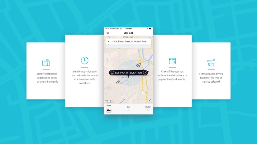
If you think about our luxury car example and apply it to Uber and the UX for its app, Uber has done an excellent job designing the “interior of the car” to present a simple appearance and hide the complexity within, that people are starting to believe that there is no engine at all. Such is the power of well-crafted UX design.
An example of a minimalistic approach that is confusing for users is when we find icons without text to identify their purpose. Sure, they can look very stylish and cool, but if their purpose is not immediately apparent to the user, then they fail the accessibility test. In other words, simplicity is great, but not at the expense of clarity. Remember – it is all about the user!
Too many companies have learned the wrong lesson from Uber and it’s disruptive UX. They think that simple must mean minimal, that visual design is not as important as usability and that “simple” means “something isn’t complex”. The truth of the matter is that simple is almost always complex and style is a design choice, not a by-product of functionality.
When it comes to modern UX, delight should be the default state, and users should be emotionally engaged. In Uber’s case, calling a taxi is like playing a game on your device.
Uber UX Strategy: The lesson for tech companies

So what’s the lesson here? UX can make or break your product – so carefully consider the delicate mix of complexity vs. ease of use.
UX has the power to both entice and repel your users. An intelligent approach to UX means that you can deliver an experience to your user that is intuitive and pleasing on the surface without diminishing the complexity and power that lies beneath.
When someone says to you that Uber’s UX is simple, you can remind them that a system that tracks hundreds of cars in real-time in each of the 300 or so cities that it operates in while tracking user feedback and managing a cashless system of payment cannot possibly be simple – but with solid and clean UX design it can certainly appear so to the user.


