


UX-led companies are the future.
Look at the big guns: Apple, Slack, Intuit, IBM, Salesforce, Atlassian, Adobe – the list goes on.
But how did investing in enterprise UX design elevate these companies above their competitors in the market?
They leveraged UX to narrow the gap between user and enterprise software.
They got the gist – UX isn’t just a detail; it’s the key to making real connections with users.
Think about it: when users feel understood and valued, they don’t just like a product; they stick with it. This loyalty translates directly into dollar signs, especially now when companies won’t think twice about ditching tools that don’t cut it.
This approach sets the stage for an in-depth exploration of the strategic role of UX in enterprise business, positioning it as a key driver of success rather than just a design element. Join us as we discuss the nitty-gritty of enterprise UX design, its challenges, benefits, best practices, and everything in between.
What is Enterprise UX Design
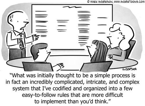
Just as depicted in the cartoon above, what may seem like a straightforward concept to outsiders — user experience for enterprises— is, in reality, an intricate and multifaceted process. The behind-the-scenes UX design involves numerous considerations, strategies, and guidelines. Enterprise UX Design refers to the specialized process of designing and enhancing the user experience (UX) of software applications and systems used within a business context. It focuses on the specific needs and workflows of professionals in their workplace.
Enterprise UX Design in Action
A few years back, our team embarked on a transformative project, integrating telehealth into EHR systems. The goal was to reduce the burden of healthcare providers swamped by the COVID-19 pandemic’s demands. Our mission was to streamline the shift to telehealth necessitated by new regulations and an unprecedented need for remote care.
Here are the user journey improvements that we worked on:
- Pre-consultation, where providers receive timely patient details
- Active consultation, enhanced with real-time translations and AI-assisted data retrieval
- Post-consultation, providing accessible summaries and recordings to reduce follow-up documentation errors.
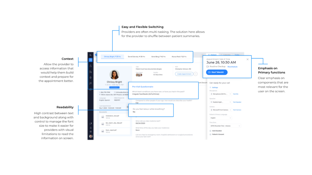
Impact:
- Utilization: 1.5 million minutes used per day across 80,000 facilities.
- Reach: Over 130,000 physicians with 100,000+ app downloads.
- User Satisfaction: Maintains an average app rating of 4.0.
This brings us to our next point.
Enterprise UX can significantly transform your operational efficiency and financial outcomes. But that’s not only why it’s worth paying attention to.
Why Enterprise UX Matters?
Let’s take the example of a customer service officer’s workflow.
To solve an issue regarding a service plan, the agent might first need to pull up the customer’s profile from the CRM before retrieving their current plan information from an entirely different platform. The whole process is tiresome and prevents employees from doing their work efficiently.
Good enterprise UX would be able to streamline the entire process into a single tool, resulting in
- Shortened business processes
- More intuitive internal systems (with less room for errors)
- More efficient sales/customer service officers- improving customer experiences in the process
- A decrease in the need for employee training
Studies state that companies with top design practices experience 2x faster growth than the industry-benchmark growth rate.
But that’s not all. Here are several key reasons why Enterprise UX holds such importance:
- Enhanced Productivity: By streamlining workflows and reducing the cognitive load on employees, well-designed enterprise applications can significantly boost productivity.
- Increased Adoption: User-friendly systems are more readily adopted by teams. When enterprise software is intuitive, training costs go down, and the speed to competency goes up.
- Enhanced Decision-Making: Good UX design helps present data in an actionable and understandable format, aiding better and faster decision-making.
- User Satisfaction: Indirectly, the ripple effect of efficient internal systems is felt by the customer through faster service, better products, and improved customer support.
- Competitive Advantage: Enterprises with a strong UX focus can differentiate themselves from competitors, offering a smoother experience both internally and externally.
- Cost Savings: Long-term, investing in UX can lead to significant cost savings by reducing the need for extensive training, support, and system rework.
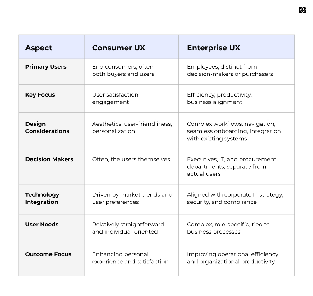
How is Enterprise UX different from Consumer UX?
Enterprise UX is a unique fusion of deep user understanding and strategic business alignment. It’s where intricate user needs intersect with complex organizational goals, navigating a landscape shaped by diverse stakeholder demands and stringent IT constraints. This specialized approach contrasts with consumer UX, as highlighted in the following table:
Characteristics Of A Great Enterprise UX
A standout enterprise UX transcends basic functionality, blending user-centric design with simplicity, emotional engagement, and intuitive operations. Here are the top five key elements of successful enterprise UX, pivotal in shaping the future of corporate software.
Intuitive Navigation
This is when the desired information or function is found naturally through instinct rather than instruction. It’s deeply rooted in thorough user research. It’s about creating a self-explanatory interface where every element feels like it’s in a logical place.
Users should not have to second-guess their next move; the design should lead them through tasks easily and efficiently. This approach reduces the need for extensive manuals or training sessions, allowing users to be productive from the outset.
Take Trello, for example.
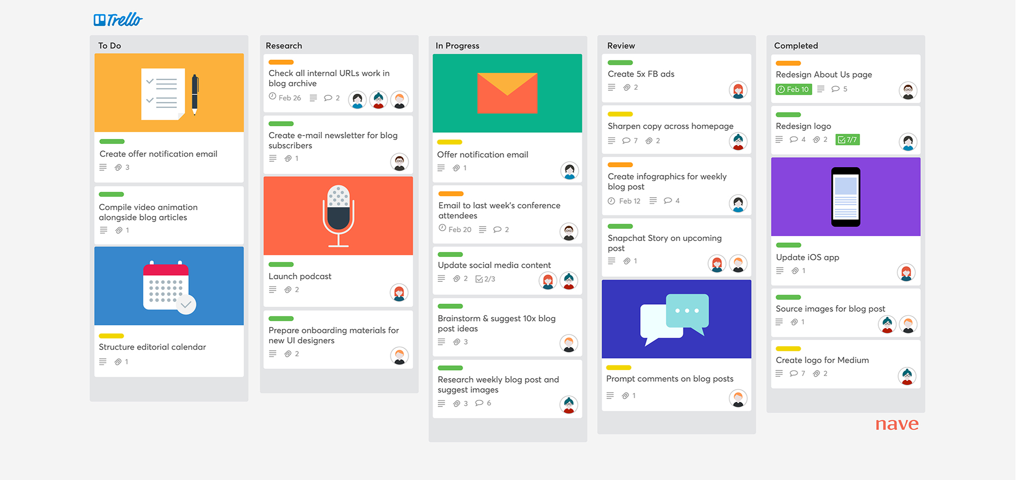
Known for its simplicity, it has mastered intuitive navigation within its project management platform. Let’s look at the prominent intuitive design elements:
- It allows users to dive right in, create boards, and populate them with tasks in cards.
- The learning curve is nearly flat, thanks to its visual guides and concise text directions.
- Trello’s interface uses color judiciously, not just for aesthetic appeal but as a navigational aid, highlighting important buttons and indicating active states.
Consistency
Consistency in enterprise UX design ensures a cohesive experience that users can quickly adapt to, reducing the complexity of learning new patterns with every interaction. By maintaining uniform design elements and interaction patterns, users can anticipate how the system will behave, fostering a sense of familiarity and reliability.
Consider Adobe’s suite of creative software
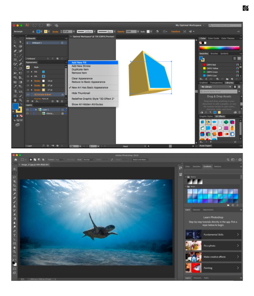
Their applications, from Photoshop to Illustrator, share a common language regarding tool layouts, keyboard shortcuts, and menu structures. Once you know Photoshop, it is much easier to reuse the same knowledge to start using Illustrator.
The design elements like buttons, sliders, and panels are consistently placed across different applications, which means users spend less time relearning and more time doing productive work.
Captivating and Emotionally Engaging
Fostering an emotional connection with users can significantly elevate the overall experience. By infusing personality and a sense of delight into applications, mundane tasks become more pleasurable, encouraging frequent and enthusiastic use. This emotional engagement can be achieved through friendly copy, engaging graphics, and interactive elements that evoke a positive response.
Take MailChimp, for example: How it makes $700m revenue.
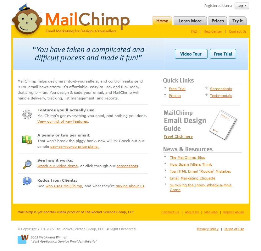
Mailchimp’s emotionally engaging UX transcends typical email marketing platforms by integrating humor and a distinctive brand personality, predominantly through its iconic mascot, Freddie. Their inventive campaigns, such as “MailShrimp,” leveraged whimsy to foster brand curiosity and connection. This emotional resonance is amplified by targeted drip campaigns and strategic social media advertising, which not only educate but also build a rapport with users.
Seamless Integration and Efficiency
The need for integrating multiple software should enhance, not hinder, existing workflows. The user experience should dovetail with current processes, enabling users to adopt new tools without disrupting their routines. By integrating intuitively with established systems, enterprise UX streamlines operations reduces adoption friction, and bolsters productivity.
Slack serves as a prime example of seamless integration in action.
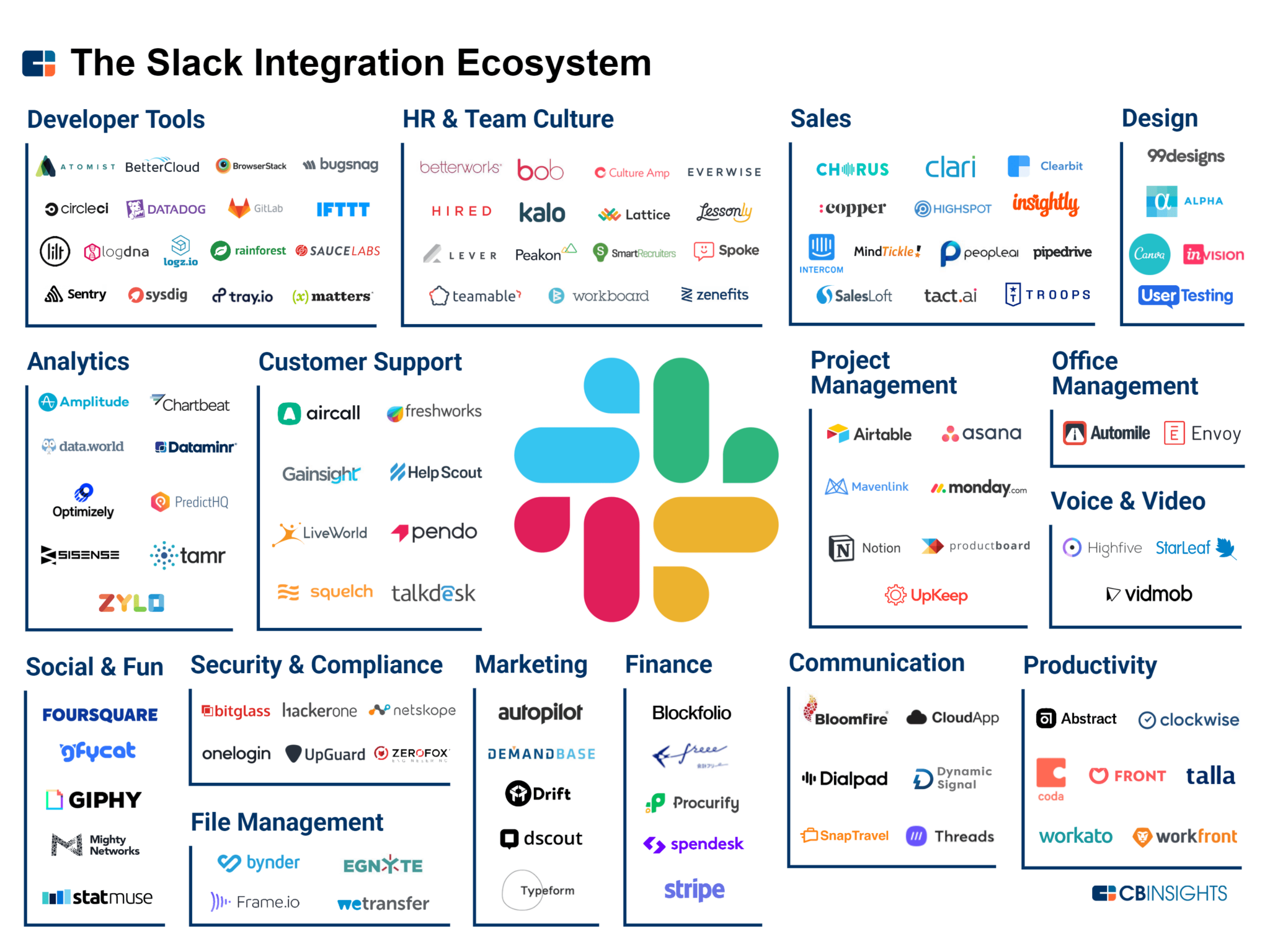
It blends into the daily rhythm of workplace communication with minimal intrusion. The platform connects with many tools and services that teams already use, pulling notifications and tasks into a central hub without overcomplicating user experience. It enables the automation of routine tasks and aggregating information from different sources, facilitating a more organized and responsive workflow.
Flexibility and accessibility
It caters to a broad spectrum of users by supporting various roles and permissions while offering customization options. This approach acknowledges the diversity of user needs and empowers individuals to tailor their experience to their specific job functions. Such adaptability enhances individual productivity and ensures a wider adoption across different organizational levels.
Salesforce exemplifies these principles by providing a highly customizable platform.
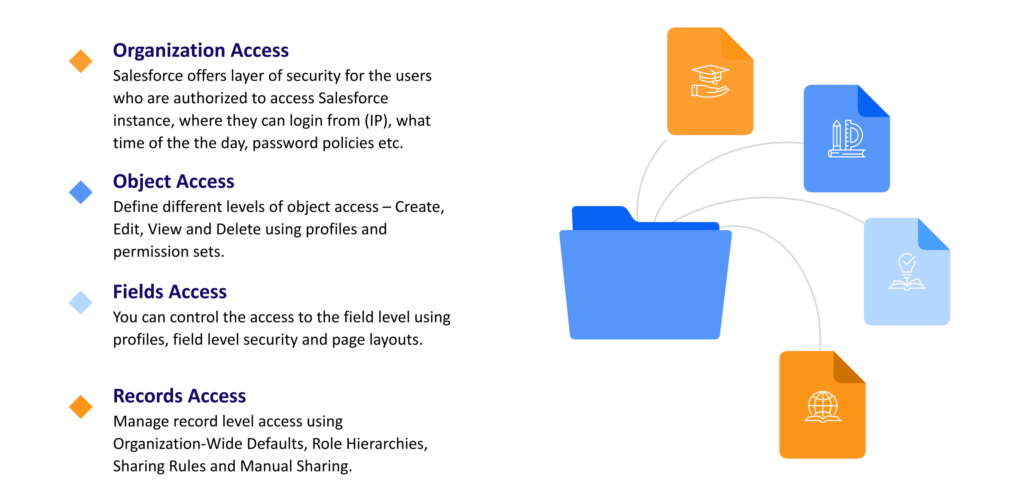
It adapts to different business roles and processes. Users can configure dashboards and reports to suit their unique roles, ensuring that sales representatives, managers, and executives all access relevant data. Salesforce’s permission settings allow precise control over who can view and edit specific information, securing data integrity and compliance.
The Role of Minimalism: How Minimalism Impacts Enterprise UX
Minimalism in the enterprise UX context isn’t about having less; it’s about streamlining complexity, making sure that users don’t get lost or overwhelmed amidst the intricacies of enterprise software.
This design philosophy is central to crafting well-designed enterprise products, aiming to enhance usability and user engagement while tackling common UX challenges.
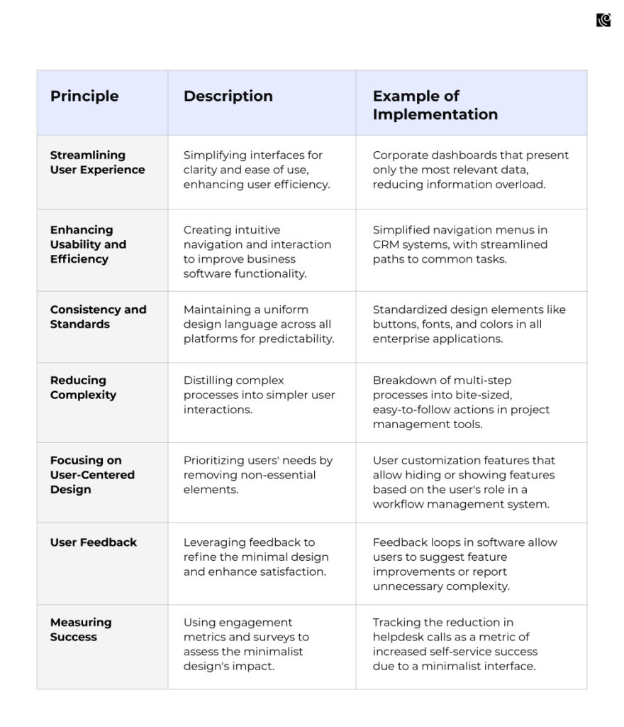
Applying Minimalist Principles in Enterprise UX Design
Minimalist principles focus on essential features to enhance usability and reduce cognitive load. By stripping away the non-essential, designers create intuitive interfaces that streamline workflows and elevate user productivity. Here’s how you can apply these principles:
Developing an Enterprise UX Strategy
In the 1970s, IBM’s second president, Thomas Watson, stated:
“Good design is good business.”
However, for good design to transform business outcomes, a good strategy must underpin it. According to an MIT Sloan report:
- Digital strategy drives digital maturity
- UX strategy constitutes a significant part of that maturation process
Implementing an enterprise UX strategy allows businesses to reimagine themselves for a new era.
A well-conceived enterprise UX strategy is a cornerstone for delivering products that meet and exceed user expectations. The journey to a successful enterprise UX strategy unfolds over time, demanding a systematic and phased approach.
The Double Diamond Approach
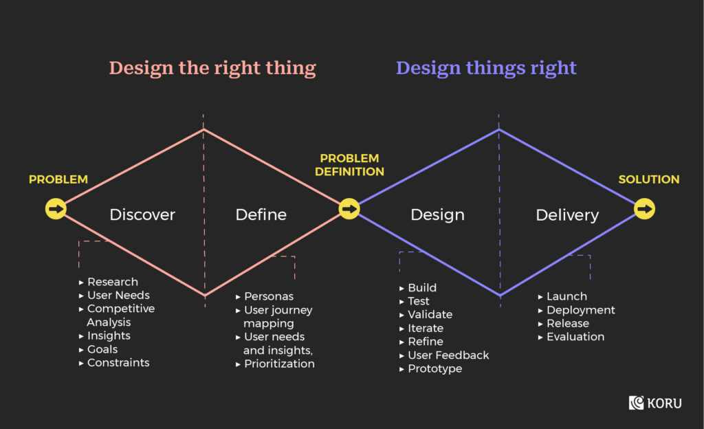
At Koru, we advocate for the ‘Double Diamond’ approach in developing an eUX strategy. This model, widely recognized in design thinking, involves four critical phases:
Discover
This initial phase is all about understanding. It’s where we immerse ourselves in the user’s world. We identify their needs, challenges, and behaviors, providing a solid foundation for the strategy. This is a phase of exploration where assumptions are put aside, and real user insights come to the fore. The primary activities in this phase are to:
- Define Research Objectives: Understand what needs to be explored and why.
- Make a Research Plan: Outline how the research will be conducted.
- Conduct Research: Engage with users and gather firsthand information.
Define
Here, we distill the insights gathered during the discovery phase. It’s about pinpointing the core problems to solve. This phase is crucial as it sets a clear, focused direction for the enterprise UX strategy. By defining the situation briefly, we ensure the strategy is on the right track. The primary focus here is to:
- Analyze the Research: Review and interpret the findings from the discovery phase.
- Conclude: Draw conclusions based on the analyzed data.
- Make Recommendations: Propose design or strategic changes based on conclusions.
Design
This phase is where creative solutions are ideated. Leveraging the insights and direction established, we brainstorm, prototype, and test various concepts and ideas. It’s a collaborative and iterative process, encouraging innovation and out-of-the-box thinking. This includes:
- Generating Ideas: Brainstorm potential solutions to the defined problems.
- Prototyping: Build mockups or models to visualize the ideas.
- Validating Concepts: Test the prototypes with users to gather feedback.
Deliver
Finally, we bring the strategy to life. This phase involves executing the developed ideas, refining them into tangible designs, and implementing them. It’s also about measuring impact, learning from user feedback, and continuously refining the strategy. The primary focus during this phase is to:
- Define Look & Workflow: Establish the visual direction and user journey.
- Design the Look & Feel: Craft the aesthetics, ensuring they align with user expectations.
- Focus on Micro-interactions: Enhance the overall user experience by refining minute details.
Tackling Enterprise UX Challenges Head-On: Best Practices and Solutions
From aligning with business goals to crafting user-centric designs, professionals in this field must tread a fine line to achieve success. Here, we delve into common UX/UI design challenges in the corporate environment, outline strategies for overcoming these obstacles, and provide real-world case studies as examples of successful enterprise UX improvements.
Challenge 1: Aligning UX Goals with Business Goals and Rallying Stakeholders
Ensuring that UX goals resonate with business objectives is crucial. This challenge magnifies when they attempt to rally diverse stakeholders behind a unified vision.
Why is this challenge pivotal?
Creating a product isn’t a one-person show; it necessitates a chorus of voices – from designers to engineers to marketers, each doing their part. However, syncing these diverse tones while ensuring the UX design remains attuned to business goals is where the real challenge lies.
Consider a product manager at a tech startup. They envision a user-friendly app, but:
- The sales team is pushing for features that boost monetization.
- The marketing team, on the other hand, is rooting for branding elements.
This cacophony can lead to a product that’s neither user-friendly nor effective in meeting business goals.
*Enter The User-Centered Business Framework*
The Law of win/win says, let’s not do it your way or my way; let’s do it the best way.
Greg Anderson
Rather than approaching this in silos, embracing the user-centered business framework can align the ensemble. It emphasizes:
- Existing Solutions: What’s the current market landscape? What are competitors offering, and where do the opportunities lie?
- Early Adopters: Engage the first users. Their feedback can act as the North Star, guiding the product’s direction while considering business objectives.
- User Fears: In the era of data breaches and privacy concerns, addressing these fears can be a game-changer. Communication becomes the key.
To learn more about the nitty-gritty of stakeholder alignment, you can dive into our on-demand webinar:
Challenge 2: The Buyer Is Not The End-User
Product leaders know this conundrum: the one who holds the purchasing power is different from the person who’ll ultimately use the product. In an enterprise setting, the decision to purchase new software might be made in the boardroom, but it’s the employees on the floor who will use it daily.
Understanding The Challenge
The crux of the problem lies in separating decision-making from actual usage. When C-level executives or senior management make purchasing decisions, they might focus on cost, brand reputation, or scalability. However, they might overlook the nuances of everyday use, such as user-friendliness or specific usability requirements.
This discrepancy can lead to a scenario where end-users grapple with software that doesn’t cater to their specific needs or preferences. The result? Reduced efficiency, potential resistance to using the product, and increased requests for workarounds or modifications.
The Way Forward: User-Centric Tailoring
The solution lies in bridging the gap between decision-makers and end-users:
- Deep Dive into User Demographics: Understand the varied user personas who’ll interact with the software. This could range from sales executives inputting daily data to HR managers tracking employee performance.
- Segment and Study: Group these users into meaningful clusters based on their unique demands. For instance, the finance team might prioritize data security, while the sales team might focus on ease of inputting and retrieving client data.
- Tailor-Made Solutions: Once these clusters are defined, craft solutions that cater to each segment’s unique needs. By customizing features or interfaces based on user requirements, the product becomes more user-friendly and efficient.
Challenge 3: Navigating the Minefield of UX Debt
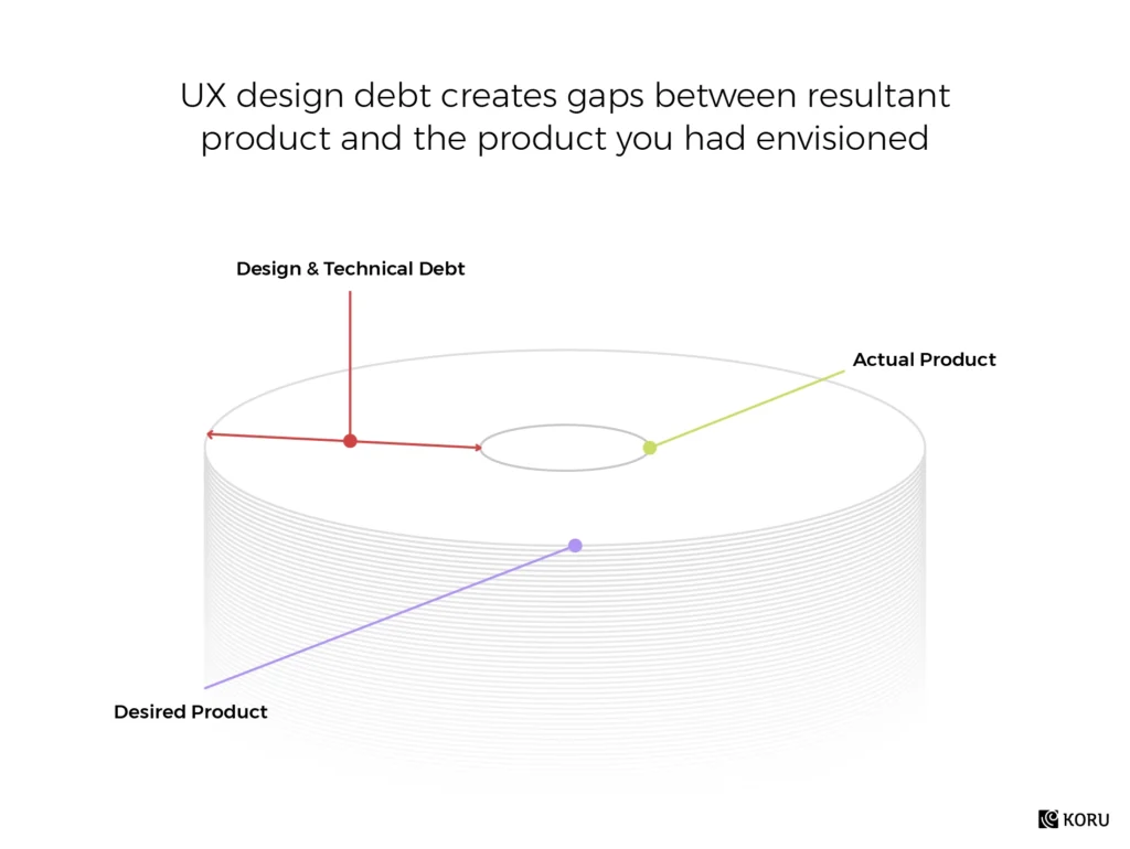
Enterprises often unknowingly accumulate what’s known as UX debt. Think of it as the accumulating cost of shortcuts or compromises made during product design or iteration. As financial debt grows, so does UX debt, particularly in enterprises where swift decisions and rapid product launches can sideline user experience.
Existing UX debt is a ticking time bomb.
It’s the backlog of design choices that were good enough for the moment but could have been more optimal for the long term. As businesses scale, this debt becomes glaringly evident. It manifests as confusing user interfaces, poor interactivity, or even loss of user trust. Left unchecked, the cost of resolving this debt multiplies, impacting user retention and business credibility.
The Way Forward: Addressing UX Debt Proactively
- Audit & Identify: Initiate a thorough UX review to spotlight areas where debt has accrued. This could range from non-intuitive layouts to cumbersome workflows.
- Prioritize & Plan: Not all debt needs immediate repayment. Rank them based on impact and effort to resolve. Address high-impact, low-effort items first for quick wins.
- Iterate & Improve: Redesign and refine, focusing on user-centric solutions. Ensure regular feedback loops with users to avoid piling on new debt.
Challenge 4: Innovating Within Budget Constraints
In the enterprise context, budgetary restrictions are a frequent hurdle. While innovation demands freedom and resources, many teams find themselves caught in the dilemma of aspiring to innovate but being shackled by tight budgets.
The challenge is straightforward yet profound
How does one push the boundaries of creativity and innovation without breaking the bank?
Shoestring budgets can often stifle creativity, hinder experimentation, and push teams to opt for tried-and-tested methods rather than venturing into the unknown.
Navigating the Budget Crunch: Strategies for Innovation
- Embrace Continuous Product Discovery: A proactive approach to ongoing research and testing paves the way for well-informed decisions. By identifying potential pitfalls early, teams can prevent the wastage of resources on non-viable products. This ensures a match between product offerings and customer expectations, making the development process more efficient. For instance, Atlassian’s enhancements for their Jira platform emphasized continuous product discovery, promoting alignment of technical and business teams even before development.
- Prototype Wisely: Use low-fidelity prototypes to test ideas. These require fewer resources and can quickly give insights into what works and what doesn’t.
- Prioritize & Phase: Instead of aiming for a large-scale overhaul, break down the innovation process. Start with smaller, feasible innovations and gradually expand as budget and results allow.
Challenge 5: Collaboration Resistance
At the foundation of user-centric design lie multidisciplinary teams. But the road to effective collaboration is often marred by management resistance and the looming shadow of organizational silos.
What’s The Root of this Challenge?
Why does this resistance surface?
Deep-seated organizational habits and the ‘silo mentality’ are prime culprits.
As Jeff Gothelf, author of Lean UX, puts it succinctly, “Silos are the death of collaborative teams.” This fractured approach dampens inter-disciplinary dialogue, paving the way for distrust and a defensive attitude.
Strategies to Promote Cross-Functional Collaboration:
By creating interactions between product managers, developers, QA engineers, designers, and marketers, you put everybody on the same page and level.
Jeff Gothelf, Author of Lean UX
- Early Engagement of Stakeholders: Involving stakeholders from the get-go ensures everyone is aligned from the project’s inception. This early engagement paves the way for shared goals and understanding.
- Develop Personas and Scenarios: Creating personas and defining scenarios is not just a designer’s job. Engaging the entire team in this exercise fosters shared empathy for the user. It helps everyone visualize the end user’s needs and challenges.
- Collaborative Design Exercises: Encourage designers and non-designers to co-create lo-fi wireframes. This practice demystifies the design process for non-designers and highlights the value of diverse perspectives in problem-solving.
Measuring Success In Enterprise UX Solutions
Designing a good UX isn’t the endgame; understanding its effectiveness is.
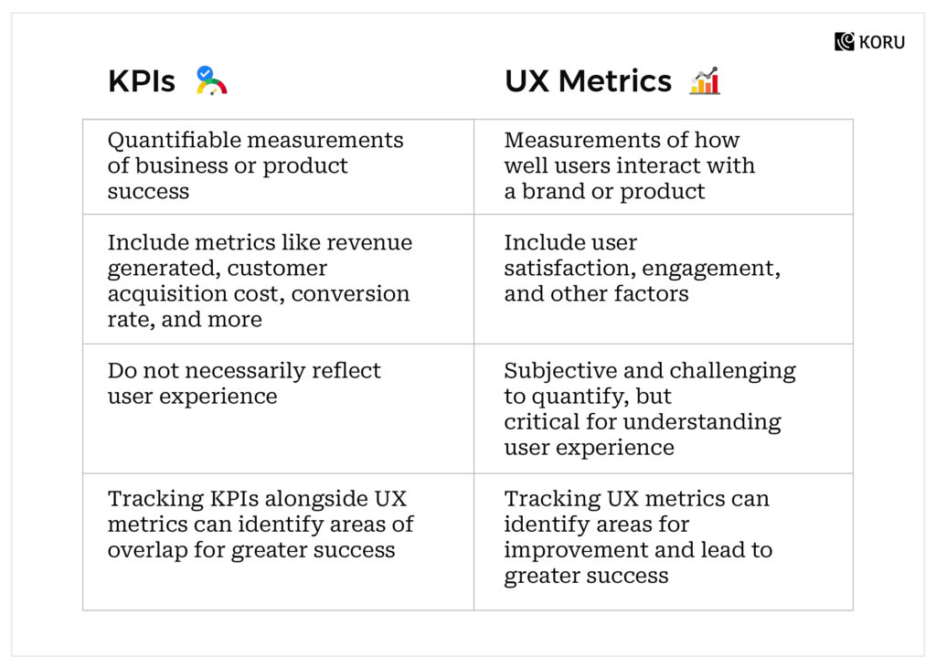
Measuring the impact of UX design can propel businesses forward, fine-tuning user interactions and driving profitability. However, one cannot stress enough the need for outcome-oriented experience metrics rather than merely output-oriented KPIs. Here’s a brief difference between both:
How to Measure Your Enterprise System’s UX Success
Step 1: Align Metrics with UX Strategy
It’s imperative to discern the connection between metrics and their respective success indicators. A well-defined UX strategy will delineate which metrics align with specific success markers and how they resonate with individual activities.
Step 2: Safeguard Against Ambiguity
With varied stakeholder expectations and intricate systems, enterprises can easily meander into metric confusion. By establishing a robust UX strategy, potential ambiguities can be nipped in the bud.
Step 3: Tailor Metrics to Business Objectives
Adapt UX metrics to resonate with business goals. If, for instance, an enterprise aims to slash internal training expenditures, measuring task completion time or success rates pre- and post-software can offer valuable insights.
Step 4: Translating Business Goals to Metrics
This is a reciprocal relationship. Just as business goals influence the choice of metrics, the insights derived from these metrics should echo back, refining and realigning business goals. Design solutions, too, should be aligned in a way that bolsters these goals.
Final Thoughts
The undeniable influence of UX in shaping the future of business is no longer a debate. Enterprises, big or small that prioritize user experience find themselves at a competitive advantage, both in terms of financial gains and customer loyalty. The alignment of UX design with business goals, the nuanced understanding of the user, and the strategic approach to design challenges play a pivotal role in an enterprise’s success.
However, achieving this optimal synergy demands a holistic strategy, one that puts the user at the center while balancing business objectives. As we’ve explored the intricacies of Enterprise UX design, the challenges it faces, and the strategies to address them, one thing remains clear: UX is not just an added feature; it is the very fabric of future-centric businesses. Investing time, resources, and effort in UX today will pave the way for a more connected and user-centric tomorrow.
Related Enterprise UX Resources
Deep Dives
Enterprise UX Research: What to Expect – A practical guide to researching complex B2B software
Handling Complex Use Cases in Enterprise Applications – Strategies for designing multi-faceted workflows
Creating User Personas for Enterprise Applications – Building accurate personas for B2B contexts
Trends & Examples
UI Design Trends in Enterprise Applications – What’s working in B2B interface design
3 B2B Apps with Delightful UX: Slack, Trello & Toggl – Case studies in enterprise UX excellence
4 Enterprise Apps Excelling in User-Centric Features – Real-world examples of great B2B UX
Practical Guides
The Ultimate UX Audit Checklist for SaaS and Enterprise Products – A systematic approach to evaluating enterprise UX
7 Things to Enhance Your B2B Product’s Experience – Quick wins for enterprise products
Top 8 Principles for Crafting SaaS Design – Design principles for power users and beginners
AI & Enterprise UX
The Impact of AI on B2B Enterprise UX Design – How AI is transforming enterprise interfaces
Leveraging Gen-AI for B2B SaaS Product Design – Practical applications of generative AI
Ready to improve your enterprise product’s UX? Talk to our team about enterprise UX design services.


