


What if you got a chance to visit the Louvre Museum in Paris, but could spend no more than 15 minutes there? Chances are you’d rush to the Salle des États, the largest display room in the museum and home to the superstar herself, the Mona Lisa.
There’s a solid reason why the Mona Lisa was shifted to the Salle des États in 1966 in the company of other Venetian masterpieces. The most famous painting in the world deserves to be seen by every single person who sets foot inside the Louvre with utmost ease – a textbook mobile UX practice.
Interaction design defines mobile UX design to be focused on accessibility, discoverability, and efficiency to optimize on-the-go interactive experiences. It refers to the design of user experiences for hand-held and wearable devices.
Designing for mobile users began gaining precedence in 2014 as their numbers steadily rose. UX designers had to learn to make the best use of smaller screens and cater to human physical limitations such as fingertip size. Mobile users expected quick access with minimal effort and zero friction.
Designing for Mobile Users

If we were to identify some typical scenarios for mobile phone users they would be –
Local discoveries – they use their device to find out about things around them such as a movie theater or a restaurant or even for directions.
Micro tasking – they use their device to fulfill certain short-term, specific tasks such as paying a bill or making an appointment.
Entertainment and information – they use their device to seek entertainment and news in the form of social media, games, and news plugins.
Communication – Calling and texting to share and exchange information.
Here are the best practices to keep in mind when designing for mobile users, keeping the focus on the scenarios above.
Main actions should be easily accessible
People tend to hold their phones in 3 main ways as shown in the diagram. Therefore, it is crucial to limit the action buttons within this defined span.
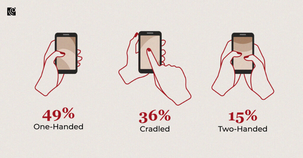
As the sizes of mobile phones keep on increasing, it is important to adapt your design to fit those. Also, it has been observed that most users (85% to be precise), operate their phones using one hand. The tricky part is that the bigger the device, the smaller the accessible zone is. This makes it very important to ensure that the main action buttons be easily accessed on a large screen with one hand within the thumb’s reach.
- The light zone should include the most frequently used controls and common action items so that they can be comfortably accessed with one thumb.
- The dark zone should be reserved for destructive actions to refrain users from accidentally tapping them.
Make tactful use of white space
White space or negative space refers to the empty area between and around elements of a design. It is an essential element of mobile design that can be prudently used to draw attention to important content. White space is a vital element used to enhance the readability and aids the prioritization of the content.
- Each section or screen must be designed to support actions that provide real value to the users. Doing so aids learning simplifies usability, and makes it easier to build on in the future.
- Improve comprehension by reducing clutter. Remove every element and feature that isn’t absolutely required. A simple rule of thumb to follow is that of having one primary action per screen.
Don’t overwhelm users
Information overload happens when the amount of input to a system goes beyond its processing capacity. Keep in mind that users have a limited cognitive processing capacity, so when faced with information overload, their decision-making capacity is impacted.
Information overload interferes with decision-making since there are a lot of details for users to consume. This is likely to happen when there’s an attempt to replicate successful web experiences on mobile applications with the expectation of the same result. Mobile users today have grown to expect certain interaction patterns and interface elements in their apps, as is evident from these trends. Not matching those expectations spells doom for the app.
- Only feature a limited set of features that are highly focused by prioritizing what’s actually important above the nice-to-haves.
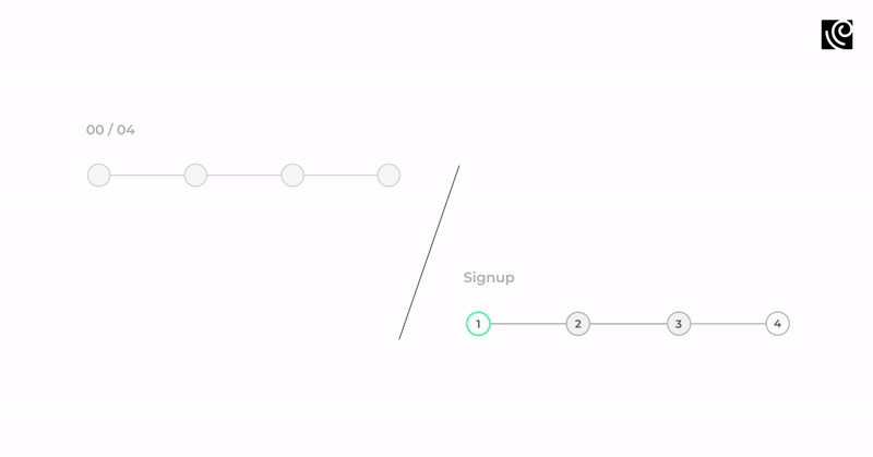
- Chunking is a rule of thumb that recommends the display of a limited number of input fields at a time and breaking down lengthier processes into pages, progressively disclosing fields as necessary.
Focus on content quality to send the right message
Airbnb from Koru UX Design on Vimeo.
Spare all the talk about how humans are more visual, for content is what provides value in most apps. It is therefore critical to pay attention to the quality of the content and do away with unnecessary elements that do not support user tasks.
- Simple and direct communication is vital to ensuring clarity. Acronyms, culture-specific axioms, and technical terminology should be avoided at all costs and replaced with familiar, understandable words and phrases.
- Card-style design is a great way to display actionable content because they allow content to naturally reveal itself – think Airbnb.
Consider legibility
Designing mobile interfaces presents unique challenges in terms of presenting voluminous information within a limited space in a legible manner. Always pick a font that works well across sizes and weights to ensure legibility and usability in every size. Remember that a smaller screen doesn’t necessitate the use of smaller text or less white space.
- The text should be at least 11 points to enable users to read it at an average viewing distance without zooming. The text or other elements should not overlap.
- Maintain a sufficient color contrast for the text to avoid it from blending into the background. Enhance legibility by increasing line height or element spacing.
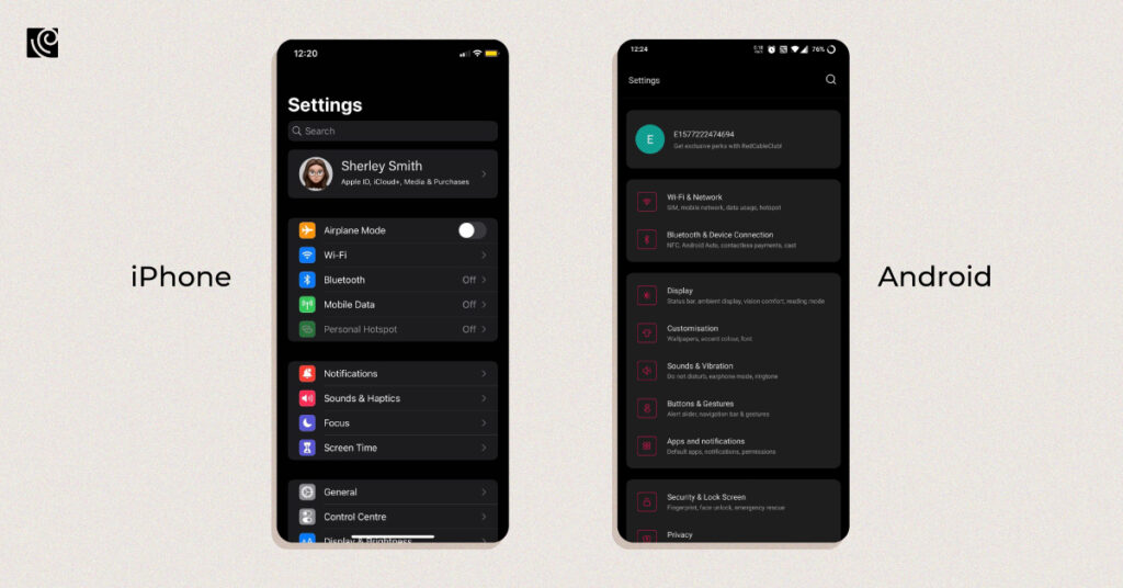
Keep the navigation simple
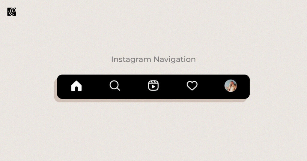
Aim to design the navigation in a manner that urges users to engage and interact with the content. If making use of tab bars, make sure to use labels for icons to avoid turning the navigation into a guessing game. Only use icons that are sure to be easily recognized and their purpose understood.
- Keep the navigation discoverable and accessible, while occupying little screen space. Assign tasks as per defined priority levels, giving prominence to paths and destinations that will be frequently used.
- Communicate the current location using indicators and reduce cognitive load by making actions and options visible at all times.
To conclude, do keep in mind that no matter how rigorously you follow these mobile UX design best practices, nothing can replace the need for usability testing. Users and their needs are unique and it is important to ensure that they are being fulfilled via the design.


