


Here’s a story from Netflix’s early days.
When Product Manager, Kate Arnold, and her team changed the company’s business model from pay-per-rental to subscription-based, it increased the overall inventory costs.
Through their analysis, they found that this was because people tended to watch the latest and most expensive content.
To lower this cost, the team needed to modify or change this behavior.
They then devised a solution to modify the behavior of users by developing a queueing system and a recommendation algorithm. The new system suggested older and less expensive movies to users, encouraging them to watch content that was cheaper to license.
This change in user behavior led to a decrease in inventory costs, achieving the team’s objective.
Sounds pretty easy, right?
But it only looks like it because they started with a clear business objective i.e. reducing inventory cost. And they were quick enough to find the reason for the rising inventory cost.
In the past, setting goals in output-driven and project-oriented management was relatively straightforward. However, in today’s digital and experience-oriented era, quantifying whether or not the product is working is less clear-cut — especially when it comes to measuring user experience metrics.
So…
What are UX Metrics?
Spuriously, UX is considered a subjective aspect.
User interface design metrics are reliable data points that evaluate the effectiveness of your UX strategy.
To effectively measure UX and innovation, product organizations need a robust framework that not only focuses on tangible impact but also on the innovation process itself.
Unfortunately, despite years of reliable research and empirical data on goal-setting theory, many organizations, including startups, still fail to measure the right things, or worse, neglect to measure anything of significance at all.
According to Userzoom’s UX 360 report, nearly two-thirds (63%) of digital experience professionals wish they could prove the value of UX to leadership.
Naturally, you’d ask if there’s a surefire way of measuring success, especially the success of your user experience.
Keep reading.
What you celebrate is more important than you think
Outcomes Over Output
You must be aware of Josh Seiden’s “outcome Vs. output” approach that prioritizes outcomes over outputs while measuring the success of a product. The same applies to UX too. In fact, it makes it easier to explain the value of UX to the stakeholders.
Tony Ulwick’s Jobs-to-be-Done and Outcome-driven Innovation framework defines an outcome as:
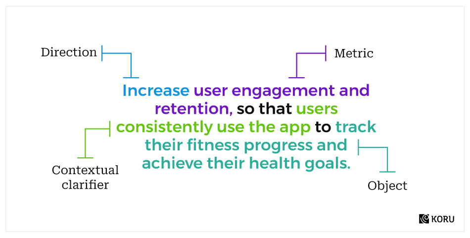
A metric that users use to measure success and value while performing a job.
An outcome statement can be thought of as a description of the result or benefit that you want to achieve while users use their product or services. For example, an outcome statement for a fitness-tracking app could be:
By focusing on the user’s desired outcome, UX teams can better understand their needs and develop products and features that align with those needs.
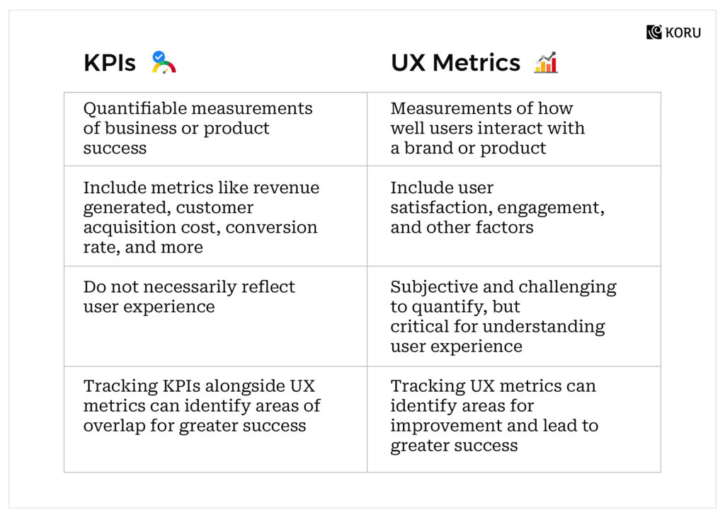
KPIs Vs. UX Metrics
While both KPIs and UX metrics are important for measuring product success, measuring KPIs alone can sometimes become too output-driven.
Over-reliance on KPIs may lead to a focus on short-term revenue goals rather than long-term user satisfaction, while ignoring KPIs may lead to a lack of focus on business goals.
By regularly evaluating both KPIs and UX metrics, product teams can identify areas of overlap and adjust strategies as needed to achieve greater success.
Common UX Measurement Tools
UI UX metrics, also known as UX measurement tools lie under three broad categories-
- Usability Metrics: It focuses on the ease of task or event completion by users. It includes commonly tracked metrics like time on task, navigation vs. search, task success rate, ease-of-use rating, etc.
- Engagement Metrics: It focuses on the way users interact with your product. Apart from the time per interaction, it also focuses on event streams, page views, scrolling, and most importantly, the attitude of the interaction.
- Outcome Metrics: It focuses on a relatively small set of users who are ready to commit to your product via prolonged engagement, usage, and retention.
Various companies and UX agencies deploy various methods and data points to track UX metrics. Let’s take a look at the prevalent methods and key UX metrics and how to measure these UX metrics:
Method 1: Net Promoter Score (NPS)
Introduced by Bain & Company founder, Fred Reichheld, Net Promoter Score (NPS) is a user loyalty metric that gauges how willing a customer is to recommend a product or service.
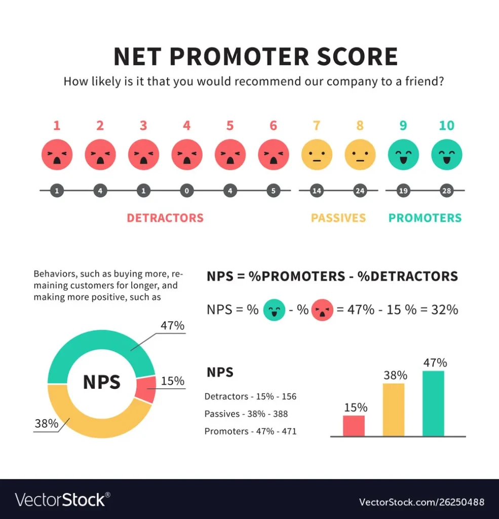
Net Promoter Score categorizes users into one of three groups: Promoters, Passives, and Detractors through their response to a simple question:
“How likely is it that you would recommend [Organization X] to a friend or colleague?”
Respondents are given a standard scale that ranges from 0 (not at all likely) to 10 (extremely likely). Based on the responses, users are categorized as Promoters (9-10), Passives (7-8), and Detractors (0-6).
- Promoters are the users who are loyal and likely to refer others, thus helping you to lower your cost per acquisition.
- Passives are generally satisfied users who can sway both ways, depending on competitive offers and incentives.
- Detractors are highly unsatisfied users, who may have serious issues with your product.
One of the main reasons why so many companies choose Net Promoter Score is its simplicity.
Although NPS lacks deep insights and specific reasons for a product’s success or failure, it can help you gain insight into the overall scenario and the level of urgency required to handle a given situation. This is why NPS is commonly used as an alternative or supplement metric to measure UX.
Method 2: System Usability Scale (SUS)
Another standardized UX measurement methodology is a usability testing tool developed by John Brooke in 1986, known as the System Usability Scale (SUS).
Comprised of a ten-item questionnaire, with five response options for respondents (ranging from Strongly Agree to Strongly Disagree), SUS helps UX professionals gather subjective information which NPS cannot provide.
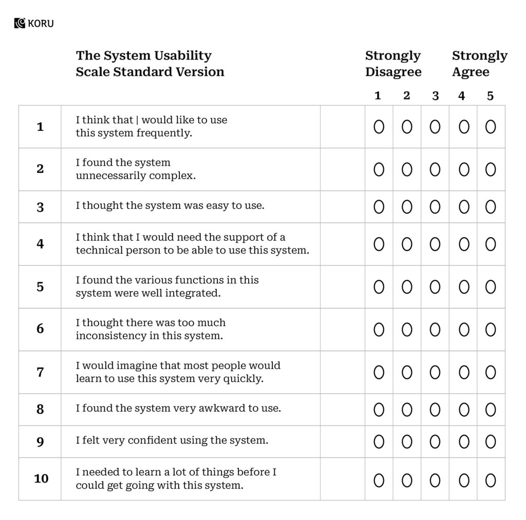
Interpreting SUS scores is a bit complex. The participant’s scores for each question are converted to a new number, added together, and then multiplied by 2.5 to convert the original scores of 0-40 to 0-100.
This is then used to produce a percentile ranking. Studies show that a SUS score above 68 would be considered above average and anything below 68 is below average.
Although SUS is a very easy method to administer and can be used on small user/test-case samples; the scoring system is complex and is not diagnostic.
Method 3: PULSE Metrics
The slightly more insightful methodology employed by UX professionals and agencies. This method includes tracking the following aspects:
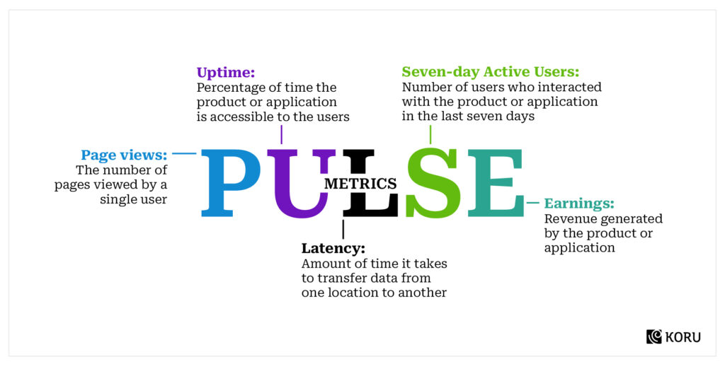
While the PULSE metrics remain more insightful than NPS or SUS methodology, it should be noted that it lacks context sometimes, thus becoming redundant for UX measurement.
For example, the number of Seven Day Active Users reflects the sticky quotient of the site, app, or software, but it doesn’t differentiate between new and returning users and doesn’t provide any insights into the users’ level of commitment.
Method 4: HEART Framework & Goals-Signals-Metrics Process
Developed by Kerry Roden, Hillary Hutchinson, and Xin Fu of the Google Research team, the HEART framework fulfilled the shortcomings of PULSE metrics.
Based on large-scale behavioral data, the HEART framework stands for Happiness, Engagement, Adoption, Retention, and Task Success.
Each metric from the HEART framework is scaled against a Goals-Signals-Metrics process. It is a simple method that keeps the entire UX team in sync by articulating the Goals of a product or feature, then identifying signals that indicate success, and finally, building-specific Metrics to track on a dashboard.
- Goals: The first step is assigning goals for the product or the feature, in terms of user experience. It may be related to task success or increasing engagement, or simply attracting more traffic/users.
- Signals: Once the goals have been determined, choose measurable signals that are sensitive and specific to the goal, as well as the method to collect and map those signals.
- Metrics: To capture metrics, and transform the signals into measurable data points, suitable for tracking overtime on a dashboard.
The combination of the HEART framework with the Goals-Signals-Metrics process provides you with precise information and analytical solutions to improvise User Experience:
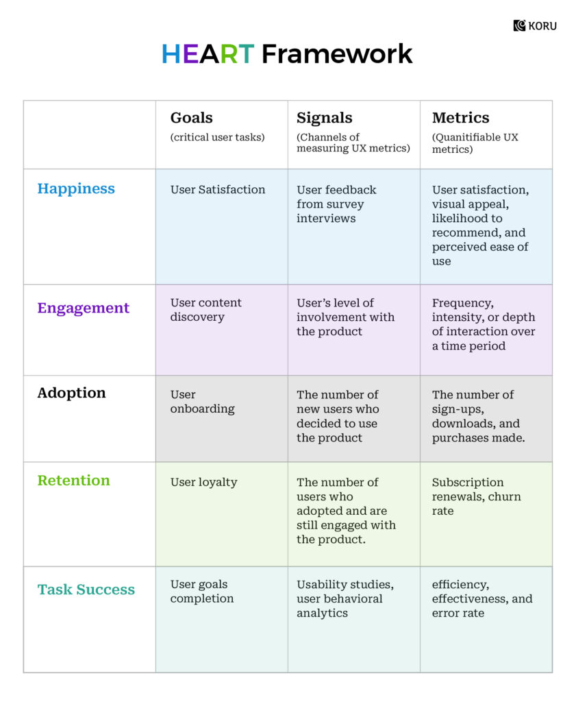
Each of these categories has specific metrics that can be applied for an individual feature/ section or the entire product/ project. The HEART framework can be modified as per the project requirement; by adding key metrics per category, by removing irrelevant categories or by focusing on a single category.
Key Usability Metrics for User Experience
Some of the frequently measured User Experience KPIs are –
- Task Success Rate: Task success rate is the percentage of correctly completed tasks by users. It reflects how effectively users can complete certain tasks.
- Time on Task: Time spent on each task provides us insights into how much time is being spent on the successful completion of a pre-defined task. Prolonged processes affect UX negatively.
- User Errors: During a given task, the number of error opportunities provides an error rate. Depending on the frequency and type of errors, we can evaluate the UX and usability of a website, app, or software.
- Search vs. Navigation: Analytic tools provide much-required information about users’ interaction with a product or application. Navigation vs. Search Ratio can provide information about the pages/features most frequently used.
- Form Usage: Every product or software uses a form to capture users’ information. However, from a UX point of view, it is advised to keep the forms restricted to essential fields only. Measuring the time taken to fill up a form or the number of visitors who abandon the process can provide an idea about the situation.
- Back Button Usage: Again analytic tools can tell you how frequently the ‘back’ button has been used while navigating through your website, app, or software. A higher number indicates a broken or faulty information architecture.
- Random Visitors vs. Conversions: While high traffic is a good thing, the conversion rate is the most important metric for any website, app, or software.
- Sticky Quotient: Apart from conversions, the sticky quotient of a website, software, or app also marks the effectiveness of UX and usability.
- Offline vs. Online Visits: In case you own an online as well as an offline entity, the difference between the number of visitors as well as conversions you get on both mediums should be a fair indicator of your UX and usability on digital platforms.
Time for Implementation
To create a killer UX metrics strategy, it’s essential to start by defining your organization’s KPIs and understanding your target audience.
Once you’ve linked your KPIs to UX metrics, you’ll be able to improve the user experience in no time.
Just remember to track your UX metrics over time and iterate frequently to keep your strategy on track.
And don’t forget to periodically audit your UX methods and metrics to ensure you’re still on the right track. With a solid plan and a witty eye for UX, your products will keep users happy and profits soaring.


