


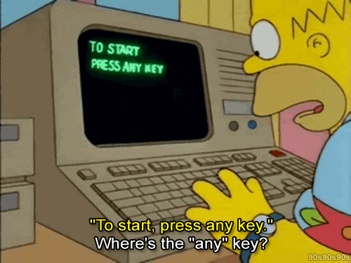
You instinctively know how to hold a coffee mug or unlock your house. But, what if you’re asked to conduct surgery? Land an airplane? You’d be clueless, wouldn’t you?
Psychologists and interaction design researchers Klaus Bærentsen and Johan Trettvik, state that everything humans know how to do has been learned by them at some point in their lives. Some things are learned as newborns; some as adults through conscious effort.
When we first learn how to do something, it is a conscious action. With practice, actions turn into operations that we can perform without considering them – riding a bicycle, cooking a dish, writing, or swimming. These actions become intuitive.
Things aren’t too different when it comes to designing enterprise products.
What is Intuitive UI and how does it drive a better user experience?
Intuitive product design is about creating products that are easy to use no matter how complex the jobs they are helping users solve. Intuitive UI interactions help shorten the learning path and enhance the experience of using the product.
According to the work of environmental psychologists Stephen and Rachel Kaplan, humans prefer landscapes that provide the most useful information for their survival. These preferences can be developed through two cognitive functions: understanding and exploration.
We have successfully evolved to instinctively seek environments that allow us to assess and gather knowledge from our surroundings. We have learned how to interact with different landscapes efficiently: where to find food, water, shelter, and, as importantly, what to abandon.
Cut to today, where, unfortunately, the users of enterprise products do not enjoy the luxury of abandoning them after their first poor experience. Instead, they are forced to find workarounds and spend extra time learning how your product works. What it results in is a steeper learning curve, usage of unauthorized tools, and a serious drop in productivity, not to mention the threat to the security of your operations.
Intuitive UI design allows product leaders to take a user-centric approach instead of a product-centric one. The former helps provide users with the best possible product experience, resulting in improved product outcomes of up to 200%.
Every product leader wants their product’s UI to be intuitive to users. The question is, how do they achieve it without having to provide a brief that goes –
“Make it simple to use, like Slack.”
“Make it fun to use, like Mailchimp.”
“Make it smooth and sleek, like Stripe.”
So, here’s what intuitive UI design really means.
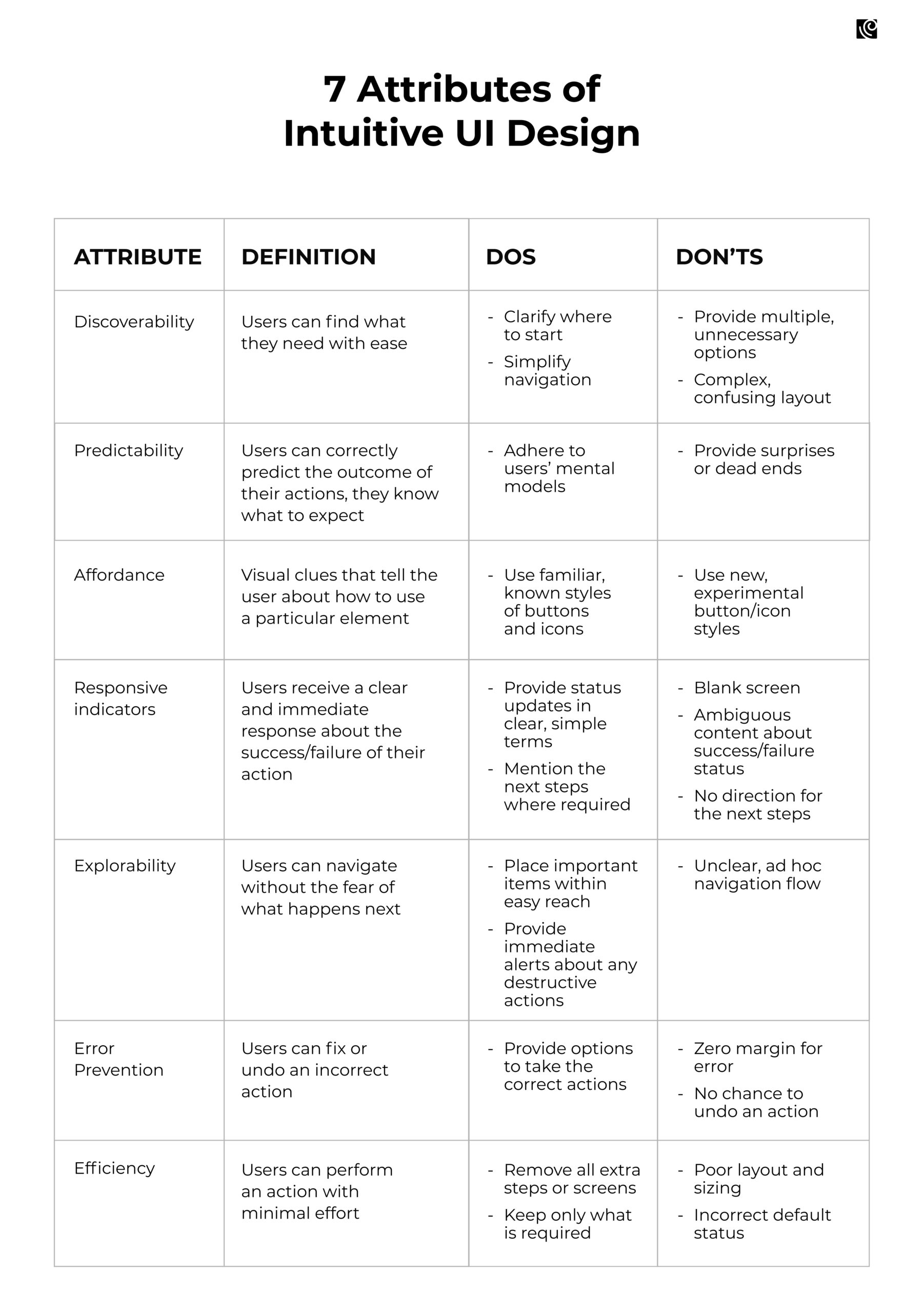
7 Examples of Intuitive UI Design
How Gusto’s dashboard aces discoverability
Discoverability refers to a user’s ability to understand a product and its capabilities and locate content and features they may not be aware of, and Gusto does a fabulous job with it.
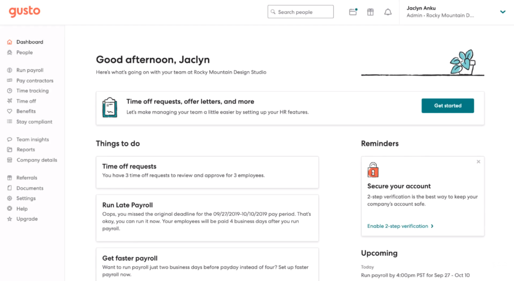
Gusto is not your regular HRMS. Its dashboard is packed with information, but it’s so clean and a breeze to navigate. All features are easily accessible from a side panel menu on the left of the screen. Users’ most recent payment details are front and center on the dashboard, and a clear CTA button takes users to their pay stubs.
The right side of the dashboard displays the status of users’ future payments, with a link to add a calendar reminder. The banner at the top of the page provides a link to a resource that users can use to determine their eligibility for assistance with their taxes.
How to achieve this?
- Conduct usability testing using heatmaps, A/B testing, surveys, or first-click tests to understand people’s actions and decisions. For example, did they use the navigation or search? Could they find the easiest route to complete tasks?
- Based on the data, design a clear, consistent, and simple navigation system, including menus, breadcrumbs, and sitemaps to help users discover and explore content and features.
Stripe’s users know exactly what to expect, thanks to its predictability
In his seminal book ‘Don’t Make Me Think’, Steve Krug mentions these questions that the user should be able to answer to ensure predictability –
- Where am I?
- Where should I begin?
- Where is the option to perform X action?
- What can I do here?
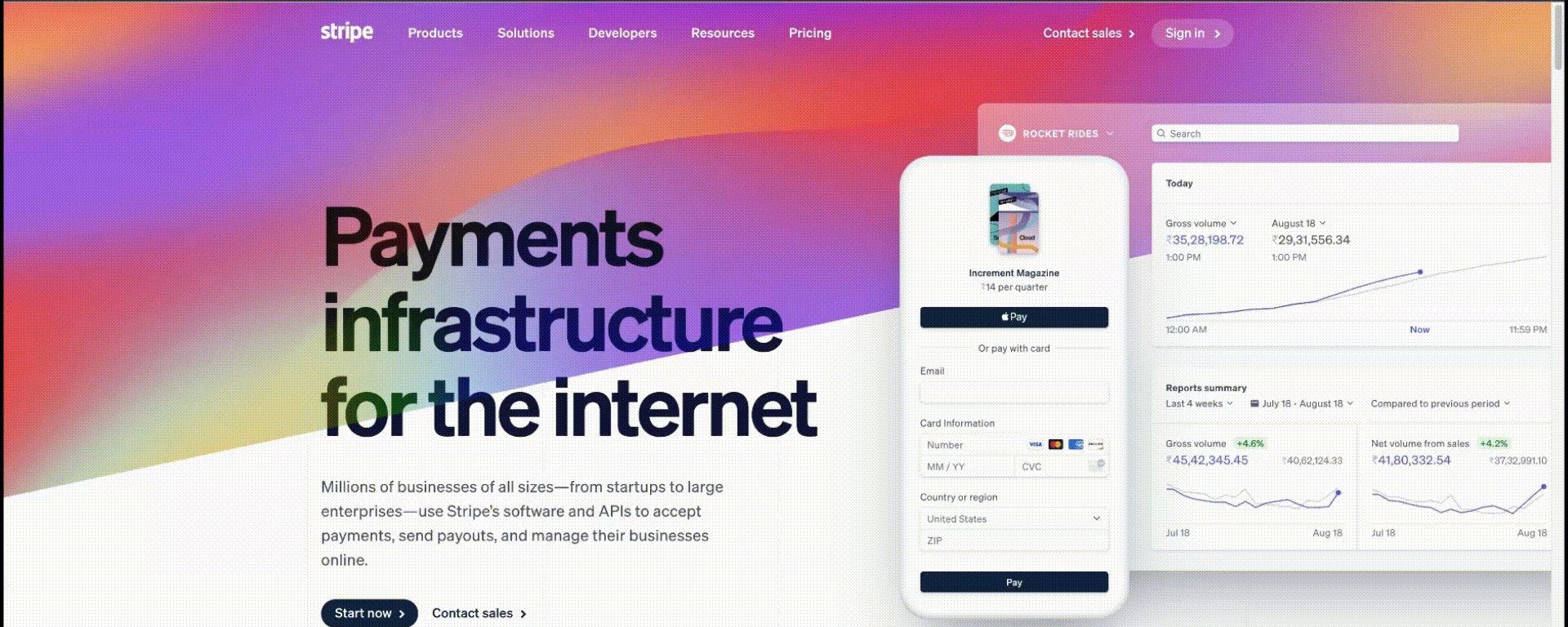
One look at Stripe’s homepage, here’s what really sticks out:
Elegant typography
Stunning color palette
High-quality images
Bold CTA buttons
Predictability is the feeling of assurance that your product’s features provide, which enables users to confidently play with it. These are features and elements that behave exactly how your users expect them to, even before any type of interaction happens. They are designed to be self-evident and self-explanatory enough for the user to feel welcomed. And Stripe’s homepage ticks all these boxes.
It’s quite like McDonald’s – where the customers experience a no-frills, fast, and friendly service, with food that tastes more or less the same every time, no matter when or where.
How to achieve this?
- Adherence to UI design standards and guidelines helps ensure a predictable user experience as they limit the number of different ways an interaction can work.
- Dive deep into the user’s actual experience with the product through contextual field studies. (An interesting P.S.: When Stripe had just launched, its CEO, Patrick Collison, went to customers’ houses to see how they installed Stripe).
- Lay out this data into an end-to-end user journey map and define the major phases with the smaller phases contained within them. Highlight points where customers expected something different than what they got – these are the pain points that need to be addressed.
Predictability is key to providing users with a sense of control and comfort, which is a hard-wired cognitive requirement in the brain. This helps speed task completion and makes people feel good about what they’re using, thus instilling trust in your product.
Intercom’s affordances enable users to take the right action
Affordances are mental shortcuts that help users understand the tasks that they can carry out on a digital interface. The simplest example of an affordance is the doorknob which conveys to the user that that’s how they can open or close the door.
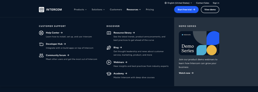
In the example above, Intercom deploys sharp contrast, hierarchy, and alignment to create a clear and attractive affordance for users to take the action of their choice. Its clean look removes any traces of chaos or confusion, considering how complex, and layered their menu is. Their use of the bold, royal blue buttons as a contrast invites attention for the user to take the right action.
How to achieve this?
- Always put the users first by researching their needs and their context to design helpful affordances for your users.
- Create logical and clear affordances that leave no room for misinterpretation.
- Use signifiers to provide more information to your users about the affordances you design. Use text labels, highlights, color, and shadows to make affordances obvious (As seen in the menu items above).
- Use size to show your users the affordances that they should prioritize.
Responsive indicators in Litmus let users know exactly what’s going on
A responsive indicator helps provide context, track progress, improve usability, and sometimes motivate users to complete forms and tasks. This can be an error message, small prompts, tooltips, button color changes, etc.
Designing for responsive progress trackers requires a comprehensive understanding of the process and empathizing with users–how are they feeling while completing this task, and what can a progress tracker do to alleviate any frustration and anxiety?
Litmus is a tool designed to test email messages across different types of software and devices, and here’s how it gets it right.
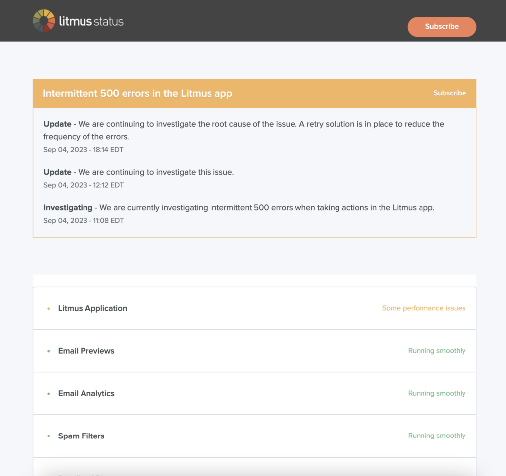
Their status indicator makes use of colors and style to match their overall design themes. Users have an at-a-glance overview of the status of each operation, leaving no ambiguity. There’s a section at the bottom that provides contact to their support agents, in case users have any queries or need clarification. Plus, the statement, ‘This status page is updated every five minutes’ lets users know about the frequency of the status refresh.
How to achieve this?
- Create explicit visual cues using colors, icons, or shapes informing the user where they are, what they have completed, and the next steps to completion.
- Use descriptive labels to communicate with users and provide context.
Remember, design your UI in a way that prompts users to quickly find their way around, take action, and get to experience value, fast.
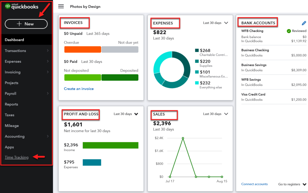
Quickbooks’ explorability makes users navigate with confidence
At some point, you come to make peace with the fact that enterprise applications, with their complex functionality, are bound to have complicated interfaces.
Well, there’s no need to give up that easily.
Quickbooks, an accounting software, had a navigation system that consisted of more than 50 tabs – this was before its redesign in 2013.
After multiple rounds of user research, they set a goal to make the product more usable and intuitive so that new users had an easier time getting acquainted with the product.
Following the redesign sprints, the team at Quickbook managed to reduce the number of tabs from more than 50 to just 10.
As a result,
- Their user base exploded from 250,000 to over 700,000 within a year after the redesign.
- There was a 23% increase in first-visit task completion.
- They experienced an NPS increase of 9 points
How to achieve this?
- Keep only the essential things within reach of the user, treat the rest as clutter.
- Make actions reversible, so that users can explore with confidence.
- Provide clear pathways to allow users to go back to the “home” status
Error prevention in InVision guides users through any mistakes they might make
Users feel safe to explore a product when they are assured that any action they might take won’t cause harm. To instill this level of trust, users have to be alerted when they’re making an error, with the intention to make it easy for them to do whatever it is they are doing without making a mistake.
Prototyping platform, InVision helps users transform a static design into a dynamic one that’s suitable for user testing or stakeholder feedback.
While InVision is simple to use, building prototypes still takes time and effort, and any mistake in the management of the prototype files can result in very frustrated and unhappy users. To avoid this happening, InVision intentionally adds friction to the deletion process.
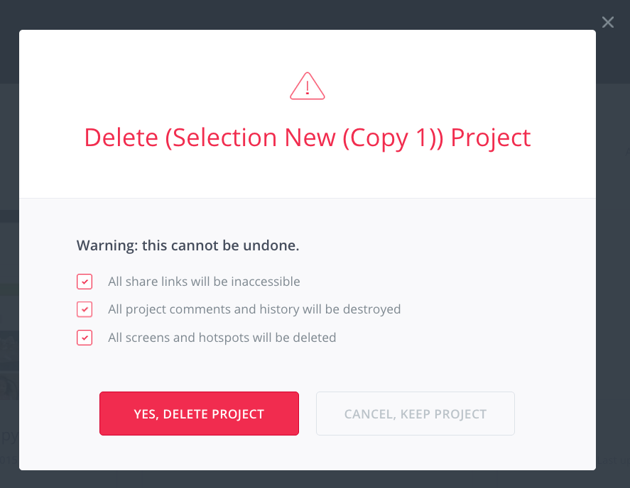
As seen above, it requires users to manually check off 3 boxes in order to delete a prototype. By making users take deliberate action, InVision reduces the risk of accidental deletion – thus instilling confidence in users that they won’t accidentally delete any file.
How to achieve this?
- Use design patterns that communicate how they work to users.
- Encourage users to double-check their work (especially before deleting), and warn before mistakes are made.
- Human error is inevitable, but it need not be catastrophic – always provide the option to undo an action
Exponea’s customization options ensure efficiency
Efficiency is how easy it is for users to fulfill their tasks. If someone wants to browse how easily can they do it? If someone wants to book an appointment, how easily are they able to view the available time slots?
Efficiency is about correctly predicting what the user needs at every step and preventing unnecessary clicks. It saves time that the user would otherwise spend trying to accomplish their task. Think auto fills or personalization of features.
Users have different intents when it comes to using the product. Efficiency is all about considering all intents and making the experience pleasing for the user.
Exponea is a Customer Data and Experience Platform (CDXP) that provides a powerful combination of advanced CDP, AI, Marketing Automation, and CRO capabilities. Its data-heavy interface allows users to learn about their customers buying journeys Their data is presented in various formats, including tables, modal dialogs, forms, reports, and graphs.
Their efficiency comes to the fore in the way they allow their users to customize the platform to the particular needs of every enterprise organization and every user within it.
With a set of graphs, custom behavior blueprints, and reports, Exponea users can quickly build and adjust data flows to their particular needs.
The app covers a wide range of data queries in the modern enterprise, going from fully visual representation of data.
How to achieve this?
- Remove all usability roadblocks, i.e. anything that makes your users stop and think about how to accomplish an interim activity on their way to their ultimate activity.
- Design for expectation – deep dive into the user journey to smooth over the bumps by inserting features that make it more efficient.
Finally, the recap!
Designing for enterprise users is a challenge. So, here’s what product leaders always need to keep in mind.
- Prioritize simplicity, and avoid overwhelming users with an interface cluttered with unnecessary elements.
- Design for every type of user’s abilities.
- Stick to common design patterns to help with quick adoption.
- Conduct periodic heuristic evaluations to assess your product’s standing
Enterprise products can be incredibly complex with hundreds of criss-crossing features and workflows. However, that should not come at the cost of cluttered, poorly designed interfaces that users can’t stand.


