

That enterprise UX is challenging is perhaps the understatement of the year. And, we at Koru UX have been fortunate enough to tackle a variety of UI and UX design challenges in our projects over the years. While it is true that enterprise systems are highly complex and mission-critical behemoths, human needs and requirements form their core.
The past year, with its varied ups and downs across industries, managed to throw up several design challenges. From bringing patients and healthcare providers to safely communicate in times of need to designing a more accessible way of healthcare data visualization, we took on some interesting UX challenges that tested us to the best of our ability.
Here’s a recap of the most intriguing UX challenges we solved in 2021.
Top UX Challenges of 2021
Challenge 1 – Fragmented service across multiple touchpoints causing friction in the end-user experience
Solution – Identify the pain points and areas of opportunity across the user journey
Customer journeys cover a multitude of things that happen before, during, and after the experience of a product or service. Enterprise user journeys, especially, can be long-winding, stretching across multiple channels and touchpoints, and lasting over a period of several weeks.
A telecom client reported a severe dip in customers along with rising costs of retaining existing ones, despite deploying tactics such as upgraded offers and discounted plans.
A deep dive into the customer user journeys threw up a novel insight – a significant number of customers dropped out owing to poor service over time. This, despite the company having kept a constant eye on measuring customer satisfaction and website and call center performances. What was truly pushing the customers away was the cumulative experience across multiple touchpoints over a period of time.
An average plan selection journey, for instance, spanned six weeks and involved an average of twelve phone calls, a site visit from a technician, along with email updates. Each interaction in isolation had at least an 80% chance of going well. But average customer satisfaction fell to 50% over the course of the entire journey.
While most service encounters were positive in isolation, the underlying problems left unaddressed, and the cumulative effect on customer experience was negative. A siloed focus on touchpoints means that there’s little to no attention paid to the customer’s end-to-end experience. To provide meaningful experiences requires a thorough study of the user journey from start to end.
Challenge 2 – Innovations in presentation of healthcare data visualizations
Solution – An accessibility-driven design approach
Data-driven decision-making in healthcare is paramount. The UX design community is constantly looking for innovative ways to display information and aid users to consume it in the easiest manner possible. Also, the healthcare industry is striving to adapt to the digital age by seeking seamless data visualization practices.
Our client was a US-based company providing clinical diagnostic solutions that provide fast and accurate results. A data-driven environment such as theirs relies heavily on well-designed, powerful solutions to analyze, store, and safely manage data. This overwhelming quantity of data requires adept management solutions, allowing users to make the right analysis and interpretations and detect anomalies in record time with a minimal rate of errors.
We conducted a UX Audit to gain a better understanding of their entire ecosystem. A standout finding of the audit was that a few users had trouble discerning the color blocks in the bar graphs in the data visualization system. From a design standpoint, relying on color alone for readability and affordance (possible actions that the user can take) was making it difficult for users who had visual impairments.
Users with visual impairments face varied problems in accessing and assessing information from all kinds of everyday workplace sources including the internet, documents, and presentations, photographs, maps, charts, and diagrams.
With this into consideration, we explored Ul options to present the data and see how it could be made flexible enough to accommodate users with varying levels of capabilities. We built a few options along with some variations and tested them with users to learn how the new solution faired.
Accessible design improves overall user experience and satisfaction, especially in a variety of situations, across different devices, and for older users and users with varied capabilities. It helps drive innovation by solving unanticipated problems, enhances the brand value of the business, and expands its market reach. The new solution complied with WCAG standards and conformed to WAGC 2.0 level AA.
Challenge 3 – Safe and secure remote communication among healthcare providers and patients
Solution – Telehealth integrated EHR system
The COVID-19 pandemic brought in a mandated distancing policy between providers and their patients, which caused a scramble for both, organized and unorganized telehealth solutions. However, this resulted in complications for providers who had to shuffle between multiple online tools to conduct their consultations. It also raised serious concerns about the quality of care delivery and patient safety.
During this time, the United States Department of Health and Human Services announced unprecedented steps to expand Americans’ access to telehealth services during the COVID-19 outbreak including expanded Medicare coverage for telehealth visits and waiving potential HIPAA penalties for emergency use of telehealth.
With over 95% of U.S. hospitals use a certified EHR platform, this was to be a key factor in the implementation of an appropriate solution. By integrating telehealth into the EHR, our goal was to merge aspects of patient care – safety, effectiveness, patient-centeredness, communication, education, timeliness, efficiency, and equity into a single, robust technology.
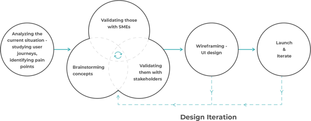
We used the Minimum Viable Product (MVP) design approach to create a viable, basic solution in a short span. This iterative process was perfect for the project as it built on constant user feedback and remained user-focused throughout. Here’s how the MVP process panned out for this project –
The solution we designed worked with existing EHRs and helped simplify documentation between appointments, helping providers make the most of this time frame. It also included pre-appointment responses from the patient to help providers prep in advance and triggered follow up steps required post-consultation.
Sure, enterprise UX has challenges aplenty, but this is what makes them worth a go. As we step into the new year, we’re looking forward to tackling bigger, more complex UX challenges to ensure that enterprise products get their due. Do you have a unique challenge to solve with your own enterprise application? Connect with us to explore possible ideas and solutions.


