


Human beings are naturally hard-wired to identify patterns, even when there may not be any present. Similarly, we tend to follow a pattern when using a new website or an app. We navigate it instinctively and get frustrated if the site does not respond the way we expect it to. If we encounter this frustrating experience in a consumer context, we have the choice of deleting the app or never visiting the said website again. However, such experiences in enterprise applications can negatively impact the productivity of the users, and thereby, the business goals of the organization.
Therefore, it is crucial for designers to create the right interface which aligns with this natural pattern-spotting in order to provide a comfortable navigation experience to the user. This patterned organization of visual elements in the UI is called visual hierarchy. This post explains the concept and logic that goes in the making of visual hierarchy.
What is Visual Hierarchy?
Visual hierarchy has been based on the Gestalt principles which explain the visual perception of elements and how people tend to unify the visual elements into groups. It is one of the core elements of the design process.
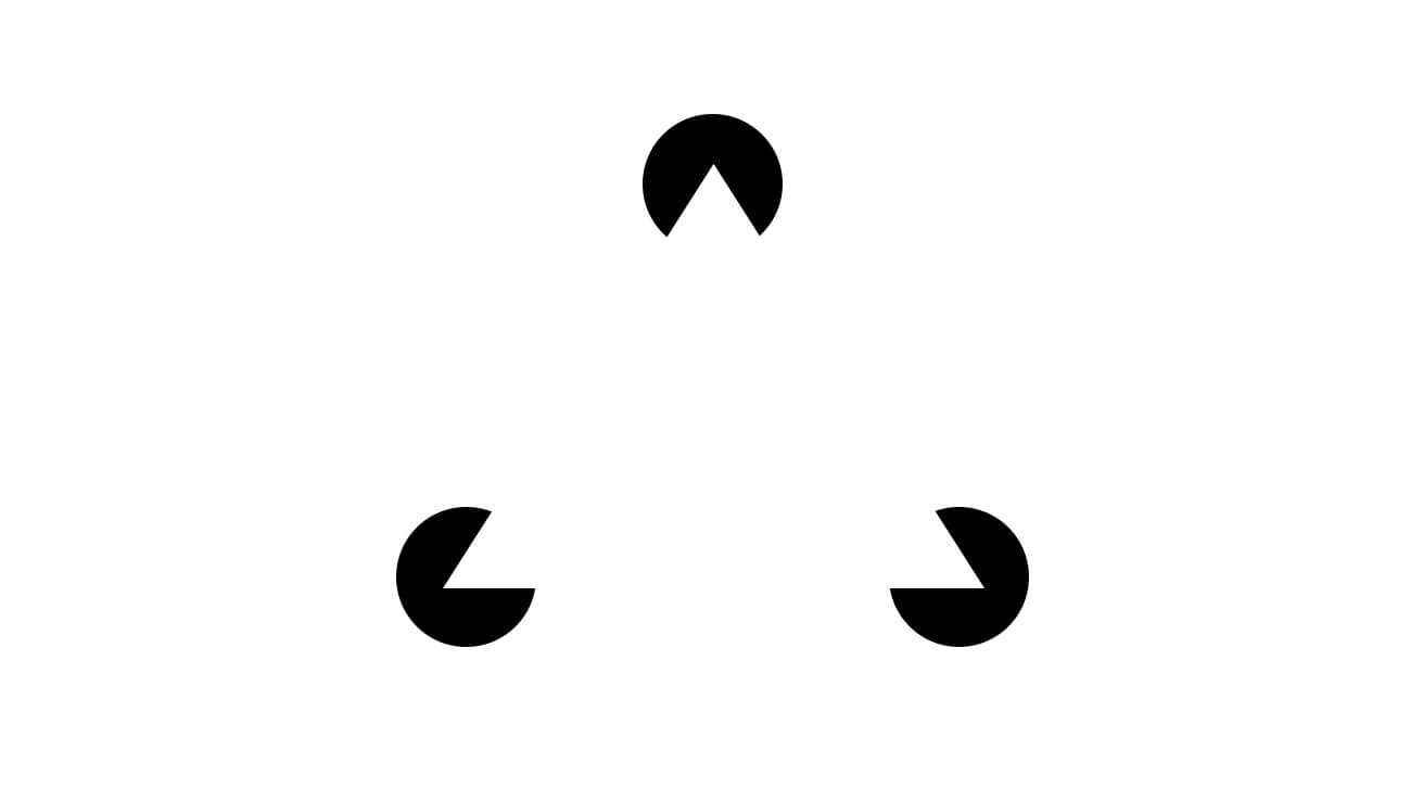
Visual hierarchy is all about creating the layout of the content in a manner that users are easily able to perceive the significance of each element. It involves organizing the UI components in such a way that the human brain distinguishes the elements based on their appearance in terms of size, color, contrast, etc.
Visual elements have a key role to play in a user interface. Components that are messy in appearance or those which are misplaced only add to the confusion of the user. Further, an unorganized copy is low on legibility, which leads users to put in extra efforts to seek the information they’re looking for, or an action they want to perform.
Just as with a sudden movement in the corner of your eye or an object of interest appearing in your periphery, our eyes are naturally drawn to certain captivating visuals. Of course, the detail may vary from person to person, but the majority of humans tend to follow certain visual patterns, and this includes how they view digital content.
- Clarity and cohesion in visual hierarchy and information flow makes for layouts that are easy to scan and follow.
- Visual hierarchy helps users achieve their goals faster and lead to better outputs.
Importance of Visual Hierarchy
“Chaos was the law of nature and order was the dream of man”.
– Henry Adams
Users naturally favor order as opposed to chaos, because it makes things easier to comprehend. Consequently, they prefer elements of familiarity when it comes to using digital products. Users express happiness and satisfaction while using an interface with well-organized elements.
UI patterns are the means which blend together structure patterns and logic to make delightful user experiences. It is truly said that ‘old habits die hard’, which makes it imperative for designers to consider user patterns carefully before finalizing designs.
The seamless experience occurs when the interactions are so smooth that the users navigate through them without having realized it. Even a few extra seconds that users spend on decoding the navigation can cause inordinate delays in the users fulfilling their intended aims and objectives.
How to Create Visual Hierarchy
Once you are thorough with the Gestalt principles, you can make use of them to emphasize elements or sections of the page that need to be highlighted or appear different from the rest. This is referred to as an anomaly and is used to create a visual contrast. This helps draw the viewer’s attention to a specific area or focal point, all the while enabling the overall flow and discoverability.
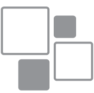
Size and weight
Elements that are larger in size are used to attract the viewer’s attention. This is one of the simplest and most effective ways to lend visual hierarchy. Enlarging a particular element’s size (dimension) and scale (its size as compared to other elements) is how to give it visual precedence over others. Components lower in priority can be de-emphasized by reducing their size to make them less visible — and thereby, lower in the visual hierarchy.
Color and Contrast
A bright pop of color naturally draws attention as compared to muted tones. Following the brighter tones, richer and darker hues can be used to generate focus. Lighter tints or grayscale colors are used further down the hierarchy. This is the color scheme to follow while creating a visual hierarchy.
Also, sharp contrasts in color are bound to appear more eye-catching than those with muted contrasts. Contrast helps in depicting the more important aspects of the design.
However, it is important to note that the use of colors has to be sensible and controlled, as the over usage of different colors only adds to visual chaos. This only dissolves any impact that would be made by the usage of colors. Therefore, colors should be used sparingly and with the right purpose to create the correct visual hierarchy.
Placement
Users are habituated to scan web pages in a set pattern. Certain areas on a page receive more attention than others. The area above the fold, and along the top and left sides are understood to be spots where the user’s eyes fixate on the most. Thus, these areas can be used to display important content.
Alignment
Alignment is used to establish an order between the components of the interface. For instance, placing text with a sidebar column creates a visual priority for the reader. Login buttons, considered to be a high priority element is usually placed in the top right-hand corner of a page. Larger font used as a heading placed on top of the page and its break with the alignment with the rest of the text creates a hierarchy that draws attention.
Whitespace
Whitespace refers to the area around the content; it may be white in color or of any other hue. This area can be used to draw focus towards certain visuals. Doing so comes with the dual advantage of making information appear pleasing to the eye, and letting the viewer zero in on each area of information.
Following these tools of the visual hierarchy can help in creating a UI that is user-friendly and positively impacts user responses and experiences.


