


While discussing product design, product leaders often find themselves immersed in dialogue, saying, “We desire simplicity for beginners,”
Meanwhile many assert, “But what about the experts?”
This conundrum takes center stage, especially in the SaaS market, where in 2022, a significant 60% of global revenue was credited to large enterprises with over 1000 employees.
Beginners approach an interface with a basic inquiry: “Where do I begin?”
They seek clarity, structure, and an intuitive roadmap.
Conversely, experts dive deeper, asking, “How can I maximize efficiency and customize this to fit my exact needs?”
For instance, think of the dexterity needed to build a data analytics tool—one where a data scientist finds depth and complexity, yet a marketing executive feels the ease of pulling straightforward reports.
Overcoming this is not just a design challenge—it’s central to creating a universally effective user experience. However, classifying your users as beginner/intermediate/expert isn’t quite as simple as it seems.
This blog will unravel the art and science of designing SaaS platforms that adeptly serve power users and beginners alike. These principles build on the foundations covered in our enterprise UX design guide.
Understanding the Users Through Design Lenses
The philosophical underpinnings of UX design undergo a transformation when the focus shifts from novice users to power users. Here’s a quick comparison between both user archetypes.
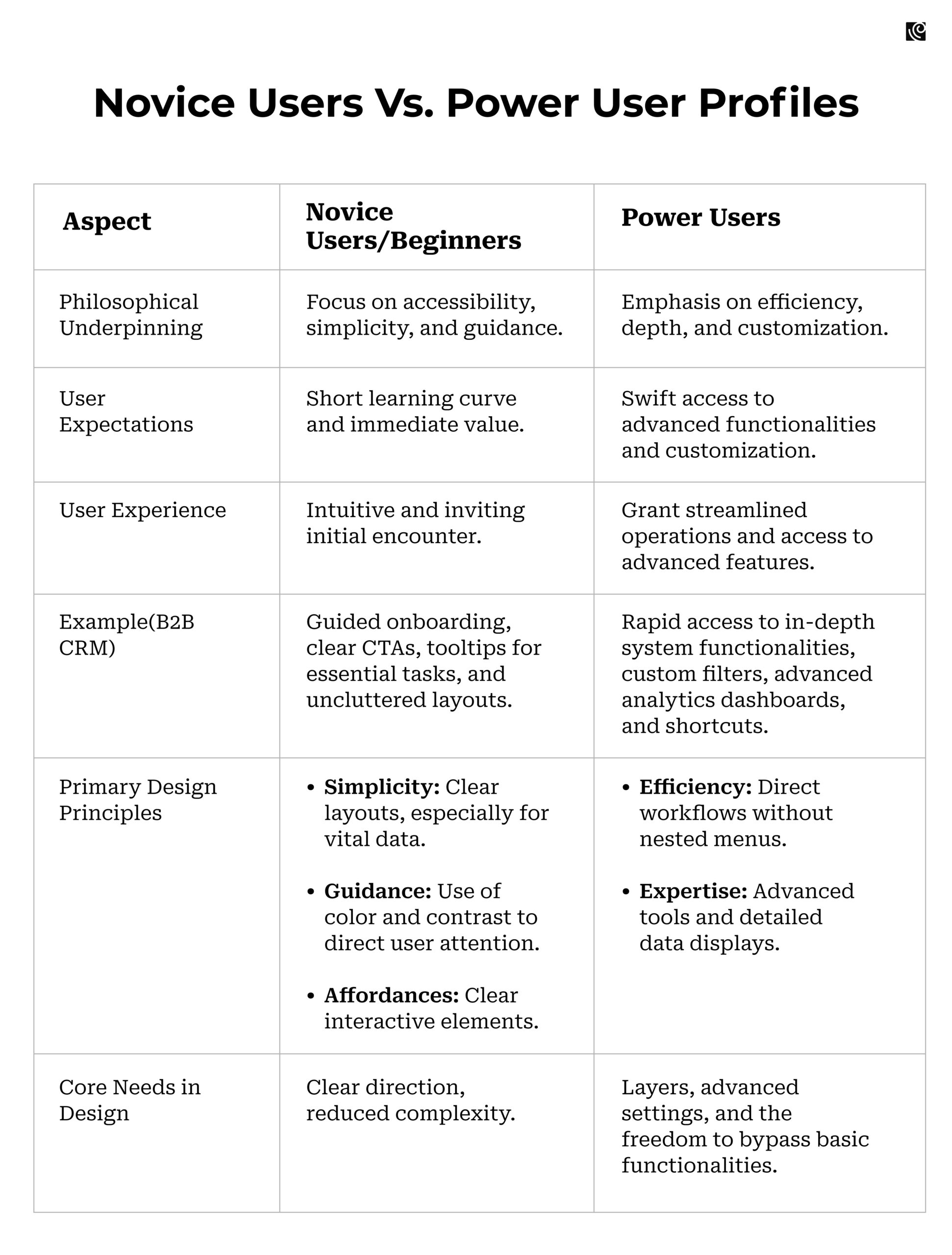
Profiling Novice Users/Beginners
Novice users often step into a platform expecting a short learning curve. They’re on the lookout for immediate value and can easily feel swamped by complex features. Catering to this audience requires a keen sense of direction. Here are the design principles that product leaders need to take care of while designing for novice users:
- Simplicity: Clean layouts reign supreme here. Picture a B2B dashboard where essential KPIs shine without being buried under data mountains.
- Guidance: Using color and contrast can illuminate the path. Consider an enterprise CRM, where the ‘New Lead’ button stands out, guiding the user effortlessly.
- Affordances: Interactive elements should be evident. Shadows, buttons, and icons can make functionalities like “Schedule Meeting” in a project management tool palpably clear.
Profiling Power Users
Power users, in contrast, are set on advanced functionalities, craving customization, efficiency, and the little shortcuts that make big differences. They don’t need hand-holding; they need layers, advanced settings, and the freedom to bypass the basics. Let’s break down the design principles:
- Efficiency: Streamlined workflows make their day. Visualize an ERP system where inventory checks are a click away, not lost in nested menus.
- Expertise: Dense information displays and advanced tools are their playground. Think of a financial analytics platform where users can manipulate multiple data streams, drilling deep into business insights without feeling restricted.
Strategies to Integrate UX and Design for Both User Groups
Achieving a retention rate between 85-90% is a golden standard in the SaaS industry. It reveals the authentic health and potential of your subscriber base. This benchmark can be achieved by thoughtfully curated design strategies that cater to both novice and power users.
Adopt Layered Onboarding
By integrating thoughtful and layered onboarding, Twine, an intranet software platform, slashed its 65% drop-off rate by over 50%.
Layered onboarding customizes user introductions based on their experience and role. This is indispensable in the B2B sphere where a single software often collaborates with an ensemble of enterprise systems.
The concept of “scaffolding” can be of great prominence here. It refers to the provision of temporary support to learners, enabling them to achieve tasks they couldn’t manage independently. As learners grow competent, this support is progressively removed.
In essence, layered onboarding, influenced by scaffolding, adjusts support based on user capability and familiarity.
- For beginners, scaffolding may be rich tutorials and explicit tooltips that hold their hand through initial tasks.
- As they progress, these aids reduce, transitioning users to more independent operations.
- For power users, minimal scaffolding is provided from the outset, acknowledging their prior expertise.
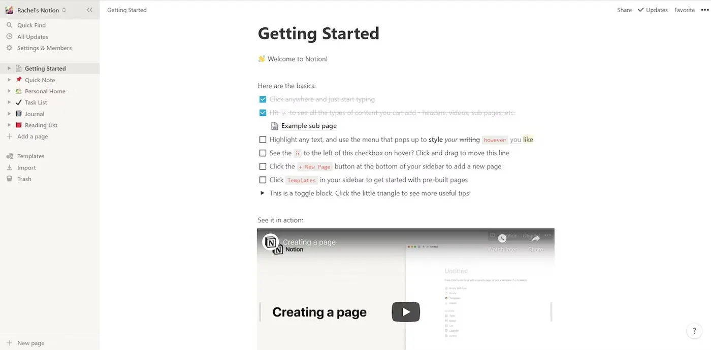
Example: Notion’s onboarding screen
Notion masterfully employs a “blank slate” approach, presenting an uncluttered interface to newcomers. This tactic ensures that users aren’t inundated with information immediately, offering a gentle introduction to the platform’s capabilities and preventing early-stage overwhelm.
Tailor Tooltips With Clarity and Depth
Tooltips, when designed aptly, can bridge users from uncertainty to clarity, offering immediate insight without disrupting their workflow. Their depth, however, needs calibration.
In 2013, Jakob Nielsen and crew were surprised to discover that, “users were unaware of basic features of the apps they frequently used.”
Strategy For Implementation
From an information theory viewpoint, it’s pivotal to recognize the ‘information saturation point’—the juncture where users can’t effectively process more data.
- Beginners, with their limited familiarity, reach this point swiftly, demanding succinct tooltips. For instance, a brief “Click to view monthly reports” upon hovering over a dashboard feature would suffice.
- On the other hand, power users have a higher threshold, due to their existing expertise. While they benefit from concise tooltips, embedding links for deeper dives into documentation or advanced tutorials caters to their expanded capacity. Imagine a tooltip in an intricate data visualization tool, not just explaining a function but also offering a pathway to a detailed guide on data interpretations.
Example: Figma’s Helpful Tips For UI
Instead of overwhelming new users with the intricacies of its powerful design tools, Figma uses popups as a helpful UI design to assist users in understanding important guidance and shortcuts. These tips ensure users don’t get stuck and are placed strategically so they don’t interrupt users’ workflows. It’s a subtle way of teaching without being intrusive, allowing for a smooth user experience.
Example: Airtable’s Tips For New Users
Airtable, acknowledging the complexity of its platform, ensures that users are provided with handy tooltips as they navigate. These tips aren’t overwhelming; they blend seamlessly into a user’s exploration, ensuring they make the most out of the platform without feeling lost. This “virtual guide” approach instills confidence in new users, allowing them to understand the platform’s capabilities step by step.
Role-Based Access, Personalized Dashboards, And UI Customization
For SaaS apps, a one-size-fits-all approach is rarely effective.
- You need to customize UX for Different Roles. In B2B, roles like admins, managers, and users dictate unique needs. Design your UX to recognize these distinctions. Higher-tier roles, such as admins, should have access to more advanced features, ensuring they harness the platform’s full capabilities.
- Your Dashboards should not be static but adaptable. Recognizing a user’s role and proficiency level, adjust the dashboard elements. This tailored approach ensures that users immediately see the data and tools most relevant to their daily tasks, boosting efficiency.
- Different roles demand different data visualizations and tools. Ensure your interface offers customization based on these roles. By doing so, a salesperson, who prioritizes lead tracking, and a data analyst, who dives into complex data patterns, both find an environment specifically tailored to their needs.
Configurable Workflows: Designing for Autonomy and Structure
B2B SaaS platforms face the challenge of accommodating both beginners and power users. Configurable workflows offer a compelling solution to this design conundrum. Here’s how you can optimize your UX design for varied user proficiencies:
For Beginners
Provide Default Configurations: Start novices on a structured path. For instance, in a project management tool, offers a linear task management flow that they can follow without feeling overwhelmed.
Tips:
- Use intuitive icons and labels to guide novices through the process.
- Incorporate tutorials or step-by-step guides that introduce basic features.
For Power Users
Offer Customization Options: Empower advanced users by allowing them to shape workflows as per their project needs. They should be able to add, modify, or remove stages, enabling a fit-for-purpose approach.
Tips:
- Implement a drag-and-drop interface for easy workflow adjustments.
- Provide templates for common workflow configurations, but allow for granular modifications.
A real-world example is Jira’s adaptable workflow rights. By enabling distinct transition rights for different user groups, Jira ensures that each user interacts with the tool in a manner suited to their expertise and role.
This adaptability creates a UX design that simultaneously supports and challenges users based on their proficiency. It promotes both ease of use for beginners and depth for power users.
Modular Design & Progressive Disclosure
Embracing modular design and progressive disclosure ensures users encounter the right amount of information, warding off cognitive overload. By “chunking” complex tasks into manageable modules, beginners can easily navigate core functionalities. As familiarity grows, expandable menus reveal advanced tools.
Strategy For Implementation
- Start with primary functions on the main dashboard.
- Use hover-triggered expandable menus to introduce deeper layers.
- Design intuitive tasks for newcomers, gradually unveiling intricacies for veterans.
Trello, a project management platform, expertly implements progressive disclosure wonderfully.
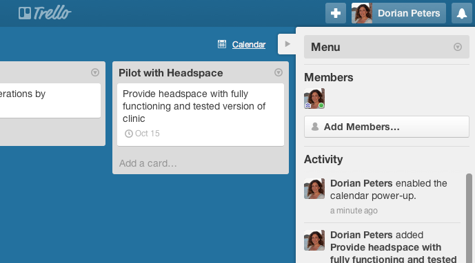
Initially, users are met with an uncomplicated interface for board, list, and card creation. As they advance, more sophisticated features like custom fields and power-ups become accessible. Moreover, Trello customizes workflows with pre-built templates catering to roles like marketers and developers.
Adaptive UI
The brilliance of Adaptive UI lies in its ability to grow alongside the user.
Inspired by Vygotsky’s “Zone of Proximal Development,” it hits the balance between a user’s independent skills and what they can achieve with assistance, ensuring challenges match their skill set without overwhelming them.
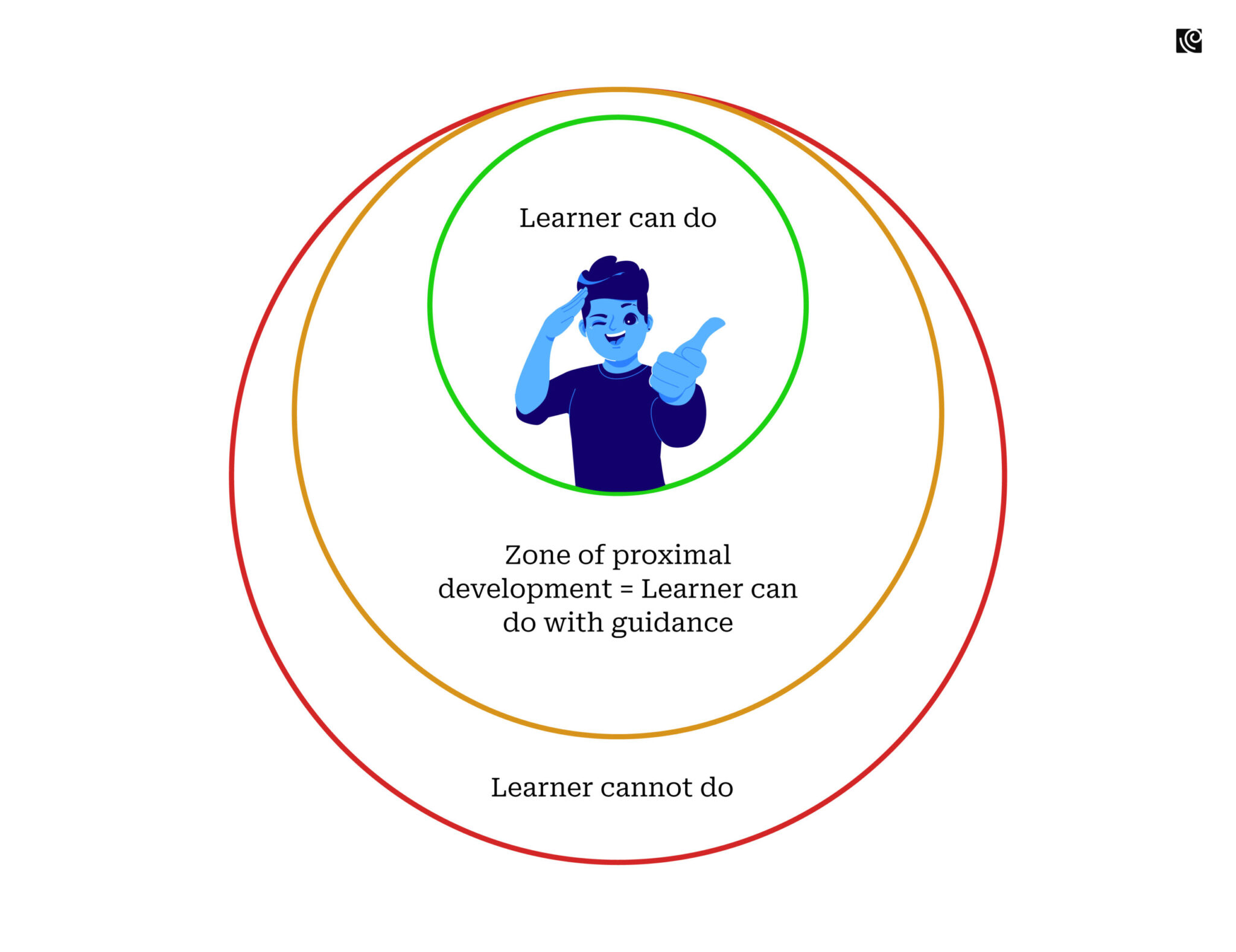
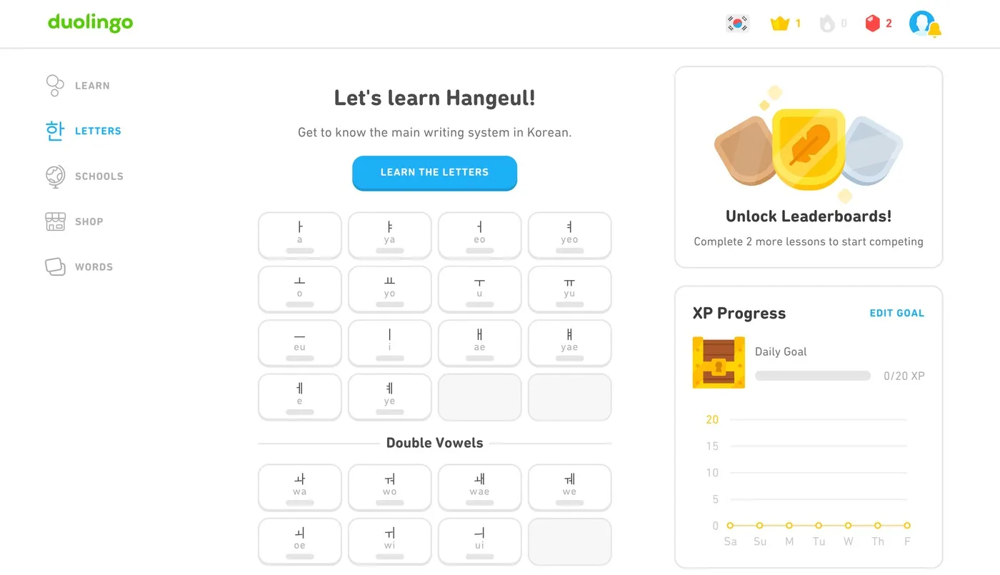
For instance, Duolingo tailors its UI to the user’s progression. If someone struggles with a concept, they get extra practice. Conversely, swift learners receive advanced challenges, keeping engagement high.
Strategy For Implementation
- Initiate with basic tools, scaling complexity as user proficiency grows.
- Monitor user interactions to determine their comfort level and adjust UI elements accordingly.
- Celebrate user milestones, making the feature “unlocks” a rewarding experience.
Integration and API Access
Integration is the cornerstone of a seamless user experience. Each tool or software doesn’t exist in isolation but is part of a larger ecosystem. When these systems synergize effectively, they create an amplified user experience that’s more than the sum of its parts. Here’s how SaaS platforms can cater to both novice and expert users:
Seamless Integration For Beginners
Offer straightforward, plug-and-play integrations. For beginners, the ability to easily integrate tools enhances their user experience, as they don’t need to navigate the complexities of manual syncing. Think of it as providing a pre-configured connection between a project management tool and a communication platform.
Robust API Access For Power Users
Allow power users the freedom to harness APIs. This empowers them to sculpt and mold the platform to suit their specific operational requirements. Instead of limiting them to basic integrations, you’re providing them with a canvas to design bespoke solutions, like custom data funnels for CRM tools.
Regular Product Updates with Tiered Rollout
Timely product updates ensure relevance and user satisfaction. A strategic, tiered rollout approach can maximize the benefits while minimizing disruptions for different user groups:
- Target Power Users First: Begin rollouts with power users who are more inclined to experiment. They often serve as your innovators or early adopters. Using the example of an ERP system integrating AI-driven analytics, provide power users with early access, allowing them to familiarize themselves and give constructive feedback.
- Refinement Based on Feedback: After obtaining insights from power users, refine and optimize the feature. Address identified challenges and enhance usability based on their experiences. This stage is crucial to ensure the update is robust and beginner-friendly.
- Broader Release for All Users: Once refinements are complete, introduce the feature to the entire user base. This guarantees that when beginners access the update, they’re met with a stable, well-tested feature, ensuring a seamless experience.
Example: Google’s Strategy For Its Chrome Browser
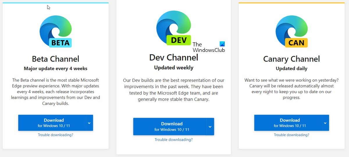
Google employs a tiered rollout system with multiple channels: Stable, Beta, and Canary. This structure enables them to introduce new features and fixes gradually. Users who wish to experience cutting-edge developments can opt for the Canary version, while those prioritizing stability might stick with the Stable release. This tiered approach ensures that any potential issues are identified and resolved before reaching the broader user base.
Empowering All Users in the SaaS Landscape With The Right Design Strategies
Designing an interface that resonates with both beginners and power users is not just a design aspiration but an imperative for business growth. The diversity of users—each with their unique needs, expectations, and proficiencies—calls for a design methodology that’s adaptable, intuitive, and empowering.
SaaS platforms and product leaders need to recognize that every user is on a journey. A novice today could be a power user tomorrow. By ensuring that the initial steps are clear and inviting while still offering depth and customization for those who seek it, businesses can foster loyalty and ensure that their tools remain indispensable in users’ digital toolkits. A user-centric design approach doesn’t just enhance the user experience—it propels the business forward, marking the distinction between good software and a great one.


