


Quick question – what is the one thing that immediately tells you that you are in a UX design company’s office?
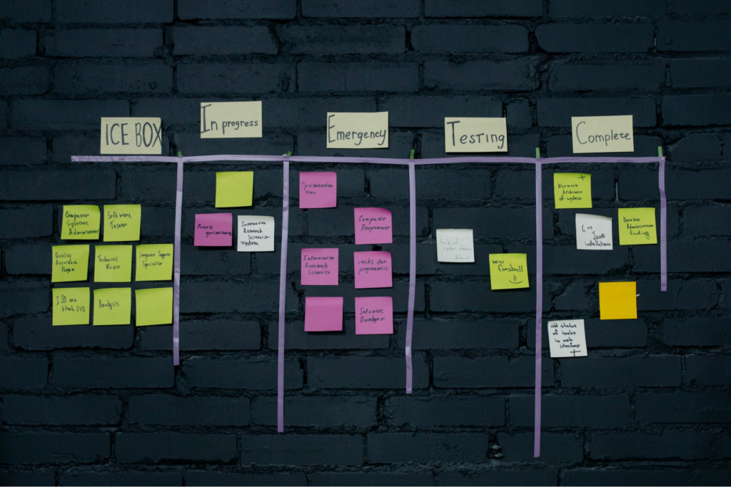
Here’s the easiest one – you’re sure to see a wall or a whiteboard full of post-it notes affixed, maybe in some sort of a pattern.
What you’re looking at is an Affinity Map – a synthesis method that helps UX design teams collectively analyze research findings as well as ideas from their brainstorming sessions. Affinity diagrams are a great way to simplify information into digestible bits especially when there is a lot of mixed data, such as ethnographic research, ideas, user surveys, user needs, insights, and design issues. Clustering exercises such as affinity mapping are all about bundling and categorizing information which helps in making more sense out of it. This is what makes it valuable enough to be used in the UX Design process, as well as outside of this context.
Getting started with Affinity Mapping

Things you’ll need:
Before you get on with the actual exercise, you need to have gathered user data through methods such as usability testing, surveys, observation, or any other means of collecting feedback. You can also use this method to make sense of ideas that surface in design-ideation meetings or ideas about UX strategy and vision.
Armed with this information, you’ll need –
- Sticky notes, to write out each idea.
- A large whiteboard or wall (or an online whiteboard) where you can stick, organize and rearrange the ideas.
- A facilitator who keeps the meeting on track and ensures productivity.
- Participants.
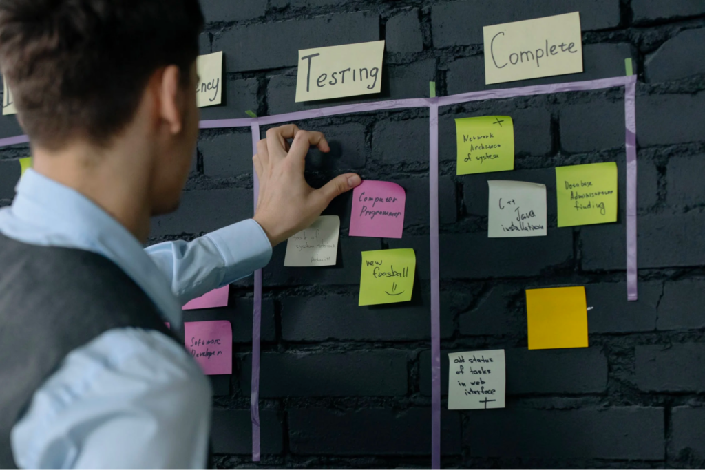
Conducting the Affinity Mapping exercise
Affinity diagramming essentially is about assembling related facts into distinct, organized clusters for gaining a better understanding.
The exercise itself involves the following steps:
- The facilitator and the participants write their ideas and observations each on one sticky note.
- These notes are then categorized into groups based on different themes.
- Once done, the team analyzes the broad categories and ideas under each.
- This analysis helps create concept directions out of it.
The entire session should last no more than three hours with a 5 to 10-minute break in between.
Facilitator’s responsibilities:
- Communicate the main objectives and goals to the group.
- Clarify and monitor the steps at every stage of the session.
- Place all the notes on the board.
- Facilitate moving past any possible roadblocks.
Tips to get the most out of Affinity Mapping

- Consider starting with a few category names. In the case of a website, for instance, categories such as Search, Homepage, Footer, Page layout can be created. Stick these category names high on the board, so many notes can fit below.
- Use a “?” for category notes that are not understandable or ambiguous.
- Sort the idea notes into categories and/or sub-categories.
- Determine priorities of categories by taking votes.
- The categories are ranked based on the values, motives, and priorities of the design objectives.
- Justify the ranking by way of user needs, pain points, or look for gaps you haven’t addressed yet.
- Similarly, rank the ideas under each category by voting, based on the same parameters.
Benefits of Affinity Mapping
Giving a voice to varied perspectives
Affinity diagramming is an exercise that provides an open space for team members to voice their thoughts and ideas. It is a fertile ground for everyone to explore their imagination and come up with crafty solutions to designated issues.
Clustering and ranking large chunks of information
Affinity diagrams help in discovering unique and novel connections between various components of a given project. Synthesizing ideas into a simple, visual manner such as this allows teams to come up with new solutions that they otherwise may have overlooked.
Summing up the major insights, user needs, pain points, and gaps
It can be difficult to come to a consensus when tasked with synthesizing voluminous research data or bringing coherence to a varied set of ideas. This is where affinity diagramming comes in handy. By categorizing the data and ideas it is easier to zero in into specific design directions.
Affinity Mapping without a group? Yes, it’s possible.
While Affinity diagramming is a UX synthesis method that’s often conducted as a group activity, doing it as a solo designer is beneficial as well. In fact, it proves especially valuable to categorize research insights and overcome confirmation biases, if any. The activity of laying out data and grouping it can help view things with a fresh perspective and open up newer avenues.
As a designer, you are sure to have been a part of umpteen feedback sessions with stakeholders, ideation exercises, or meetings devoted to analyzing research findings only to have no conclusive, actionable output from them? Well, UX workshops such as affinity diagramming exercises can come to your rescue. From generating empathy for users to educating stakeholders and making them feel involved and responsible for ideas and research findings, this method comes with numerous benefits. Additionally, affinity mapping is great to bring attention to usability issues and design challenges, and create a common ground for people across all types of backgrounds and expertise.
Have you made use of a thematic analysis method such as affinity diagramming for any of your projects? How has it helped you? Do let us know in the comments!


