


As a designer, you’re always aware of the dos and don’ts every time you set out to design something as significant as the dashboard. Basically, the rules, guidelines, or principles to follow are always at the back of your mind leading the way as you go about designing. This is mostly helpful – they are called guidelines for good reason – but sometimes, they can also feel restrictive.
A well-designed dashboard enables the monitoring of all aspects relevant to the stability of the business and has a direct impact on employees’ productivity. A good dashboard is one that offers quick access to relevant data, simplifies complexities, and does so on an easy-to-comprehend user interface.
So how can one design a dashboard that helps users make informed decisions? By not being trapped within the box of rules and principles.
3 Dashboard Design Rules To Override
Dashboard design best practices are in place to help designers deliver a superior user experience. However, there are times when logical judgment and strategic thinking takes precedence over dashboard design principles. Here are 3 such instances.
Lesser the better
Minimalism is a good dashboard principle to follow – no one likes to work their way through the clutter. However, enterprise applications are data-heavy, and their users devise their own ways to work through the chaos and do what needs to be done. So, when designers decide to “declutter” dashboards and go the minimalistic way, there are chances that it would end up making things difficult for the users. When designers decide to do an intensive clean up, they can instead deprive users of the tools and routes they use to perform their work on a regular basis.
What to do instead…
…Is to choose the right metrics to be displayed. How can that be done? By creating the design based on user data. Learn how the users typically use the dashboard and note the metrics that matter to them. Yes, the aim is to reduce cognitive overload, but this is to be done by carefully selecting the metrics that matter based on user research data. To determine which metrics make it to the dashboard, analyze how much detail the users need. The idea is to provide simple access for the user to dig deeper into the data in case they need to.
Pie charts are a no-no
No! This is one rule that modern dashboard design gurus love to propagate. But, remember that data visualization is a complex process, and there aren’t any golden rules about it. Data visualization tools are used to organize data in a simplified manner. They serve a specific purpose – that of conveying important facts in a more effective way than the basic tables.
What to do instead…
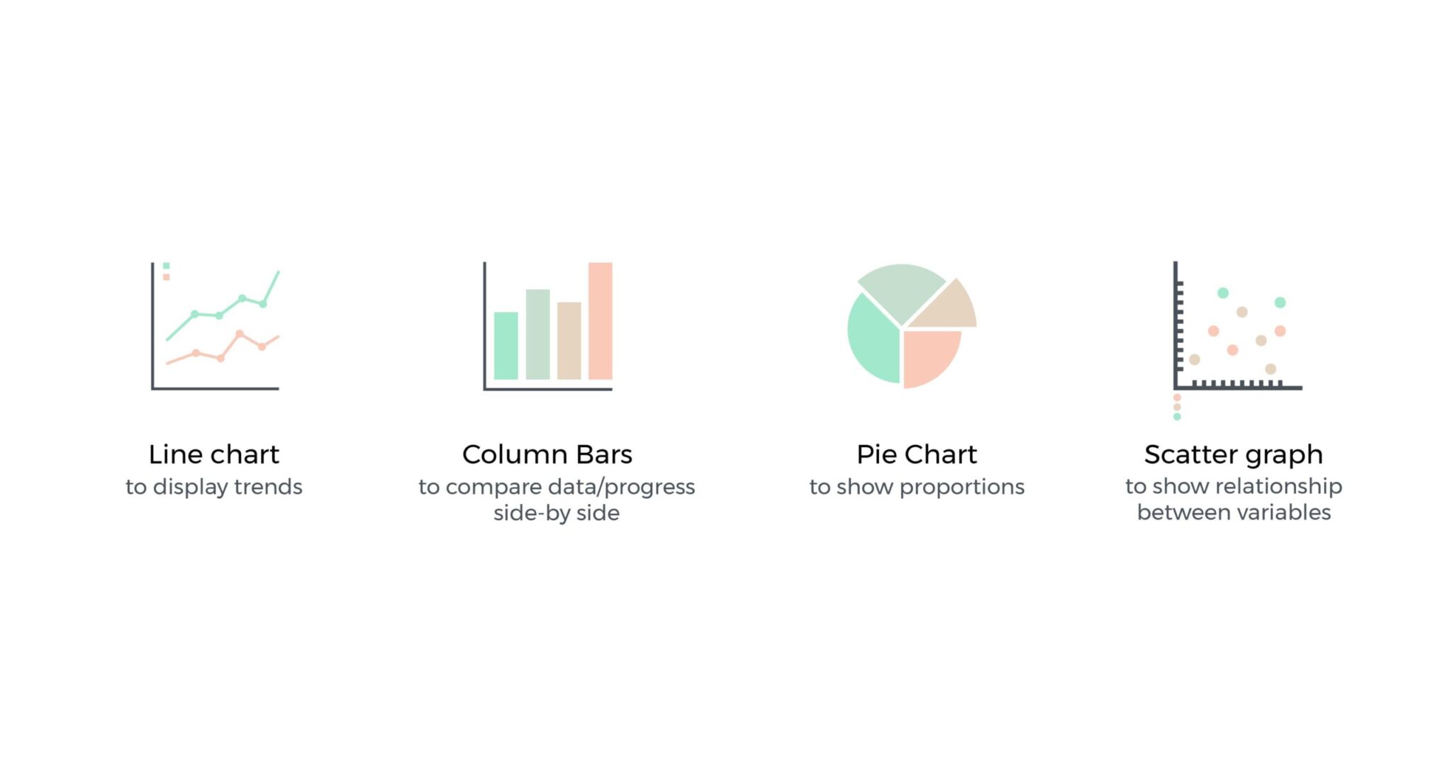
…Is not to say that ‘pie charts are useless’, but to come up with the best possible way to depict the information. When it comes to picking the right visualization tool, here’s how you can categorize the data you want to showcase –
- Connections between two or more variables
- Comparison of two or more variables side by side
- Data broken down into separate components
- Data range and grouping of values
Categorizing the data will help you pick the right visualization tool rather than dismissing a system outright.
Keep all the important things at a glance
The 5-second principle of designing dashboards says that the user should find the information they’re looking for within 5 seconds of examining the dashboard. But here’s the thing. Your users are a group of individuals using the same system, but with varying needs – the product manager doesn’t need to see the same data as a marketing executive, the HR department, or those in logistics. Even within the same department, a user at the entry-level has different expectations of his dashboard than the VP.
What to do instead…
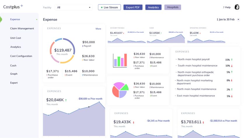
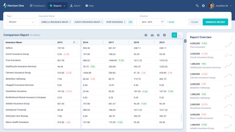
…Is to allow users to determine what’s important to them. Provide options for customization. That’s how you get users to tweak the appearance of the dashboard with features that matter most to them. Make it as easy as possible for users to absorb the information on the screen. Here’s a good dashboard design example –
Every inch on the dashboard is prime real estate compared to the rest of the system. Therefore, instead of fixating on dashboard design principles, switch to creating principles of effective dashboards. Remember, the goal is always to deliver an optimal user experience via the dashboard. And if doing so involves tweaking a few rules, it hardly matters!


