

Do you ever wonder?
In the era where the democratization of content is the norm, TikTok rose to the top by flipping the script and taking the power of choice away from its users.

But it’s not. Instead of giving users the freedom to explore and discover content, TikTok curates a selection of the most highly-rated and captivating content, leaving users wanting more. It’s a bold move, but one that has proven to be a stroke of genius.
The magic wand behind the disruption here is Tiktok’s up+down swiping pattern — it is a game-changer in the design world. This simple gesture, used to navigate between videos, is intuitive and effortless, making it easy for users to access a never-ending stream of content. The pattern is ingeniously designed to keep users engaged for as long as possible, by eliminating all possible distractions and unnecessary controls.
It’s an exciting time for product design!
“Today, innovation is not about staying ahead in the competition, it’s about reshaping the competition.”
Mark Benioff, CEO of Salesforce
Disruptive design patterns are everywhere — infinite scrolling, micro-interactions, dynamic island, conversational interfaces, scroll-triggered animation, parallax scrolling, split-screen layout, sticky sidebars, pagination, virtual lists — I could go on and on about this. These disruptive designs elevate the user experience to new heights, but they also have their drawbacks. Let’s unpack the impact of these cutting-edge design patterns on user experience, both the brilliant and the blemishes.
Disruptive Design Patterns: Prominent Examples and Their Impact
Let’s Talk More About TikTok
TikTok has revolutionized the way users interact with mobile apps, breaking traditional design patterns and introducing a new way of navigating through content. It broke multiple mobile-app principles — swipe gestures, white text overlaid on the video, small tappable areas, and lack of hierarchy, just to name a few. The app’s intuitive interface and habit-forming mentality have made it a favorite among users, despite its steep learning curve.
With more than 1 billion active users in 2023, it’s no surprise that other platforms have followed suit, copying TikTok’s design and features to offer their own immersive video experiences. From Instagram’s Reels to Facebook’s Stories, and even Twitter’s latest video feature, it’s clear that TikTok’s influence has spread far and wide.
Impact: A Double-Edged Sword

TikTok has challenged the traditional norms of mobile app design, introducing a new way of navigating through content that has captured the hearts and minds of millions of users.
But, is this disruption of design patterns a double-edged sword?
While it’s true that TikTok’s success speaks for itself and their design choices are effective among younger audiences, some experts argue that breaking with established standards can create frustration for users, especially for those with cognitive disabilities. The expectation for user flows to be intuitive and straightforward is a widely accepted principle, but when faced with a foreign pattern, it can create a barrier to accessibility.
However, it’s worth considering that pushing boundaries and disrupting the status quo can lead to innovation and progress. The question is, are you willing to take the risk and challenge the conventional wisdom, or are you content with sticking to what’s familiar? The decision ultimately lies with designers, developers, and product managers, but it’s crucial to remember that the goal is to create an inclusive and accessible experience for all users.
Minimalism and Simplification: From Slack to Revolut and Oculus
Leading tech companies have long favored simple, informative, and minimalistic interfaces. From fintech leaders like Revolut to cutting-edge technology like Oculus, the trend towards minimalism has only continued to grow in popularity.
This approach not only makes products more accessible and user-friendly, but it also helps to convey a sense of professionalism and reliability.
Impact: The “Less is More” Philosophy
We are creatures of habit, constantly drawn to the familiar patterns in our environment. Our brains are wired to recognize and navigate through familiar interfaces, and the mere-exposure effect has proven that we prefer things that we’re used to.
Interface design patterns are built to be consistently used and widely accessible, allowing users to effortlessly switch between devices, platforms, and software.
“Good design is as little design as possible”
Dieter Rams
But, is good design always minimalistic?
We’d say, it’s debatable.
Is Less Really More?
Different cultures have different views on what good design looks like, and it’s essential to consider the needs and wants of users from diverse backgrounds.
Here’s an example that speaks for itself.
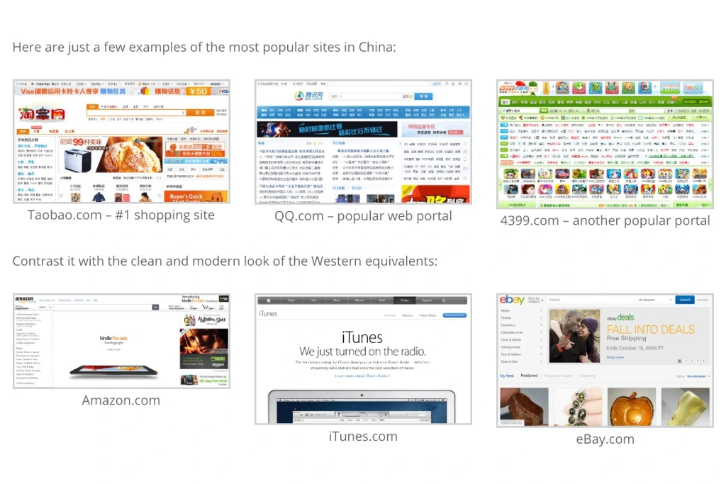
The idea behind minimalism is to create a user-friendly experience by reducing the cognitive load on the users. However, some argue that this approach can lead to a lack of detail and personality in the design, leading to the death of detail in the design!
Without the use of detailed elements and embellishments, the design can appear bland and generic. This can be particularly problematic for brands, as they rely on their visual identity to stand out and make an impression on their customers. A minimalistic design may not be able to convey the brand’s personality or message effectively.
Here’s an excellent explanation of the same:
Another issue is that minimalistic design can be too rigid and restrictive, making it difficult for designers to express their creativity and explore new ideas. With fewer elements to work with, designers may feel constrained and unable to add the detail and nuance that can make a design truly stand out.
Designing with a user-centered approach trumps adhering to a particular design aesthetic – whether it be minimalism or maximalism. Prioritizing the needs of the user and the goals of the product should always take precedence.
Apple’s Notch & Dynamic Island
In 2017, Apple made a bold move by introducing the iPhone X with a brand-new, bezel-less redesign and replacing the Touch ID sensor with Face ID technology. This change also brought about the highly recognizable and controversial notch. While some users were quick to adapt to the new design, others still long for the return of Touch ID and question the longevity of the notch.
But Apple didn’t stop there.
It once again pushed the boundaries of design when it introduced the Dynamic Island feature in the 14 Pro and Pro Max models. They brought the Notch to life by transforming it into a sleek and dynamic element of iOS 16.
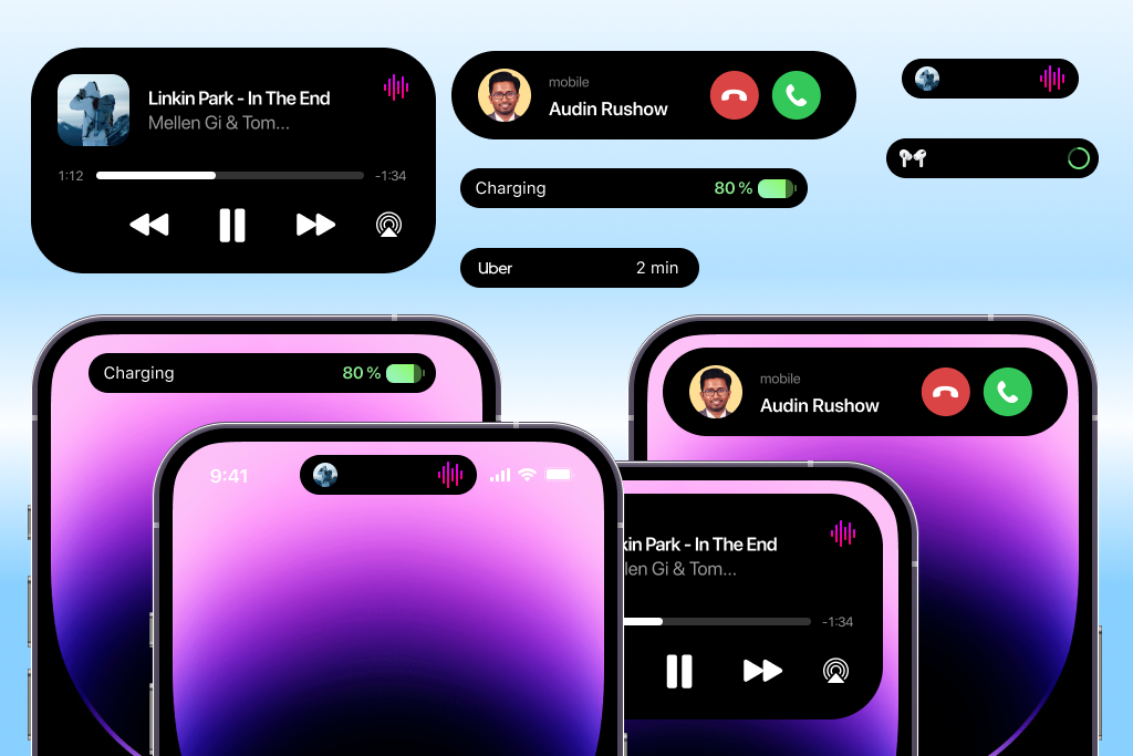
The Dynamic Island, appearing as a fluid and energetic bar, houses an array of widget-like icons for notifications, maps, alerts, and music, and can expand to reveal even more information like phone calls, timers, alarms, and live activities.
Apple has not limited this revolutionary feature just to iPhone, but also extended it to other devices, thus showing the company’s dedication to innovation and design excellence.
Impact
Design decisions are a delicate dance between innovation and consistency. And the Dynamic Island feature is a shining example of that. But, it is essential to consider its impact on users of all abilities and how much they are willing to learn every time they interact with a new product.
With a relentless drive for innovation and a fierce determination to stay ahead of the competition, Apple often introduces new features that leave users questioning their necessity.
The Dynamic Island, while a visually striking addition to the interface, left many wondering if it was truly necessary, especially when users were consistently asking for the return of Touch ID. A bold and creative move, it’s a testament to Apple’s unwavering commitment to pushing the boundaries, but it raises the question, at what cost?
Superhuman’s Cmd-K: A Power-User Feature
Superhuman employs a design pattern that allows for lightning-fast keyboard input, simply by hitting Cmd-K. This powerful feature is like having a secret weapon, making you feel like a time-traveling cyber criminal from the future. And, it’s not just for show, it’s designed to help power users process large amounts of email quickly, with the potential to increase efficiency.
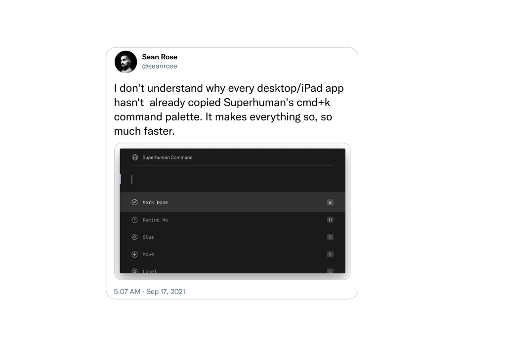
But Superhuman takes this design choice to the next level, making it clear that speed is their top priority. Their near-total reliance on keyboard navigation means that the screen UI can cut away unwanted code or software, making it even faster. And if you dare to use your mouse, the app admonishes you for doing so, teaching you the faster way.
Impact
It’s a bold and creative design choice that is not for everyone, but for those who love it, it’s a game-changer. Superhuman is not afraid to take a stance and stick with it, it’s what makes it one of the best-of-breed products. It’s not trying to be everything for everyone, but it’s designed to help users get the most out of it, and that’s what makes it truly great.
Design Nostalgia: The Canon Cat, A Magical, Forgotten Machine From The Late 1980s.
The design of Superhuman, the sleek and powerful email management tool, dates back to the pioneering work of legendary designer Jef Raskin and his revolutionary Canon Cat computer. By zeroing in on a specific niche audience, office workers, looking to make mountains of work disappear faster, Raskin designed a product that was far superior for this core group of users.
The canon Cat, like Superhuman, was a masterclass in design simplicity, doing away with the mouse and desktop metaphor in favor of lightning-fast keyboard input and a single multi-purpose document. Even cursor keys were eliminated, in favor of the revolutionary “Leap” keys, which allowed users to shift input to the nearest instance of typed letters, with a single keystroke.
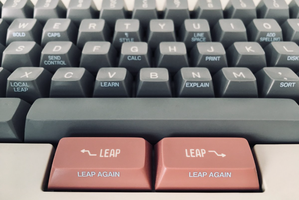
It’s a bold and creative design choice that may not appeal to everyone, but for those who embrace it, it’s a game-changer. The canon Cat may have only sold a modest 20,000 units, but it proved that designs aimed at getting work done can be a hotbed of innovation.
Fun Fact
In case you want to step back in time and relive the glory days, the Internet Archive has an in-browser emulator of the Canon Cat you can play with.
Finding The Right New Patterns
Charting new design territories requires a delicate balance of innovation and consistency. Companies like Apple excel at striking the perfect balance, introducing new technology and design patterns that consumers quickly adopt and love. But for every Apple, there’s a Vine – a once-promising app that failed to evolve and ultimately fell to competition.
As designers, how do you know when to break the rules and push boundaries, and when to stick to tried and true methods? The answer lies in striking a balance between innovation and convention, considering factors such as consistency, accessibility, user adoption, and validated research. It’s a tricky path to navigate, but those who dare to tread it will create experiences that are both disruptive and intuitive, standing out from the crowd and capturing the hearts of consumers.


